Grishin's Art Blog (GAB)
‘Tarnanthi 2021’ at the Art Gallery of South Australia 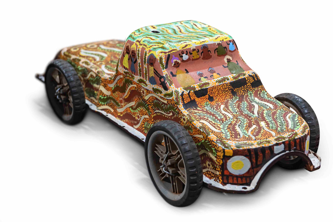 Eva Anyupa Baker, Bush trips to Mitutu Homeland, 2020, synthetic polymer paint on found object, 30.0 x 70.0 x 26.0 cm, © Eva Anyupa Baker/Minyma Kutjara Arts Project, photo: John Montesi What’s in a word? The word ‘tarnanthi’ in the language of the Kaurna people, the traditional owners of the Adelaide Plains, means to spring forth or appear – like the sun and the first emergence of light. It is the name given to the festival of contemporary Aboriginal and Torres Strait Islander art at the Art Gallery of South Australia and spreading to other participating venues. It commenced in 2015 and its sixth iteration opened in October 2021. However, the word ‘tarnanthi’ is not simply a snappy title, but according to its artistic director, Nici Cumpston, it also represents a new curatorial attitude. Cumpston writes in the lavish exhibition catalogue, “this curatorial approach is far from conventional. Western museology dictates that the curator is author and grand selector … Tarnanthi jettisons this way of working in favour of a practice that encourages excellence and innovation to spring forth and appear.” The curator becomes like a participating collaborating artist and a more collaborative, organic and fluid approach evolves for the selection of participants and exhibits.  Nici Cumpston at Tarnanthi 2021, December 2021, photo S. Grishin The proof of the curatorial pudding always lies in the exhibition and this one is interesting. There is some unexpected work from some well-known artists, including Nyunmiti Burton, Teho Ropeyarn, the irrepressible Kaylene Whiskey, Maree Clarke, Alec Baker, Angelina Karadada Boona and John Prince Siddon. There are also some fairly ‘predictable’ pieces from Kathy and Tracey Ramsay, Julie Gough, Kent Morris and Doris Bush Nungarrayi. Then there are some unexpected highlights, brilliant pieces from less well-known artists, including Timo Hogan, Minyma Kutjara Arts Project, Gail Mabo, Karen Mills and Waringarri Aboriginal Arts. The visual excitement of the exhibition in part lies in its freshness and unpredictability and in part in the exceptional calibre of some of the exhibits. For example, the room full of Tiwi papers is simply breathtaking. Unglazed and in a dense salon hang, there are some great works by some iconic and interesting emerging artists including Timothy Clark, Kaye Brown and Alison Puruntatameri. 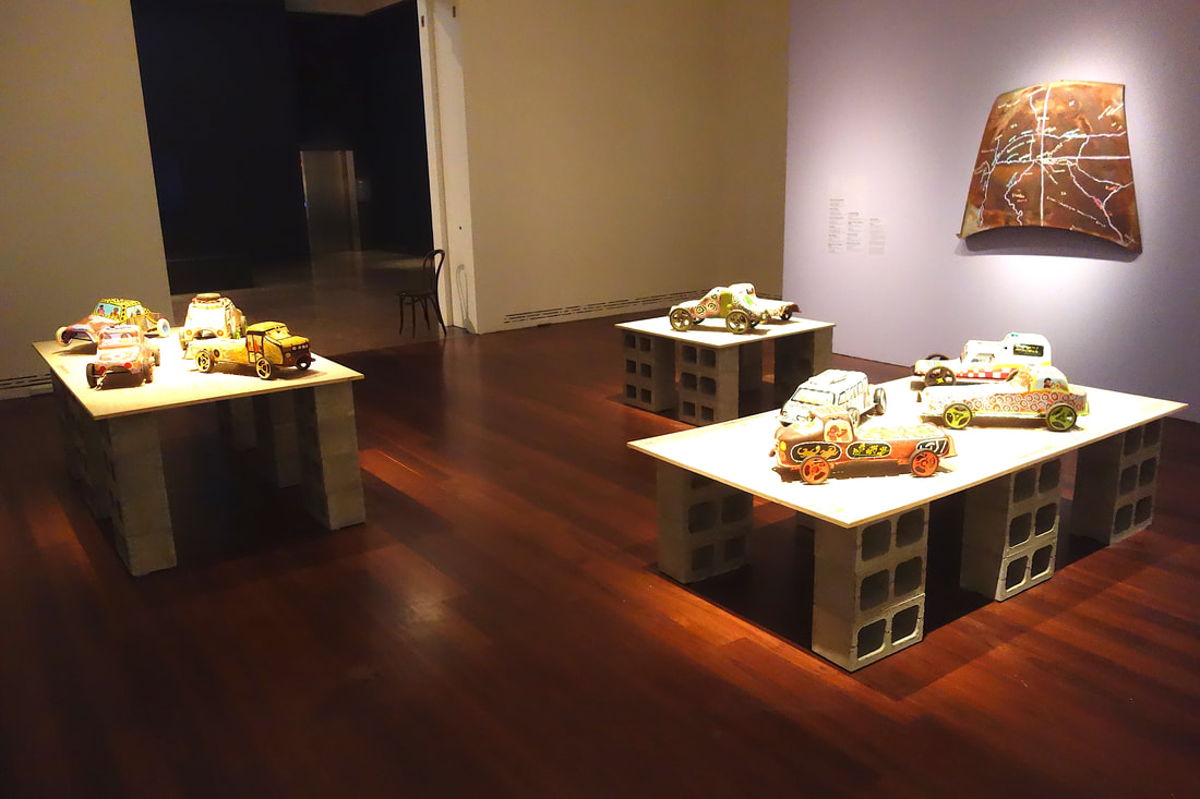 Minyma Kutjara Arts Project, Mutaka, 2020, installation view, photo S. Grishin One of the most quirky and memorable installations at the show is the Minyma Kutjara Arts Project – Mutaka (motor car). The eight artists from the remote Irrunytju community in South Australia near the tri-state border have picked up oil sumps from abandoned cars, added pram wheels and painted them as cars with their passengers and personalised narratives. A rusty car bonnet serves as a panel for a useful hand drawn map of the area and an animated video with these painted cars relates a broader narrative. All sorts of post-colonial narratives can be attached to these exhibits and there is the strong stamp of authenticity – of being there and bearing witness to the sense of place. It is also a lot of fun. 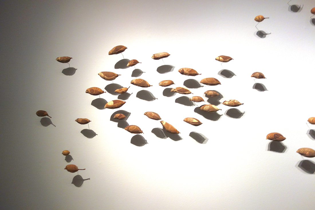 Waringarri Aboriginal Arts, Dreaming of birds, the metamorphosis of boabs, 2021, installation view, photo S. Grishin Another installation that was surprising and unusual was that by the Waringarri Aboriginal Arts artists. Carved boab nuts have long been the backbone of the tourist trade in outback Australia. Here nine artists have been commissioned to carve a large number of birds on boab nuts and these have been suspended from the wall on ingenious copper rods at various distances from the wall. There is a wonderful play between the objects and their shadows so that the flock appears to glimmer as it flies off the wall. 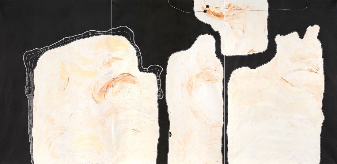 Timo Hogan, Lake Baker, 2021, synthetic polymer paint on linen, three panels, 300.0 x 200.0 cm (each panel), © Timothy Hogan/Spinifex Arts Project, photo: Grant Hancock Timo Hogan’s Lake Baker is a huge painting some three metres high and six metres across. It is an amazing piece with a fantastically detailed snake and textured white surfaces against a black background. The more time I spent with it, the more I was seduced by its magical spiritual presence. Although his star in recent times has been in ascendency, this painting makes a strong claim for his standing as a major artist.  Alec Baker, Ngura (Country), 2019, synthetic polymer paint on linen, 67.0 x 91.0 cm, © Alec Baker/Iwantja Arts Alec Baker is deservedly one of the big names in the show and is the senior artist at Iwantja Arts. His Kalaya Tjina (Emu Tracks) is a suite of sixteen paintings – each a meditation on country. He has a complete certainty of touch knowing exactly where to place the mark. The series is initially a mesmerising experience and subsequently a gateway to meditation. 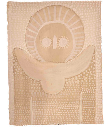 Angelina Karadada Boona, Wandjina Emerging II, 2020, white gum sap and earth pigments on paper, 37.8 x 29.0 cm, © Angelina Karadada Boona/Kira Kiro Artists/Waringarri Aboriginal Arts, photo: Sarah Duguid The painting by Nyunmiti Burton of the Seven Sisters was one of the big surprises at the exhibition. I usually associate her work with very tight carefully articulated pieces, but now there is a breadth and freedom with gestural swirls so that the ancestral travellers appear to take off and defy terrestrial gravity. Angelina Karadada Boona’s Wandjina images are growing gradually more ethereal as they are created with the materials from the land from which they arise. She captures perfectly the sensation of something emerging out of the spiritual realm to become visible but ready to retreat back into a timeless dimension. There is always a danger when reviewing a show of this nature to plunge into a catalogue of exhibits enhanced with a bit of a verbal commentary. Sadly, that by its very nature is somewhat boring and this exhibition is anything but boring. There is a great fecundity of invention throughout the show, a vitality and sense of urgency. 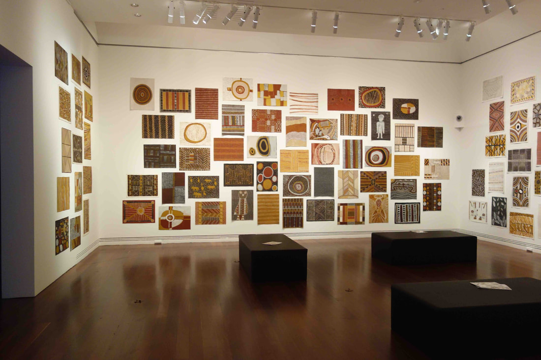 Tiwi papers, installation view, photo S. Grishin Tarnanthi 2021
Art Gallery of South Australia, Adelaide 15 October 2021 – 30 January 2022
0 Comments
Spowers & Syme: Early Melbourne modernist printmakers 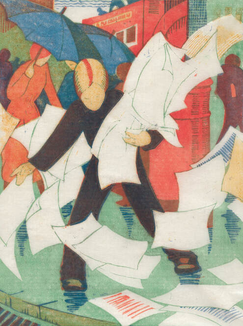 Ethel Spowers, The gust of wind, 1930, colour linocut, printed in colour inks, from four blocks, National Gallery of Australia, Canberra, purchased 1976 The long awaited Ethel Spowers and Eveline Syme exhibition was meant to open to the public on Friday 13 August 2021 at the Canberra Museum and Gallery. A day earlier, there was to be a small opening at 6.30 pm – alas the Canberra lockdown came into force that evening at 5pm – the show did not open, it has not been seen. This is almost true, sensing the disaster that was about to unfold, covering my gardening clothes with an overcoat, I hopped into the car and sped off to see the show before it and I were locked down. Ethel Spowers (1890-1947) and Eveline Syme (1888-1961) were silver spooners who came from the Melbourne establishment. They were daughters of the rival newspaper magnates – The Argus and The Age – who were lifelong friends and both were prominent printmakers who championed a version of modernism. 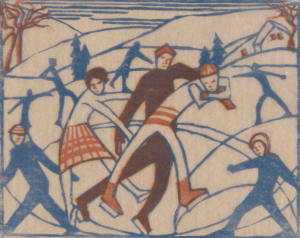 Eveline Syme, Skating, 1929, linocut, printed in colour inks, from two blocks, National Gallery of Australia, Canberra, purchased 1979, © Estate of Eveline Syme Their most productive years fell in the period between the two world wars when their art was featured in exhibitions in Australia and Britain. In the context of conservative Melbourne, their colourful linocuts looked modern and attracted a few champions and a couple of detractors. However, most of the art world simply ignored them until they were ‘rediscovered’ posthumously in the 1970s and 1980s as part of the revival of interest in the so-called ‘Claude Flight School’ of modernist linocut printmakers. Outside of the art market, the revival was spearheaded by the curator Stephen Coppel, firstly in Canberra and later in London. Today their prints are highly prized and command considerable prices on the art market. 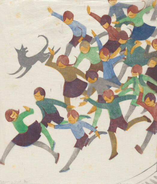 Ethel Spowers, School is out, 1936, linocut, printed in colour inks, from five blocks, National Gallery of Australia, Canberra, purchased 1976 This could be described as a ‘perfect exhibition’. It is small enough to be manageable, yet sufficiently comprehensive to give an excellent understanding of the two artists seen within their cultural context. It includes linocuts, drawings, paintings, fairytale illustrations and even an embroidered screen. It is meticulously researched by Sarina Noordhuis-Fairfax, the Curator of Australian Prints and Drawings at the NGA, who uncovers mountains of new material from the artists’ archives. She is also the author of the accompanying monographic catalogue, where the interwoven lives of the two artists are explored in her text, employing the metaphor of skating on ice. Noordhuis-Fairfax writes in a lively engaging style, where despite the abundance of quotations from primary sources, such as the detailed correspondence between Spowers and Frances Derham, it remains a very readable text.  Eveline Syme, Sydney tram line, 1936, linocut, printed in colour inks, from four blocks, National Gallery of Australia, Canberra, purchased 1979, © Estate of Eveline Syme The English artist Claude Flight, through the Grosvenor School of Modern Art in London, championed the colour linocut in Britain, with a whole army of talented pupils including the Australians Dorrit Black, Spowers and Syme. There were a few peculiarities of Flight’s method. One was his worship of the Italian Futurism and British Vorticism – the exhilaration of speed and the demonic energy of machines. Flight translated this into curved dynamic lines and fragmented colours designed to express speed, movement and hustle of modern life. Flight and his disciples used three to five blocks to print colour to produce an animated surface. The third feature of the Flight method was printing on very thin oriental tissue paper Gampi or India paper, printing on the reverse side of the paper allowing the image to bleed through to the other side, permitting a degree of subtlety.  Ethel Spowers, The bamboo blind, 1926, linocut, printed in colour inks, from five blocks Gallery of Australia, Canberra, purchased 1976 The colour linocuts of Spowers and Syme have a glowing luminosity and rhythmic dynamism. Spowers’s The works, Yallourn (1933), a print of considerable complexity and employing seven blocks, and Syme’s Sydney tram line (1936) from three blocks, are outstanding examples of the Flight method. All is caught up within a dynamic explosion of energy with a rich and vibrant colour palette. 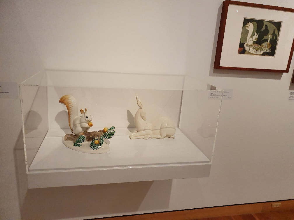 Installation photograph from Spowers & Syme, CMAG, photo S Grishin The beauty of this exhibition, at least in part, lies in the forensic matching up of sources and contexts, for example, a porcelain squirrel with an acorn appears in a Spowers’s print Still life (1932) with its dynamic play with shadows and in the exhibition the actual figurine is exhibited next to the print. In another instance, Spowers’s joyful School is out (1936) print is matched up with the artist’s drawing that served as the basis for the print. 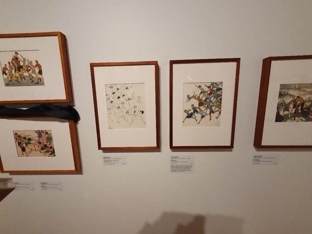 Installation photograph from Spowers & Syme, CMAG, photo S Grishin When you recall that much of the work was made during the Great Depression, it is a gay and somewhat frivolous world that we encounter in their art. The artists did possess a social conscience and were heavily involved in charitable work, women’s education and the war effort, in their art they celebrated a joyful innocence and hedonism. 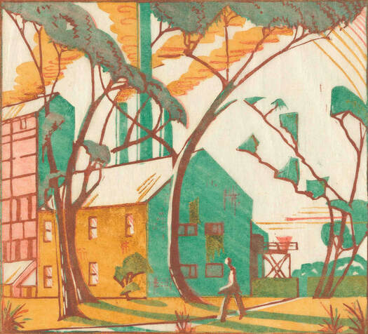 Eveline Syme, The factory, 1933, colour linocut, National Gallery of Australia, Canberra, purchased 1979, © Estate of Eveline Syme Spowers and Syme may not have made work of the same calibre or profundity as Jessie Traill or Dorrit Black, however, they did produce a body of exquisite prints that have finally been recognised and are celebrated in this wonderful exhibition. 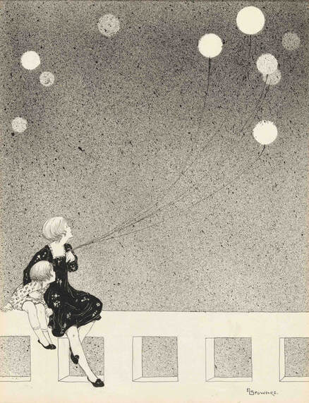 Ethel Spowers, Balloons, c. 1920, drawing in black ink, National Gallery of Australia, Canberra, Gift of Chris Montgomery 1993 Spowers & Syme Canberra Museum and Gallery, Canberra 13 August – 12 February 2022 Western Plains Cultural Centre, Dubbo 26 February – 1 May 2022 Heide, Melbourne 18 June – 2 October 2022 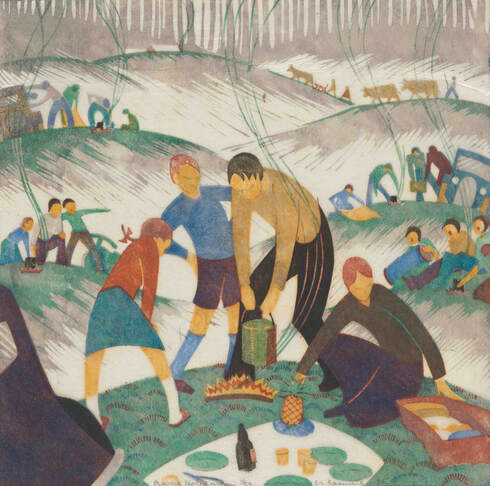 Ethel Spowers, Bank holiday, 1935, linocut, printed in colour inks, from six blocks, National Gallery of Australia, Canberra, purchased 1976 An earlier version of this review was published in The Canberra Times
Sarah Lucas from YBAs to the Venice Biennale 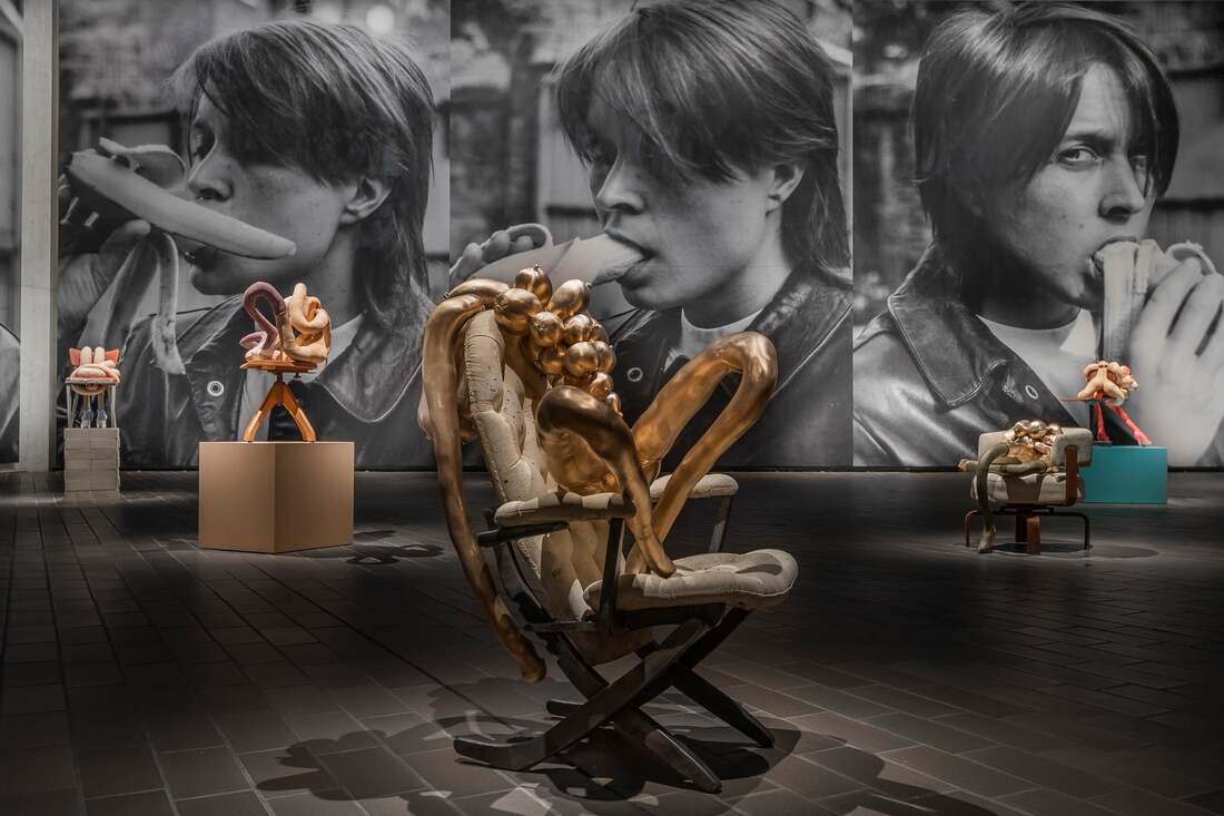 Sarah Lucas, TITTIPUSSIDAD, 2018, installation view, Project 1: Sarah Lucas, National Gallery of Australia, Canberra, 2021 © the artist Damien Hirst, the irrepressible entrepreneur in contemporary British art, was the driving force behind the Young British Artists (YBAs) and organised their infamous Freeze exhibition in 1988 that included the work of fellow students at Goldsmiths College of Art, most notably Sarah Lucas, Angus Fairhurst and Michael Landy. The YBAs look included preserved dead animals (Damien Hirst), found objects crushed with a steamroller (Cornelia Parker), one's own bed (Tracey Emin) and sculpture made from fresh and canned food, smokes and women's tights (Sarah Lucas). Fast forward to 2021, Damien Hirst no longer appears as the coolest monkey in the art jungle, Cornelia Parker, recently on show at the MCA, is also off the boil, Tracey Emin remains a mega pop star, while Sarah Lucas has been growing from strength to strength and basking in accolades. 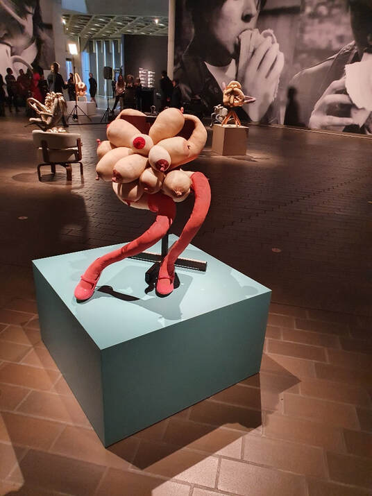 Sarah Lucas, Sugar, installation view NGA photo S.Grishin Witty. irreverent, provocative and, to some, confronting and deeply offensive, the art of Sarah Lucas is presented with a baroque exuberance at the NGA in gallery 1 in conjunction with the 'Know my name' exhibition. For 30 years Lucas has been the 'femme terrible' in the British art scene. Between 1984 and 1987 she studied at Goldsmith College where she met many fellow artists, including Damien Hirst, Angus Fairhurst, Gillian Wearing and Gary Hume, who formed the YBAs group, Inspired by the writing of the radical feminist Andrea Dworkin and her arguments on patriarchy and her analysis of pornography, Lucas in her art began to question, with wit and assertiveness, assumed structures in society and the art world. 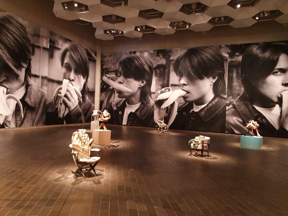 Sarah Lucas, NGA installation view, photo S.Grishin Spurred on by the organisational genius of Damien Hirst, YBAs brought a sense of excitement to the British art scene in the late 1980s and early 1990s. Lucas also for about six months ran a temporary shop with Tracey Emin, where they sold decorated keyrings, wire penises, hand-painted T-shirts and decorated funky ashtrays. Apparently the friendship was short-lived as was the shop. Lucas, drawing on tabloid newspapers, magazines, street culture and observed structures within the arts community, created a body of work that drew attention to sexist and misogynist assumptions that were held as social norms that she would expose and ridicule with humour. Lucas's sprawling collage/sculpture, Penis nailed to a board (1991), the title drawn from a tabloid report of boys behaving badly, also provided the title for her first solo exhibition that launched her career and gave her notoriety and a standing as a serious artist in the art world. She is an artist for whom humour and bricolage are important elements in her art and she developed a practice that goes across sculpture, photography and installation. Frequently in her sculptural creations she combines domestic materials, including old furniture, stockings, underwear, cigarettes, cinder blocks and food, such as raw chickens, vegetables and kebabs. The food items often do double service in portraying erotic body parts, especially genitalia. 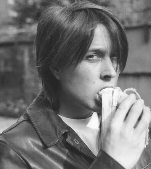 Sarah Lucas, Eating a Banana, 1990, image courtesy Sadie Coles HQ, London © the artist Recognition came early with Lucas's inclusion in the notorious Sensation exhibition at the Royal Academy in 1997, a retrospective exhibition of her art followed at the prestigious Whitechapel Gallery in East London in 2013, and in 2015 she represented Great Britain at the Venice Biennale. Today she is widely regarded as one of the more important feminist artists of her generation working in Britain. The exhibition at the NGA brings together a series of early self-portrait photographs plus some of her more recent sculptures. It is an impressive, theatrically presented exhibition, quite different from the slightly 'grunge' look of some of her earlier shows that I have encountered in Europe. The self-portrait photographs are of the artist eating a banana made in 1990 that she apparently rediscovered in about 2017 and released for sale as individual prints under the title Eating a banana (revisited) in an edition of 25 measuring 91.4 x 121.9 cm. In the Canberra exhibition, the photographs have been blown up to about seven metres and are displayed as continuous wallpaper in a gallery with exceptionally high ceilings creating a dramatic setting that invariably dwarfs the scale of the sculptures that were conceived as life-size into miniatures. This is similar to the strategy adopted for her Red Brick Art Museum show in Beijing in 2019-20, again with the same giant photographs and the same sculptures. Where the exhibitions in Beijing and Canberra differ, the banana room in Beijing was a small part of of the survey exhibition of Lucas's work, in Canberra, it is the exhibition.  Sarah Lucas, DICK 'EAD, 2018, image courtesy Sadie Coles HQ, London © the artist photograph: Steve Russell Studios The huge back and white photographic images of the 28-year-old Lucas dressed in leathers and with unisex cropped hair seductively consuming a banana (with all of its sexual connotations) converts the gallery space into a contested arena where the erotic sculptures strut their stuff under the artist's gaze. The photographs appear to cater to the male desire through the sexual euphemisms, however, the scale dwarfs the potential for this to be read as a submissive image. Big sister is watching. The 'Bunnies' sculptures, with all of their connotations of Playboy bunnies, Lucas first made in 1997 as eight mannequins out of variously coloured nylon tights that had been stuffed with wool and sat atop and around a snooker table in the installation Bunny Gets Snookered. The stuffed nylon pantyhose became splayed limbs of women's bodies - intimate, glamorous and erotic, while at the same time disposable and abject. Drawing on conventions of Dada and Surrealism - Hans Bellmer's uncanny fetishistic dolls, the soft sculptures of Dorothea Tanning and Louise Bourgeois's fabric sculptures - Lucas's tubular elongated female limbs adopt erotic poses. 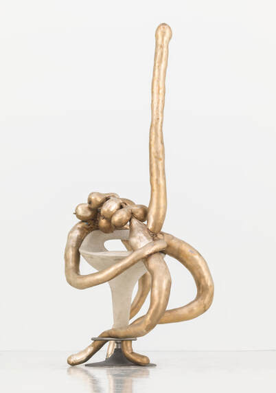 Sarah Lucas, ELF WARRIOR, 2018, image courtesy Sadie Coles HQ, London © the artist photograph: Steve Russell Studios The bunnies moved onto chairs of various descriptions and adopted stiletto heels, coloured socks, fashionista shoes and other fashion accessories and as the series developed they moved out of the snooker hall up to the fashion catwalk and business executive lounges. Lucas adopts existing gender stereotypes that are illustrated by the bunnies, subjects of masculine conquests, but non-responsive slumped, sagging forms and literally empty heads seem to turn these traditional objects of desire back on themselves and they appear as hollow and ridiculous. Lucas, as in much of her art, sets up a mirror for sexism, rather than presenting a critique or an agenda for change. As she pointed out in an interview, "I'm not trying to solve the problem. I'm exploring the moral dilemma by incorporating it." In this exhibition, apart from the soft sculpture bunnies, there is a new breed of figures cast in bronze (based on the stuffed nylon forms) where on a heightened level the line between the humorous and the abject is blurred. Some of these new bunnies, still shown in laid back seductive poses, are no longer simply female and in pieces including Elf Warrior (2018) and Dick'Ead (2018) they have thrusting, vertically positioned huge male members. In the book, Sarah Lucas: after 2005, before 2012, she listed her attraction for making penises, "appropriation, because I don't have one; voodoo; economics; totemism; they're a convenient size for the lap; fetishism; compact power; Dad; why make the whole bloke?; gents, gnomey; because you don't see them on display much; for religious reasons having to do with the spark." 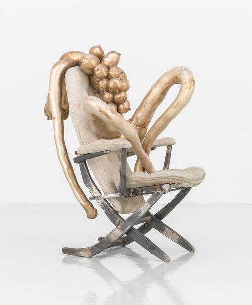 Sarah Lucas, TITTIPUSSIDAD, 2018, image courtesy Sadie Coles HQ, London © the artist photograph: Steve Russell Studios In another bronze sculpture, where gender is strangely morphed into ambiguous forms, Tittipussidad (2018), that has been recently acquired by the NGA, the struggle between attraction and rejection is palpable, where forms simultaneously seduce and repulse, but you are left with an image that will continue to haunt your imagination for a long time to come. Lucas, in recent interviews, appears a little depressed on where feminism and the world is presently heading. She observed, "things seem on a very conservative trend now, fascistic even. I was watching Nancy Pelosi speaking after the storming of the Capitol by right-wing fanatics. She was making a very serious speech about the threat to democracy, looking very pale and shaken, and I noticed that she was on very precarious stiletto heels beneath her trouser suit. This seems to be a necessary get up for women to be taken seriously in public life. They're allowed to talk tough and wear power suits but are inevitably tottering around on implausible heels. What does this tell us? Is it an ugly and hateful thing for women to look anything other than 'feminine'"? Perhaps Lucas's sculptures have lost none of their relevance and are more crucial today than ever before and are needed to expose and reverse this fascistic trend in our society. 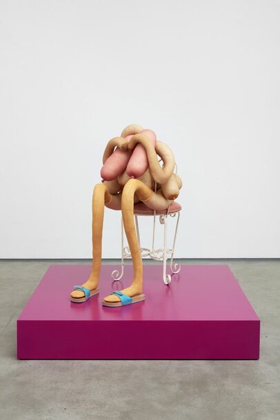 Sarah Lucas, ALICE COOPER, 2020, image courtesy Sadie Coles HQ, London © the artist photograph: Robert Glowacki *An earlier version of this essay was published in The Canberra Times Project 1: Sarah Lucas, National Gallery of Australia Canberra. 7 August - 18 April 2022 Goya: Drawings from the Prado Museum  Installation view, Photo: S Grishin Any history of modern printmaking starts with the work of an outsider, a Spaniard, Francisco Goya (1746-1828). By outsider, I mean that in the late 18th century, printmaking was not a major art form in Spain – there was no tradition of printmaking – unlike Dürer in Germany, Rembrandt in Holland, Callot and Fragonard in France or Marcantonio Raimondi, the Carracci and Piranesi in Italy, printmaking in Spain was almost exclusively a minor art form that reproduced paintings. Goya was not only a great technical innovator, as all major printmakers are, but he also advanced a new concept for printmaking, one that in many art historical constructs is seen as the beginnings of the modern print. Goya’s thinking as a printmaker is revealed through his incredible drawings that are held in the Prado and until now a pilgrimage to Madrid was necessary to be inducted into the alchemy of his creative process. This brilliant exhibition unites 44 drawings from the Prado with over 120 etchings and aquatints drawn primarily from the collection of the NGV and supplemented with a number of works from AGSA. 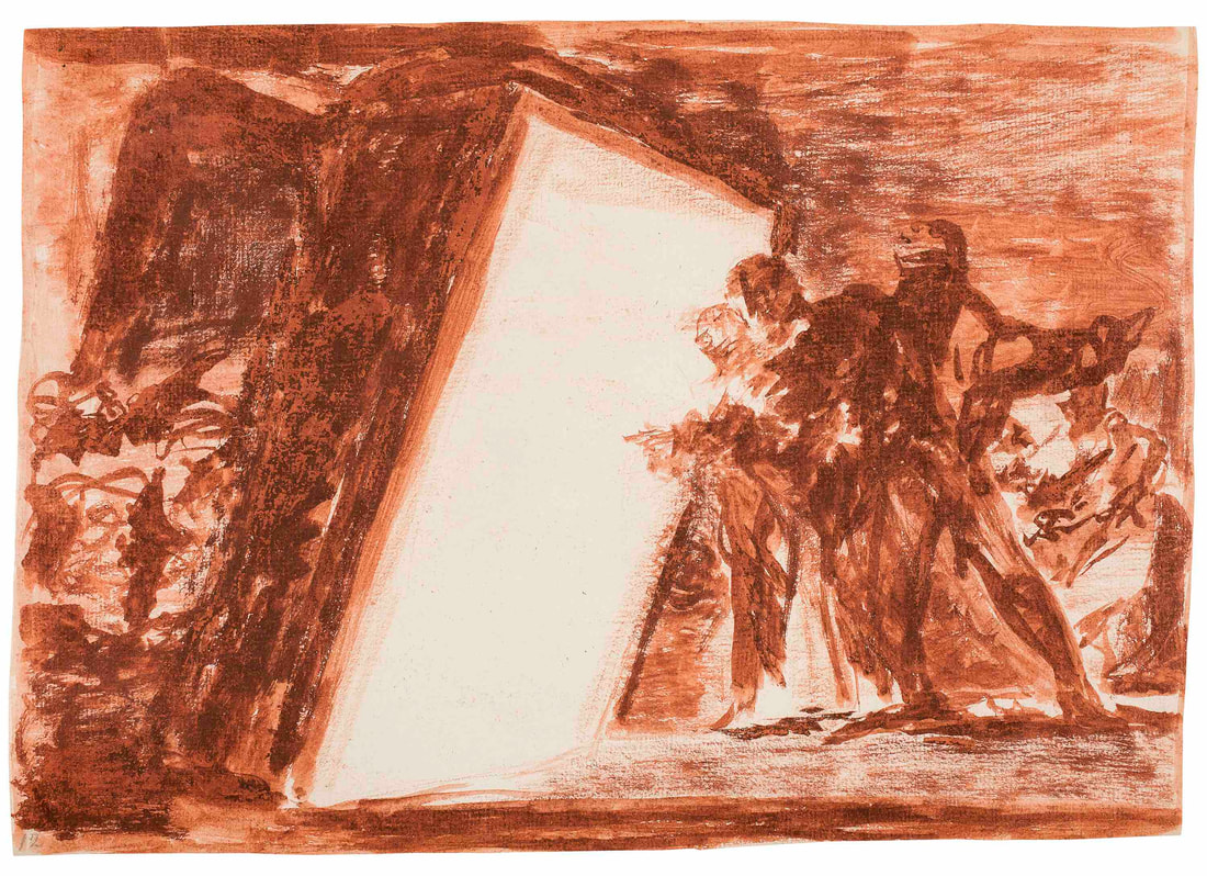 Francisco Goya, Two people looking into a luminous room, c. 1815–19, brush and red wash over red chalk, Museo Nacional del Prado, Madrid, Photo © Photographic Archive. Museo Nacional del Prado, Madrid Goya’s working method was to start with a sanguine wash drawing, this was then translated into a red chalk drawing where the composition was further resolved and this was simply transferred as a reversed impression onto the copperplate with its soft ground and run through the press. Then Goya fully engaged with the etching and aquatint processes to produce a powerful image. With printing, the composition is once more flopped over to make it the same way round as in the original drawing, but the simplicity of grounds, the subtlety of line, and the dramatic highlights made this into an image which can only be uniquely realised as an etching. Throughout the exhibition the preliminary drawings are united with the finished etchings. When Goya published in Madrid, the 80 etchings with aquatint, which comprised his Los Caprichos, in February 1799, this marked, what could be seen in retrospect, the beginnings of modern printmaking. The name Los Caprichos, which can be translated as The Caprices or satirical images, is a metaphorical smokescreen behind which are concealed images of grotesque realism made by a man steeped in Enlightenment learning examining with passion and cold introspection the surrounding world. 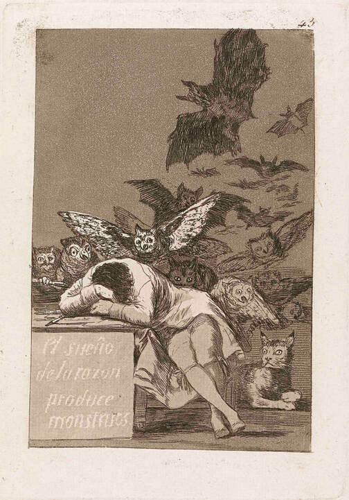 Francisco Goya, The sleep of reason produces monsters, plate 43 from Los Caprichos 1797-98, published 1799, etching and aquatint printed in sepia ink, 18.3 x 12.2 cm (image) 21.5 x 15.1 cm (plate) 24.2 x 16.7 cm (sheet), Felton Bequest, 1976, National Gallery of Victoria The intended opening plate for Goya’s Los Caprichos was The dream of reason produces monsters, an etching and aquatint, measuring 22 x 15 cm [smaller than A-4], which is approximately the impression size of most of the plates. The inscription, which is found on the preparatory drawing is: “The author dreaming. His only intention is to banish harmful common beliefs and to perpetuate with this work of caprichos the sound testimony of truth.” Goya depicts himself at his desk with the creatures of darkness swarming behind him. The owl on the desk has grasped his pencil and is urging him to work, while the demonic cat looks on from the floor. As everything in Los Caprichos, this too is a metaphor alluding to a deeper meaning, the monsters which he depicts are those of the Spanish church, the Inquisition and high society. It is this combination of dream, fantasy and social criticism and the rejection of flight from reality and the engagement and commitment with harsh realism that gives the series its unique bite. Possibly as a compromise, Goya deleted this frontispiece, shifting it to plate 43 and replaced it with the famous self-portrait Francisco Goya y Lucientes, Painter, executed as an etching, aquatint, drypoint and burin. Apparently it was an insufficient compromise and Los Caprichos was withdrawn from sale after only two days and, four years later, in 1803 Goya presented all of the copper plates and the unsold 240 sets to the king, Charles IV. It appears that the artist had been reported to the Inquisition and feared for his safety. 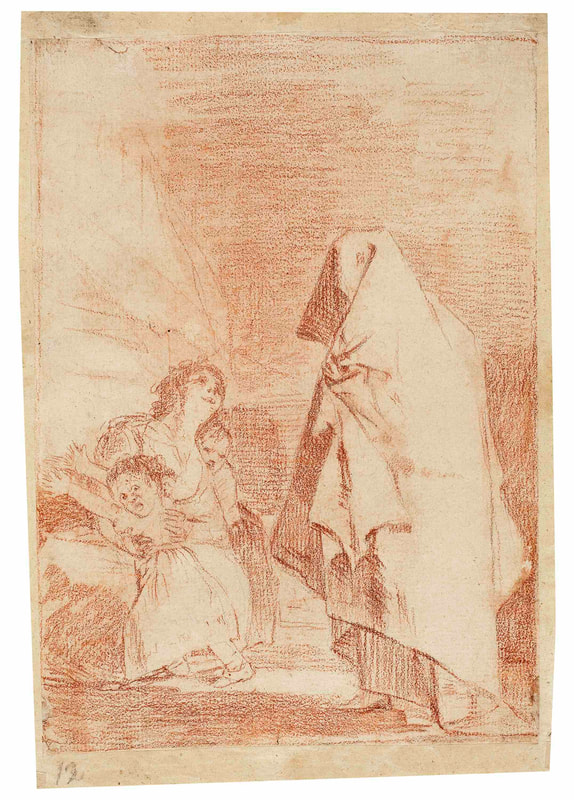 Francisco Goya, Here comes the bogeyman, c. 1797, preparatory drawing for Los Caprichos, plate 3, red chalk over traces of black chalk, Museo Nacional del Prado, Madrid, Photo © Photographic Archive. Museo Nacional del Prado, Madrid Education, or lack of it, is a central theme of Los Caprichos. The Enlightenment, or the rule of light, is contrasted with poor education, superstition and ignorance, or the rule of darkness. About half way through the series, before the witches and goblins appear, there is a sequence where the professional and upper classes in society are characterised as asses. An asinine teacher who holds a ferule in his left forehoof instructs the young ass by rote the letter ‘A’. The satirical inscription reads: “What if the pupil knows more?” In another etching, a seated aristocratic ass proudly holds open a book of genealogy demonstrating as the caption declares that his family consisted of asses “As far back as his grandfather”. In other etchings Goya shows peasants with their eyes closed carrying on their shoulders aristocratic asses, a comment on the poor stupidly carrying on their shoulders the idle rich. 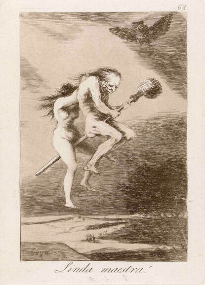 Francisco Goya, Pretty teacher! plate 68 from Los Caprichos 1797-98, published 1799 etching, burnished aquatint and drypoint printed in sepia ink, 18.5 x 12.3 cm (image) 21.1 x 15.0 cm (plate) 24.2 x 16.9 cm (sheet) Felton Bequest, 1976, National Gallery of Victoria Los Caprichos scholarship frequently dwells on Goya’s circumstances for the creation of the series. How he had been out of Madrid for a long while living in Andalusia, how he had suffered an illness which left him permanently deaf, his love affair with the sex goddess of the day, the Duchess of Alba, and her subsequent unfaithfulness to him (she did not return to her husband, nor did she stay with Goya) and the general political and religious oppression in Spain. It may also be the case that Goya, who was 53 when Los Caprichos was published in 1799, was easily the most prominent artist of his day in Spain, one who spent much of his time painting portraits of the aristocracy whom he despised. The allegorical images of the asses are supplemented with images of grisly realism. The origins of many of the plates in Los Caprichos are to be found in the drawings in the so-called ‘Madrid Album’ which Goya commenced in Andalusia while staying with the Duchess of Alba in 1796 and completed the following year on his return to the capital. There is a danger of being over literal in interpretation and reading Goya’s art as an exercise in autobiography, or even worse as a misogynist vendetta. His images of ‘majas’, basically courtesans or women of the night, have long been identified with the Duchess of Alba and this may in fact be founded in reality, but their function in his art goes considerably beyond the specific individual. 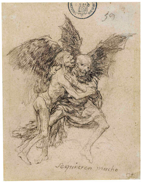 Francisco Goya, They love each other very much, 1824–28, Album G (Bordeaux Album I), 59, black crayon, Museo Nacional del Prado, Madrid, Photo © Photographic Archive. Museo Nacional del Prado, Madrid I think it is important that the women of modern Spain whom Goya depicts are shown as victims of their upbringing and at least as guilty of depravation as the men with whom they consort. The plate in Los Caprichos is called Two of a kind, sometimes translated as Two birds of a feather, it may have a specific identity in the Madrid Album drawing, but, in the etching, it becomes a universal statement. What is not always immediately apparent to a person who casually glances through Los Caprichos is the manner in which one plate visually, spiritually and intellectually, relates to another. Love and death is plate no 10, Out hunting for teeth is plate no 12; compositionally one echoes the other, the tonality has been reversed and the woman/man relationship of the live woman and the dead man is similar, yet in substance different. The episode with teeth relates to a Spanish superstition that if a woman pulls out a tooth from a dead man she would soon find herself a husband. Goya’s comment is that it is that sort of superstition and stupidity which leads to one person fighting a duel with another.  Francisco Goya, All this and more, 1810, preparatory drawing for Disasters of War, plate 22 red chalk over black chalk, Museo Nacional del Prado, Madrid, Photo © Photographic Archive. Museo Nacional del Prado, Madrid Everything to do with the series of etchings popularly known as The Disasters of War is considerably more complicated than it first appears. As three of the plates are dated 1810, this has been taken by many as the commencement date for the series, and as other subjects may refer to events following the defeat of the French, the completion date for this series has been extended to about 1820. Goya was apparently in fear of the Inquisition and was looking for a safe time to publish his edition, but such a time never arrived. These prints were never published in his lifetime. It appears that at some time between the restoration of 1814 and 1820, and before Goya fled Spain to go into exile in 1824, he printed two sets of proofs which he circulated amongst friends. These had the title Fatal consequences of Spain’s bloody war with Bonaparte and other striking caprichos. In these proof sets there were 83 plates accompanied by hand written captions. In 1863, long after Goya’s death, the copper plates were recovered and a major edition printed employing rich inky tones which were fashionable in the mid-19th century. Three of the plates were omitted and several of the captions were altered to modify their message.  Francisco Goya, They carried her off! c. 1797, preparatory drawing for Los Caprichos, plate 8 red ink wash over traces of black chalk, Museo Nacional del Prado, Madrid, Photo © Photographic Archive. Museo Nacional del Prado, Madrid It is difficult to speak of Goya’s Disasters of war without largely describing the narrative of the scenes. They are amazingly graphic images, like Why? and Great heroism against the dead, both generally dated between 1812 and 1815. They have also become some of the most famous icons of anti-war art ever made. If we look at these works as prints, they violate all of the conventions of the preceding tradition of European etching. Murky pools of aquatint appear like pools of blood, the focus is personalised, immediate and confronting. Not only the limbs, but compositional structures are truncated and violated. So many of the artistic strategies advanced by Goya are not only pictorially confronting, but also pre-empt the devices of Expressionism and Surrealism of a century later. It is a curious question, but perhaps one worth asking, who was the audience which Goya wanted to address through his Disasters of war. On one hand, apart from circulating a couple of proof sets amongst his intellectual and liberal friends, there was no audience for these images for the first half century of their existence. Was it a personal act of a cathartic nature? Modern etching has often played the role of the confessional image. Goya does here comment on many of his pet obsessions with violence, superstition, rape and hypocrisy in the Roman Catholic church. On a number of the etchings he notes “This is what I saw” and “I was here”. One of these plates is simply captioned “They don’t want to” and the imagery is self-explanatory. 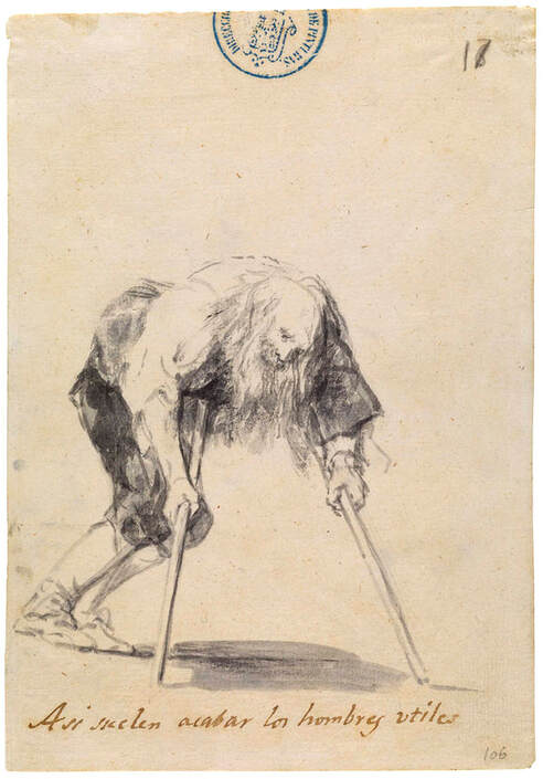 Francisco Goya, This is how useful men usually end up, 1814-23, brush and carbon ink wash, 20.6 x 14.2 cm (sheet) Museo Nacional del Prado Another image is quite loaded. A skeleton rises from its grave to inscribe a single word “Nada” meaning ‘nothing’. Goya’s caption to the work is unambiguous, he writes “Nothing, that’s what it says”. When the Royal Academy of San Fernando came to publish these etchings in 1863, even then, the inscription seemed too much an affront to the Roman Catholic church and it was altered to read “The events will tell”, rather than the bleak apocalyptic pronouncement which could be given an atheistic reading. This is an incredibly powerful exhibition that demands several visits. 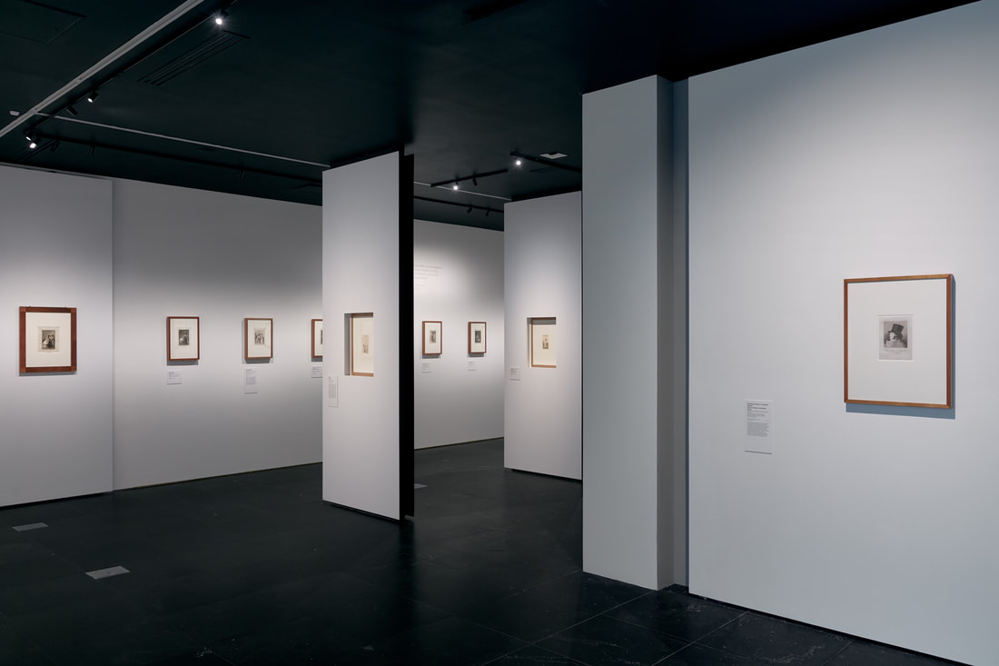 Installation view of Goya: Drawings from the Prado Museum on display, NGV International, Melbourne, Photo: Tom Ross Goya: Drawings from the Prado Museum
NGV International, 25 June- 3 October 2021 Sydney Printmakers turn 60 and the crisis facing Australian printmakers  Roslyn Kean, Defining the Edge, 2021, wrapped multiblock woodcuts, diptych, U/S, 58 x 163cm (framed), courtesy of the artist In our art schools today, printmaking is under attack. Throughout much of Australia, printmaking facilities in art schools have been cut, staff retrenched and, in some instances, students have been discouraged from enrolling in printmaking majors. In contrast, some of the best contemporary Australian art has found expression through printmaking and, it is predominantly made by women artist printmakers. It is a sad irony in Australian art history that art forms dominated by women artists are the ones most under attack from conservative political establishments.  Anthea Boesenberg, To the Edges: Two Plates, Three Colours, Four Layers of Ink, 2020, relief collagraph installation, 280 x 300cm (15 sheets, each 90 x 60cm), courtesy of the artist Sixty years ago, Sydney Printmakers held their inaugural exhibition. They arose, in part, because of the paucity of institutional printmaking facilities in Sydney. Today, they are even more critically relevant to the artistic life of this city than they were six decades ago. The calibre of work in this exhibition can be summed up in one word – it’s brilliant.  Laura Stark, Millstream Burning Series: Wall piece, collagraph, edition of 3, 30 x 90cm, courtesy of the artist There are 47 artists in this exhibition, 34 of whom are women, and not a single dud amongst them (that includes the men). The quality control, if that is the correct term for steering the group, by Susan Baron, Helen Mueller and Angela Hayson, has been remarkable (not to mention the exceptional integrity of all of the artists involved) and Katharine Roberts’ curatorial contribution has been outstanding.  Susan Baran, Ubud Bali, 2020, photopolymer intaglio hand coloured, edition of 6, 57 x 123cm, courtesy of the artist One of the inspirational aspects of this show, and of Sydney Printmakers in general, is that it spans the generations from the wonderful Barbara Davidson, who studied at the National Art School (then the East Sydney Tech) in the 1940s through to Angus Fisher, a printmaker of exceptional ability, who studied at the same institution sixty years later.  Angus Fisher, Fish Trap, 2020, etching, edition of 10, 76 x 56cm, courtesy of Australian Galleries What is this exhibition, ‘To the edges’ about? Each viewer will take something different from it and every single opinion is valid and needs to be respected. For me, the show technically is about the art of printmaking – about pushing the art form to the edges. I do find it incredibly exciting – the delicate yet vibrant Balinese hand-coloured solar plate prints of Susan Baron, the pulsating relief colographs of Anthea Boesenberg, Danielle Creenaune’s amazing and complex lithographs, Angela Hayson’s graceful yet expressive alchemy of techniques on a monumental scale and the miraculous multi-block woodcuts by Roslyn Kean. The exhibition is studded with exceptional technical feats that to the eye of the viewer appear almost effortlessly breathed onto sheets of paper.  Gary Shinfield, Dam 3: a surface of water, 2020, mixed media work on six sheets of handmade Korean paper using print processes with staining and painting, unique state, 188 x 192cm, courtesy of the artist Thematically, at least for me, this exhibition is about a planet pressed ‘to the edges’ – to the edges of destruction through climate change and the threats facing our different environments. Glance at the layered organic and sensuous mangrove filters of Helen Mueller, the delicate cloud dreamscapes of Susan Rushforth, the watery miracles of Gary Shinfield, the burning visions of Laura Stark, the metaphors for our changing sources of energy in the striking work of Anna Russell, or the political vegetation of Michael Kempson. Many of the artists manage to combine lyricism, a note of eschatological gloom, plus a spot of irony or simple humour.  Michael Kempson, Limited Potential, 2019, etching and aquatint, edition of 25, 50 x 70.5cm, courtesy of the artist As you walked around this exhibition you will be constantly surprised, challenged and delighted. This is an exhibition of a very high order by a very talented cross-section of artists based in Sydney and the surrounding regions. An enormous achievement of Sydney Printmakers has been their ability to constantly reinvent themselves and to remain relevant with what is happening in art at the present moment. It is a huge achievement to present an exhibition of such calibre on the sixtieth anniversary in the life of an organisation.  Helen Mueller, Sentinel 2, 2019, layered woodcut prints, edition 3/3, 105 x 116.7cm, courtesy of the artist Printmaking is a democratic art form – not necessarily the “friendly little craft” in Margaret Preston’s memorable turn of phrase – but an art form that frequently gives birth to multiple originals that are financially accessible to more people who love art than the more expensive easel paintings or sculptures.  Susan Rushforth, Passing Clouds IV (Sunrise), 2019, woodblock print using water-based pigments on handmade Japanese Kozo paper, 35 x 70cm (paper size), courtesy of the artist This exhibition keeps this tradition of ‘art for the people’ alive and the Manly Art Gallery and Museum and the wonderful Sydney Printmakers need to be congratulated for this memorable show.  Seong Cho, Windy Hill, 2020, woodblock print, 101 x 238cm (paper size), 71 x 200cm (image size), courtesy of the artist To The Edges: 60 Years of Sydney Printmakers,
Manly Art Gallery & Museum, West Esplanade Reserve Manly NSW 2095 Friday, 25 June 2021 - 10:00am to Sunday, 1 August 2021 - 5:00pm Ivan Durrant 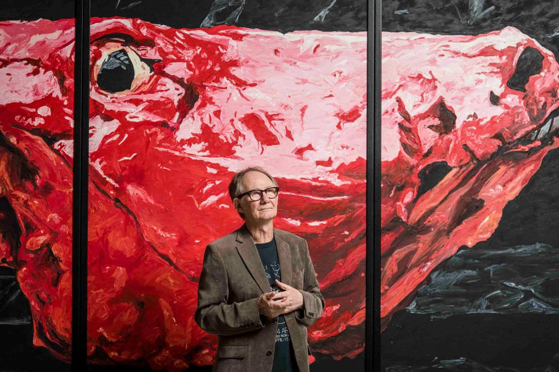 Portrait of Ivan Durrant, artist inside Ivan Durrant: Barrier Draw at The Ian Potter Centre: NGV, Photo: Eugene Hyland Ivan Durrant (born 1947) gained notoriety in the mid-1970s when he dumped the carcass of a slaughtered cow in the forecourt of the National Gallery of Victoria in 1975. A few months later, he exhibited a severed ‘human’ hand at the Hogarth Gallery in Sydney and in 1976 filmed his notorious ‘pigeon dinner’, titled ‘Chopping block’, where the guests were invited to each kill a pigeon that was subsequently cooked for them to eat. Not all of the guests managed to survive the ordeal until the end with some dislodging the contents of their stomachs. 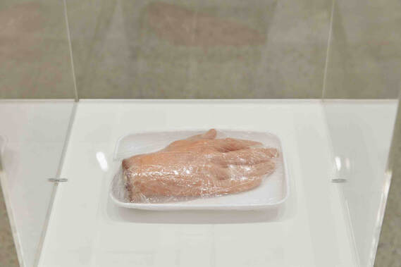 Installation view of Ivan Durrant: Barrier Draw at The Ian Potter Centre: NGV Australia, Photo: Tom Ross At a time when performance art and happenings were part of the popular art parlance, his actions were construed as publicity stunts, clever use of an ignorant and gullible press as a participant in the art game, or as taking a moral and ethical stance at an implied hypocrisy in Australian society. People were happy to consume meat, but they were outraged when told that their food was the product of killing or, in Durrant’s words, involved ‘life taking’ of animals. If animals are regarded as sentient beings, do we have the right to kill and eat them? If we do, this should be acknowledged. 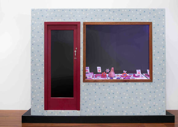 Ivan Durrant, Butcher shop, 1977-78, synthetic polymer and enamel paint on composition board and wood, ceramic tiles, transparent synthetic polymer resin, mirror, steel, fluorescent light, plastic, polyvinyl chloride, metal, string (241.0 x 303.0 x 128.7 cm) (overall) National Gallery of Victoria, Melbourne, Gift of Mr and Mrs Burdett A. Laycock, 1978 (A15.a-l-1978), © Ivan Durrant Robert Lindsay staged a major survey exhibition of his work at the NGV in 1979 that left a big impact on me and subsequently I have only caught snippets of his art, generally in regional venues. This big retrospective exhibition at the NGV is timely and a revelation. It stretches chronologically from his earliest folk naïf pieces from the late 1960s, through his hyperrealist paintings and sculptures, it includes the amazing farm shed interiors from the 1990s, through to his most recent sculptures with their exaggerated realism. 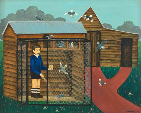 Ivan Durrant, Feeding 1970, synthetic polymer paint on composition board, 61.3 x 76.5 cm, Collection of the artist, © Ivan Durrant For all of his public pronouncements, Durrant is an artist who hides behind the façade of his creations. If his art is autobiographic, and I feel that it is, as a good ventriloquist Durrant lets his cows and horses do the speaking for him. He is quoted as saying, “Of all the animals in the world, cows are my first love, especially dairy cows. In my experience they’re quiet, softly mannered and respond lovingly to the human voice. It’s so difficult for me not to feel a sense of betrayal walking through a cattle market, seeing Friesian and Jersey cows huddled together in concrete yards, being sold for slaughter. As some sort of apology I’m giving them a pat with paint.” 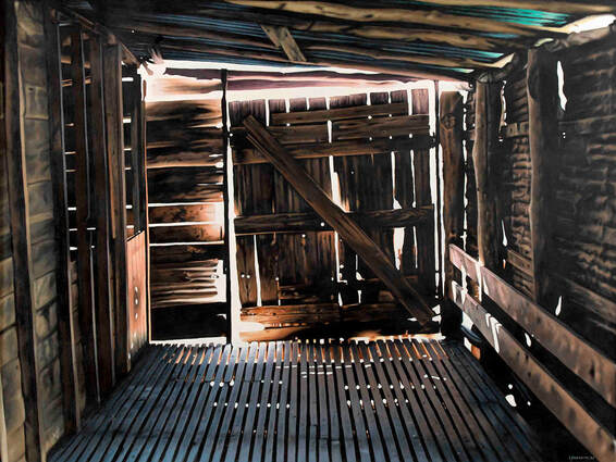 Ivan Durrant, Dicker Rd.: sheep floor, 1997, synthetic polymer paint on composition board, 92.0 x 122.0 cm, Collection of the artist, © Ivan Durrant Durrant is not a sentimental city bloke, one who visits the countryside on occasional weekends, but he has lived much of his life on rural properties in Gippsland and Benalla and his cows, horses, pigs and sheep all have individual personalities. This also applies to the horse racing circuit and the footy field. The show has the whiff of the countryside with the mysterious sheds and the stench of the abattoirs. I was surprised how emotionally affected I felt walking through the exhibition. I think that it was Bill Robinson who appropriated to Australian art Bonnard’s famous dictum of painting with a ‘backyard mentality’. For me, it seems that Durrant paints, sculpts and photographs that which he knows intimately well from his own backyard – something he loves, something with which he has great empathy, something that he has observed closely and something that he understands from the inside. 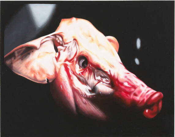 Ivan Durrant, Quality meats: pig’s head, 1977, synthetic polymer paint on composition board, 42.0 x 51.0 cm, Collection of the artist, © Ivan Durrant From this exhibition, Durrant emerges as an artist who frequently takes an ethical stance in his work and sets out to engage with society emotionally as well as intellectually. These are not pretty formalist exercises, but hard-hitting, conscience stirring works that at times have a haunting intensity. The concern with animals extends into a concern with people and with all living creatures and becomes an expression of an opposition to war and to all forms of coercion. In this, he has an almost Buddhist worldview where all forms of life are worthy of respect and he, at times, approaches life with a naïve innocence. 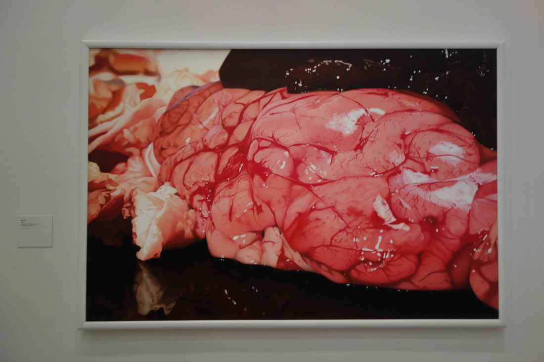 Ivan Durrant, Brain, 1981, synthetic polymer paint on composition board, 132.0 x 198.5 cm, Collection of artist, © Ivan Durrant, Photo: S.Grishin Durrant is a process artist – his techniques are frequently painstaking as he sets out to intensify his attempts at heightened realism. The six months that he spent in New York in 1976 had brought him into the circle of the Photorealist artists, including Janet Fish, Richard Estes, Jud Nelson and Chuck Close, and gave him ‘permission’ to follow in their path. Frequently, he adopted prevailing international trends and then adapted them to his own needs and endowed them with a peculiar antipodean accent. By the late 1970s, it was impossible to confuse a Durrant painting or sculpture with the work of any other international trendsetter. 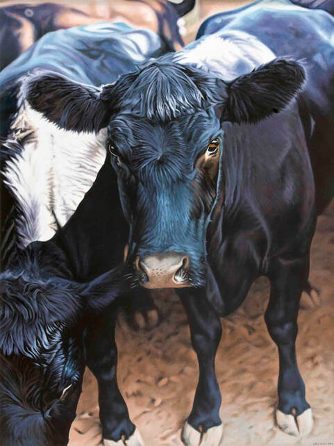 Ivan Durrant, Angus Cow, 2001, synthetic polymer paint on composition board, 120.0 x 91.5 cm, Collection of artist, © Ivan Durrant There is persistence in his art, a consistency of vision that lasts a long time after the adopted language had lost its biennale popularity. In the context of the exhibition, some of the repeated shock strategies with the severed limbs or the blurry brightly polychrome images of sportsmen start to lose their ability to shock through overuse. 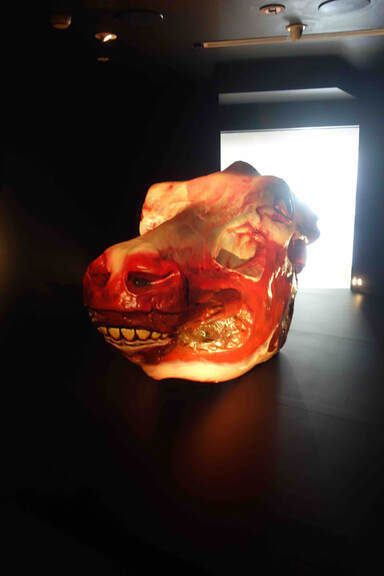 Installation view of Ivan Durrant’s The Slaughtered Cow 2020, Collection of artist, © Ivan Durrant, Photo: S. Grishin Durrant’s Barrier Draw is an exhibition that is best viewed on an empty stomach. It is large enough to be powerful and disturbing, yet not so big as to become too repetitive and predictable. It is a show that once seen, will not be quickly forgotten. 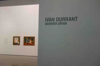 Ivan Durrant: Barrier Draw, National Gallery of Victoria, Australia, Federation Square 23 November 2020 – 25 April 2021 Triennial 2020 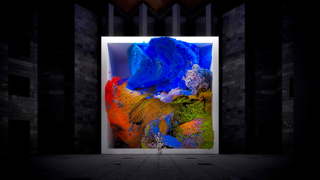 Refik Anadol, Quantum memories, 2020 (render), custom software, quantum computing, generative, algorithm with artificial intelligence (AI), real time, digital animation on LED screen c4 channel sound, 1015.0 x 1020.0 x 250.0 cm, Commissioned by the National Gallery of Victoria, © Refik Anadol, image courtesy of Refik Anadol If the 2017 Triennial at the National Gallery of Victoria broke attendance records with over 1.2 million visitors, it was short of a miracle that the 2020 Triennial took place at all. To bring together over 100 artists, designers and collectives from over 30 countries, featuring 86 projects, in the era of COVID was always going to be a tall ask. It has happened, it has a huge ‘wow’ factor with a mixture of popular household names as well as completely unexpected quirky discoveries. 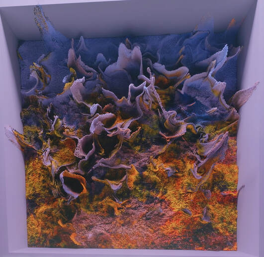 Refik Anadol, Quantum memories, 2020 (render), The Triennial 2020 is built around four broad themes with porous borders: Illumination, Reflection, Conservation and Speculation. Even after wading through the voluminous catalogue – that is more like a piece of bulky furniture than a read-in-bed book – the thematic categories are more like general conceptual props than clear categories. The concern is with the ability for art to challenge assumptions about the status quo, alert us to impending disasters, suggest alternatives, dazzle us with unexpected inventions and inspire us with wondrous creations of undreamt of beauty. The one work that had the greatest impact on me was by the young Turkish artist Refik Anadol, who now is based in Los Angeles. Titled ‘Quantum memories’, 2020, it is presented on a huge ten metre by ten metre LED display screen as you enter the NGV building in St Kilda Road. Commissioned by the NGV, it is a collaborative work between the artist and Google. Employing a dataset drawn from over two hundred million images linked to nature, Anadol uses a Google quantum computer (described as a thousand times more powerful than a conventional supercomputer) combined with machine learning algorithms enabled by AI. 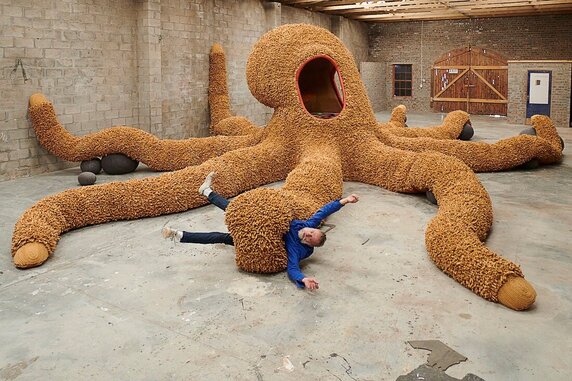 Porky Hefer (designer), Southern Guild, Cape Town (fabricator), Buttpus designed 2019, manufactured 2020, felted karakul wool, industrial felt, canvas, leather, sheepskin, salvaged hand-tufted wool carpet, recycled PEP stuffing, foam, steel 1512.0 x 1512.0 x 328.0 cm, National Gallery of Victoria, © Porky Hefer The image processing algorithms ingest millions of photographs and generate new images with related statistical properties. We are exposed to images of fantastic, ever-changing landscapes that never existed – something uncanny, a memory of something that never previously experienced, but somehow convincing and real. Enthralling, completely seductive and endlessly changing it brought to mind the words of the Sufi mystic Rumi, “Don’t grieve. Anything you lose comes round in another form.” Anadol presents us the world ‘in another form’ guided by Artificial Intelligence. The work is not like a video installation presented on a loop, but every moment it is in a state of flux constantly reinventing itself and creating new images. 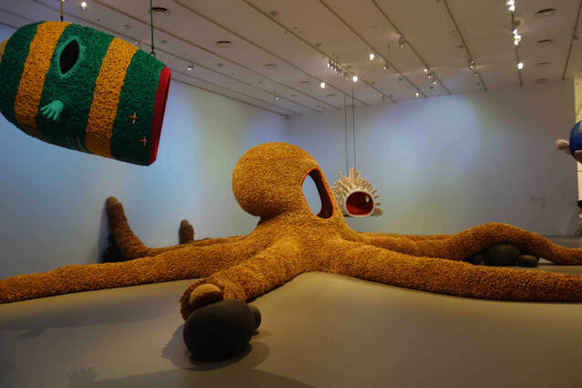 Porky Hefer (designer), Southern Guild, Cape Town (fabricator), Buttpus From the very high tech to the low tech is Porky Hefer’s Plastocene – Marine Mutants, 2020, from a disposable world. Hefer, based in Cape Town, South Africa, creates through his Southern Guild fabricators a series of handmade large-scale environments consisting of imaginary sea creatures from a dystopian future that he terms Plastocene. It includes a huge octopus-like creature made from hand-felted cigarette butts. In Heffer’s worldview, the end of the Anthropocene era will be marked by a new species that will transmutate and absorb the plastic bags, straws, coffee cups and other pollutants. Although humans as we know them will struggle to survive in this polluted environment, these mutants will flourish. 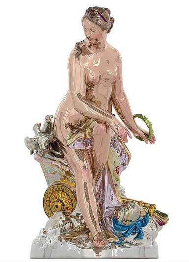 Jeff Koons, Venus, 2016–20 (render), mirror-polished stainless steel with transparent colour coating, 254.0 x 144.5 x 158.4 cm, edition 1/3 + 1 A/P, National Gallery of Victoria, © the artist and Gagosian If Anadol and Heffer are relatively unknown to Australian audiences, Jeff Koons is one of the most-high profile and iconic contemporary American artists. His ‘Venus’, 2016-20, is a two-and-a-half metre high mirrorpolished stainless steel sculpture with colour coating to add to the Baroque exuberance of the piece. The source image is a relatively obscure 1769, 34 centimetre painted porcelain figurine of the same name by Wilhelm Christian Meyer. Koons has taken liberties with his model to heighten the latent eroticism of the forms. As he observed, “Venus represents the combination of understanding the needs of society and of something greater than self, while at the same time the desire for procreation and the continuation of the species. It involves the seductiveness of all the senses – the joys, pleasures and pains of life itself.” This acquisition will certainly become a selfie-magnet for the NGV.  Lee Ufan, Dialogue, 2017, oil on canvas, 227.0 x 181.9cm, National Gallery of Victoria, © Lee Ufan, courtesy Pace Gallery, New York Another very high-profile participant in the NGV Triennial is the Korean artist Lee Ufan who employs the Zen Buddhist practice of painting as a form of meditation that reveals energy and realisation. His ‘Dialogue’, 2017, a major new acquisition for the NGV, is what could be described as a sublime piece that seems to radiate in its space. The artist recently observed, “What is light and what is darkness? I do not like the definition that sees existence in terms of light and nothingness in terms of darkness. There is darkness in all form of light, and light penetrates all kinds of darkness. A concept of light or darkness considered in isolation cannot be valid.”  Dhambit Mununggurr, Bees at Gäṉgän 2019, synthetic polymer paint on Stringybark, 183.0 x 117.0 cm, National Gallery of Victoria, © Dhambit Mununggurr It is a meditative, hypnotic painting that seems to vibrate in space and in contrast to the loud, bombastic and attention grabbing forms that populate the Triennial that occupies all levels of the gallery building. 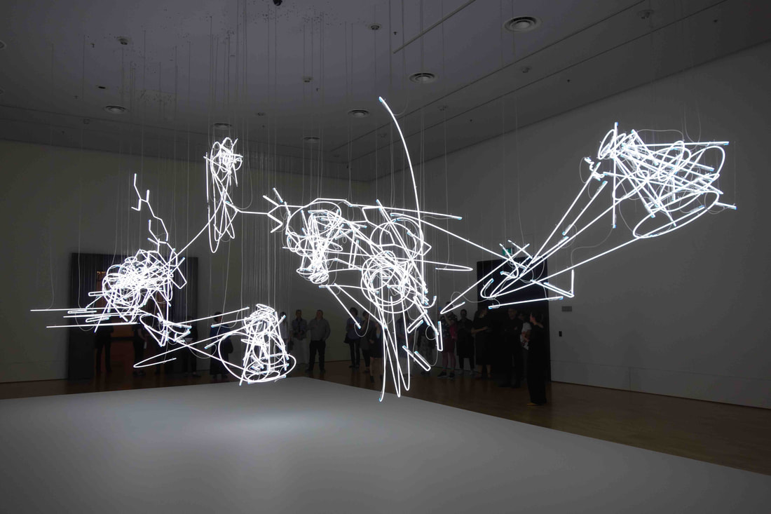 Cerith Wyn Evans, C=O=D=A, 2019–20, installation view at NGV International, photo S Grishin It is always difficult to summarise an exhibition like this Triennial that is conceived as a series of immersive spaces with superb moments such as the blue paintings and sculptures of Dhambit Mununggurr, the dialogue with the NGV collection by the Fallen Fruit or painting with neon light by the Welsh conceptual artist Cerith Wyn Evans. 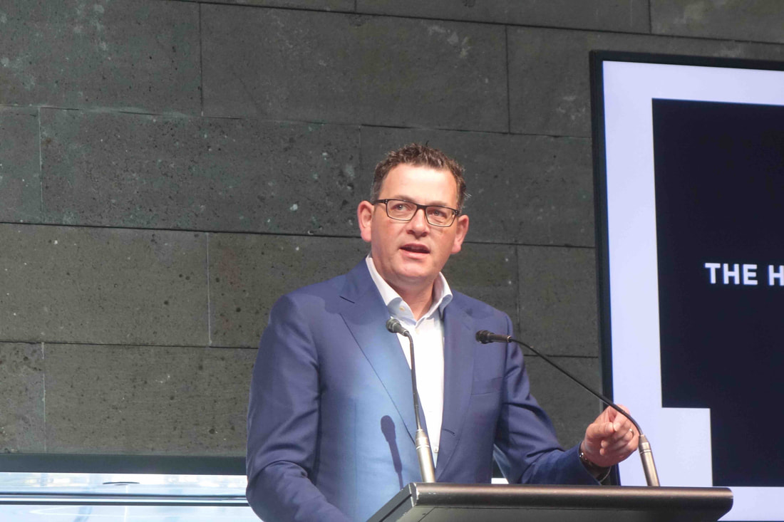 Premier Daniel Andrews launching Triennial 2020, National Gallery of Victoria, 19 December 2020, photo S.Grishin The NGV Triennial is being held at a time when the success of exhibitions can no longer be measured by attendance numbers, but it seems to be hitting the right spot. The Victorian premier, Daniel Andrews is allocating a record $1.46 billion for the building of a new NGV Contemporary and another $20 million is promised by the Ian Potter Foundation. The future looks bright for subsequent NGV triennials.  Triennial 2020, National Gallery of Victoria,
19 December 2020 – 18 April 2021 Australian Women's Art 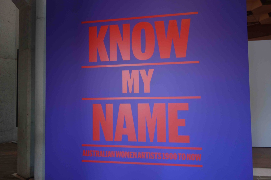 Dr Deborah Hart, Head of Australian Art at the National Gallery of Australia (NGA), tells the amusing story that when she was making a pitch to the gallery management to stage a major exhibition of Australian women's art, she projected a slide with the portraits of numerous women artists. The director asked, does everyone know their names? So was born the idea to stage a major exhibition of Australian women's art simply called 'Know my name'. 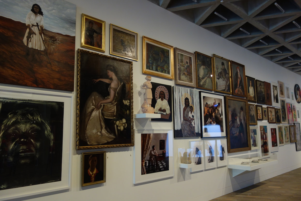 Know my name, exhibition installation view, photo S.Grishin Know my name: Australian Women Artists 1900 to Now is a vast exhibition with over 400 works by more than 170 Australian women artists working from 1900 through to the present. It is being staged in two parts - the first from Friday 13 November 2020 to 4 July 2021 and the second part opens in late July 2021. Having and exhibition based on gender is invariably problematic and historically artists like Margaret Preston and Georgia O'Keeffe were well known for refusing to exhibit in 'she-gender' exhibitions. Critics of gender segregated exhibitions speak of a 'ghetto mentality' and will argue that good art will always rise to the top and does not need any special nurturing conditions. A similar case has been argued concerning Indigenous art - that it should simply be seen as Australian art and will shine through its own brilliance. 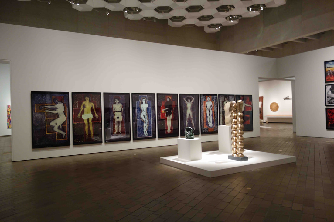 Know my name, exhibition installation view, photo S.Grishin The contrary argument is that the whole structure of the 'art industry' is engendered and discriminates against women artists. Sadly this is difficult to refute as the facts speak for themselves. According to the National Museum of Women in the Arts, 51% of visual artist today are women yet few public art galleries exhibit more than 25% women artists on their walls. At the Tate, for example, in 2017, 27% of living contemporary artists in the Tate collection were women, while at the NGA 25% of its Australian art collection and 33% of its Aboriginal and Torres Strait Islander art collection is by women artists. Please don't bring up Linda Nochlin and why there have been no great women artists article, that was fifty years ago and today it is simply boring. The fact remains that there are entrenched mechanisms in place that hinder the emergence and recognition of women artists in Australia and there is a good case to exercise affirmative action and to stage a major all-women exhibition. 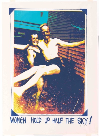 Ann Newmarch, Women hold up half the sky, 1978, National Gallery of Australia, Canberra The proof has to lie in the pudding and how good is Australian women's art and the Know my name show? Firstly, what is the show about? It is not an exhibition of dusted off pieces by obscure women artists drawn from the vaults of the NGA and now presented centre stage. It is a carefully curated exhibition (main curators: Deborah Hart and Elspeth Pitt) that is designed to bring to the fore the best and most interesting of Australia women's art from the past 120 years with numerous loans from museums, art galleries and private collections across the country; specifically acquired pieces by the NGA for this exhibition as well as treasures and lesser known works from the exceptionally rich holdings from the NGA collection. It includes Indigenous and non-Indigenous art, painting, printmaking, sculpture, photography, video, installation work and a generous cross-section of the applied arts. The NGA is billing this exhibition as, "the most comprehensive presentation of art by women assembled in this country to date ... Know My Name is not a complete account; instead, the exhibition proposes alternative histories, challenging stereotypes and highlighting the stories and achievements of women artists."  Yvette Coppersmith, Nude self-portrait, after Rah Fizelle, 2016, private collection Visually, in a word, it is stunning. Located in the NGA's original main galleries with the ridiculously high ceilings and cement walls - the spaces have never looked so good in the time I've known the building since its opening in 1982 - some of the walls have been 'shifted'. rebuilt, reclad and all have been repainted. The height has been used to an advantage rather than as a crushing blow that in Robert Hughes' memorable turn of phrase made Pollock's Blue Poles look like a shimmering postage stamp. Some really huge pieces have been unfurled, like Judy Watson's nearly six-metre-long painting Canyon, 1997. Huge installations dangle from above, including Mira Gojak's Transfer Station I, and exhibits are allowed to crawl up walls whether it be a display of feminist posters, abstract geometrics of Margaret Worth, early anatomical pieces by Marie Hagerty, a new bronze mandala-like sculpture by Linda Lee (2020) or the classic floating brides by Rosemary Laing. 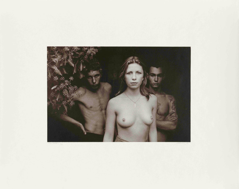 Carol Jerrems, (Vale Street), 1975, National Gallery of Australia, Canberra, © Ken Jerrems and the Estate of Lance Jerrems The exhibition has been built around seven themes with porous borders: Connection with country, Performing gender, Collaboration and care, Colour, light and abstraction, Micky's Room, Lineages and Remembering. Chronology is treated in diachronic terms - something that happens across time with numerous points of reference - rather than a linear construct of time. Part of the strength of the show is that it provides a new perspective to the familiar. Important Aboriginal pieces by Sally Gabori, Queenie McKenzie, Emily Kame Kngwarreye and the Utopia batiks are juxtaposed with major installation works by Fiona Hall, Rosalie Gascoigne and Janet Lawrence.  Fiona Foley, Badtjala people, Badtjala Woman, 1994, National Gallery of Australia, Canberra, © Fiona Foley In another space, the female form is interrogated with monumental well-known performative photographic series by Anne Ferran, Tracey Moffatt and Julie Rrap shown in their entirety. Also in the space are the less iconic female nudes by Janet Cumbrae Stewart, Freda Robertshaw and other female artists working earlier in the 20th century as well as sculptures by Mestrom Sanné and Rosemary Madigan. I did leave the exhibition feeling excited - from the moment you entered guided by Inge Kings' s black two-and-a-half-metre high Fetish, past the walls of images of Australian women artists' portraits, Micky Allan's quirky room installation, Vivienne Binns' newly acquired Tower of Babel, 1989 and eX de Medici's brand new sprawling almost six-metre-long The wreckers, 2018-19. 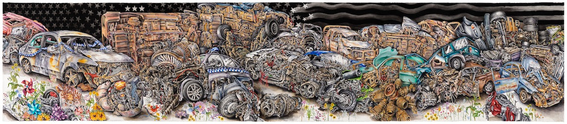 eX de Medici, The wreckers, 2019, National Gallery of Australia, Canberra, purchased 2020, © eX de Medici It is a national exhibition, not simply Melbourne-Sydney in its focus, with Western Australian, South Australian and Queensland women artists all well represented. Naturally, not everyone in the 'sisterhood' will be pleased about inclusions and exclusions in the exhibition and there will be a deafening 'why not me' outcry. In many instances the question is valid and hopefully as more public art spaces realise that women artists make art at least as interesting as their male counter parts, we will see more gender equity in the display of Australian art. 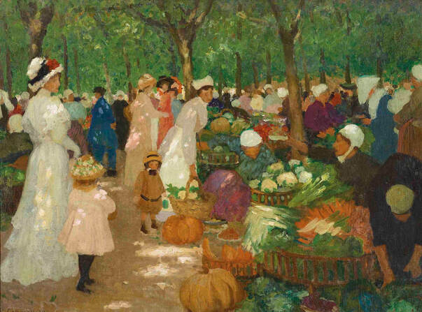 Ethel Carrick, The market, 1919, private collection, courtesy of Smith & Singer Fine Art Know my name is a free exhibition at the NGA in Canberra, but timed online bookings are necessary in compliance with COVID restrictions. Part one will be on display until 4 July 2021 and part two from late July 2021. Archibald 2020 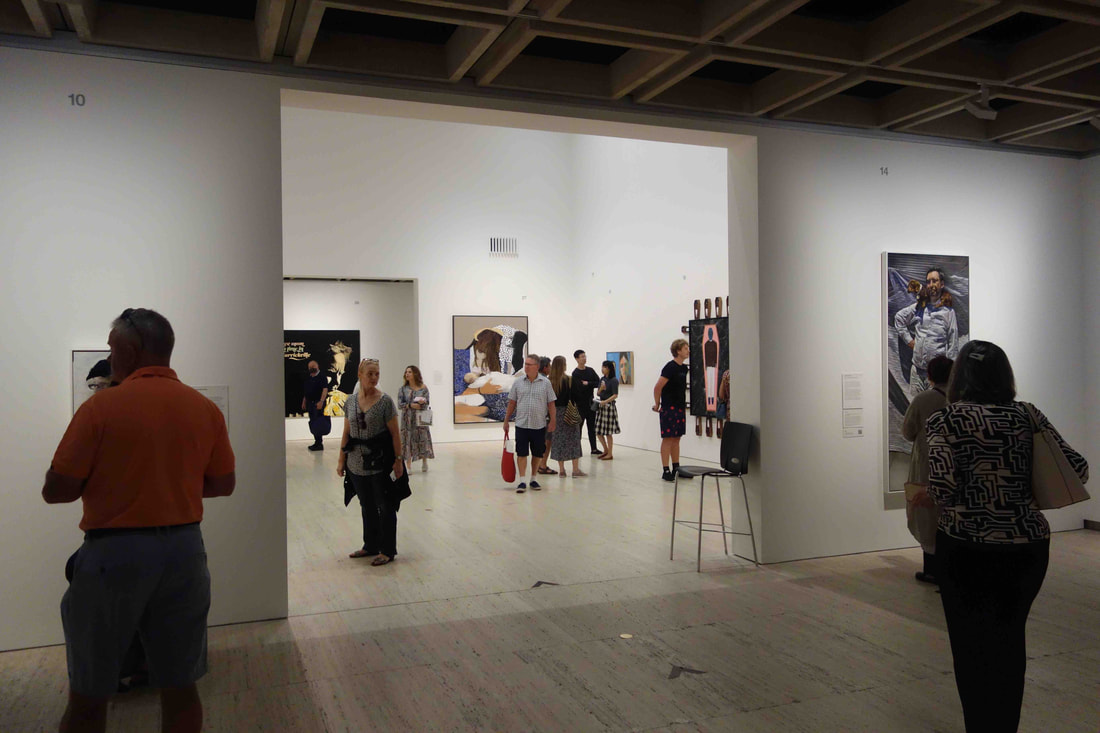 COVID-normal Archibald 2020 I once had a friend who worked as a curator at the Art Gallery of New South Wales for many years who claimed never to have seen an Archibald exhibition in his life. His justification was fairly simple - the Archibald is an exhibition for people who know nothing about art and 80% of those who go to the Archibald never go to any other art exhibition, and 80% of people who frequently go to art exhibitions never go to the Archibald. This was a few years ago and the stats probably no longer hold true (if they ever did), but the distinction between a serious exhibition and an art circus designed for popular entertainment still sounds valid. The inherent problem with the Archibald and, for that matter, the Wynne, is that they are selected and judged by people who are not art professionals - the Trustees of the Art Gallery of NSW. When the Archibald was set up 99 years ago, trustees of a public art gallery were expected to be art people - artists, art teachers, curators - now they are expected to be people with deep pockets, management expertise or backgrounds in finance, fundraising or philanthropy. 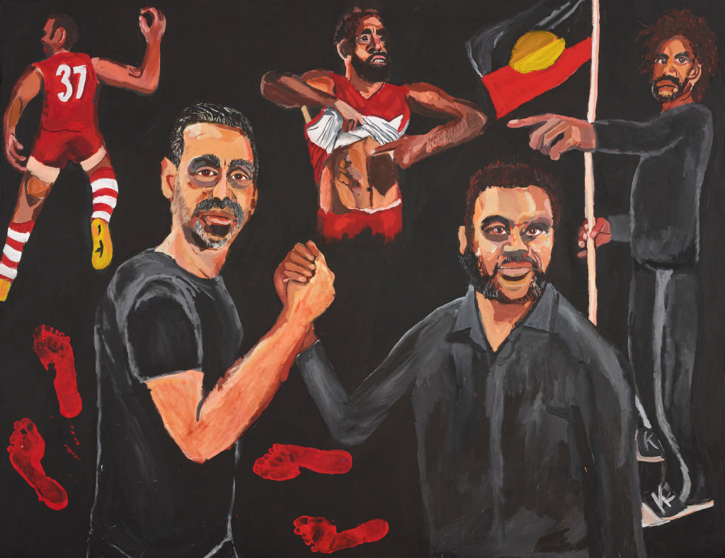 Vincent Namatjira, Stand strong for who you are, acrylic on linen, 152 x 198 cm Today, the eleven trustees of the Art Gallery of NSW include two artists, Ben Quilty and Tony Albert, while the rest may have a serious interest in art, but a background in commerce, finance, law, banking and philanthropy and include Mr David Gonski AC, Ms Gretel Packer AM and Ms Lucy Turnbull AO. For its purpose as trustees, it is a strong group that the gallery is fortunate to have assembled, but hardly a professional art body that you would trust to decide on the merits of painting. I have seen more Archibald exhibitions in my life than is good for my mental health and have come to the conclusion that there are three main criteria employed for judging the prize, namely, fashion, politics and money. I am not implying that there may be something illegal or improper here - this is not the NSW government - but I suggest that all of these are assumed, implied and emerge in a consensual way. 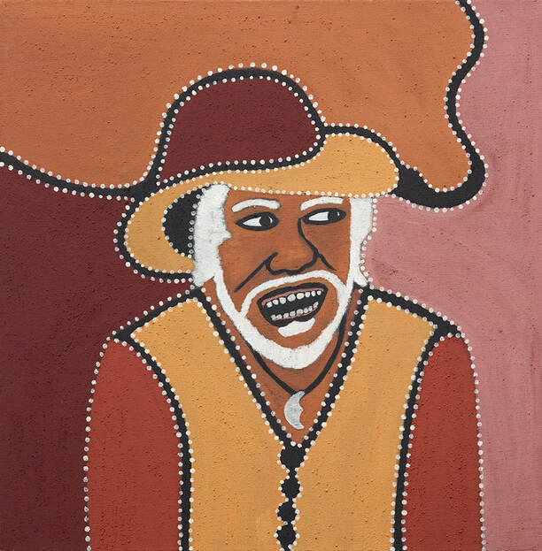 Charlene Carrington, My dad, Churchill Cann, natural ochre, pigment and PVA fixative on linen, 70 x 70 cm This year's Archibald is a pretty ordinary selection of 55 largely mediocre paintings selected from the 1068 entries and, as in previous years, some of the better entries have ended up at the Salon de Refusés across town and up the hill. The $100,000 prize for the 99th Archibald has been awarded to Vincent Namatjira's Standing strong for who you are - a portrait of the Indigenous AFL footballer Adam Goodes. In the age of the Black lives matter protests, it seemed inevitable that the prize would go to an Indigenous artist and what could be more appropriate than a self-portrait of Namatjira (the great-grandson of the renowned watercolourist Albert Namatjira) clasping hands with Goodes surrounded by smaller images of Black pride. This makes Vincent Namatjira, who started dot painting in 2012 and painting portraits in 2013, the first Australian Indigenous artist to win the Archibald. 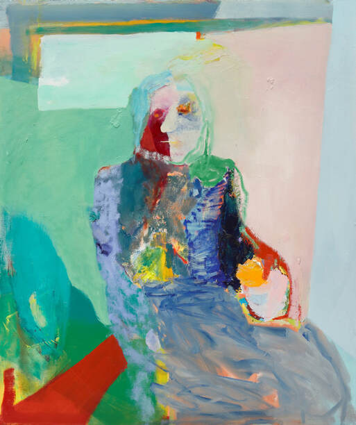 Karen Black, Madonna, oil on canvas, 96.5 x 81.5 cm The politics are right, the simplified caricature-like style is fashionable and already much money has been invested in promoting this promising artist aged in his late thirties. My reservation is that I don't find this a particularly strong painting and it is less adventurous and less accomplished than some other paintings by him seen in earlier Archibald exhibitions such as Self-portrait on Friday (2017), Studio self-portrait (2018) and Art is our weapon - portrait of Tony Albert (2019). There are quite a number of Aboriginal artists in this year's Archibald, including Charlene Carrington with her quirky portrait of her father, where she notes, "In the painting, that brown hill, his hat, is Red Butte. That's a good fishing place and where the old people used to hang out. That yellow part of his hat is the sandy ground around Red Butte, the buttons are the Texas rock holes. When we were young we used to walk up there and go swimming. It's real clear, like a big pool. The moon on his neck is the necklace that I gave him that he always wore." Executed in natural ochres it is quite an effective painting. Other Aboriginal artists included are Tiger Yaltangki, Blak Douglas, Meyne Wyatt, Thea Anamara Perkins and Kaylene Whiskey. 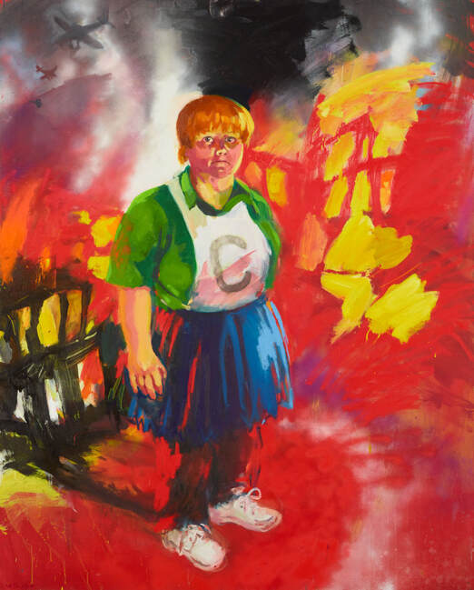 Wendy Sharpe, Magda Szubanski – comedy and tragedy, oil on linen, 183 x 147 cm One of the more interesting artist, who like Carrington is an Archibald first-timer, is Karen Black with her evocative and slightly weird painting of the wonderful artist Madonna Staunton in the final stages of life. Sinead Davies' portrait of Claire Dunn grows on you as you spend time with it, but strictly needs to be seen in the flesh. Wendy Sharpe's bombastic expressionist style perfectly suits her portrait of Magda Szubanski. Not a great portrait, but memorable and effective.  Sinead Davies, The Irish immigrant – portrait of Claire Dunne OAM, oil on canvas, 61 x 61 cm Is the 2020 Archibald a good show? In a word - no. Is it worth seeing? Again - no. But if you do see it - you will be viewing it in COVID comfort where you don't really have to compete with the crowds standing with their backs blocking the paintings while taking selfies.  COVID-normal Wynne 2020 The Archibald, Wynne and Sulman Prizes are at the Art Gallery of NSW until January 10, 2021 Are art schools an endangered species? 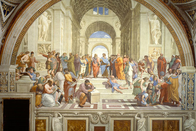 Raphael, The School of Athens, 1505-1, fresco, 500 x 770cm, Apostolic Palace, Vatican City, Rome The plight of art schools in Australia in recent decades is hardly breaking news. Shrinking budgets, staff cuts, closures, amalgamations and reduced course offerings have plagued many art schools. Some workshop disciplines are no longer viable and others are staffed through makeshift arrangements with casuals and sessional staff carrying the brunt of the teaching and administration of courses. Four year ago, Tamara Winikoff sounded the alarm in her article 'What's happening to Australia's art schools?' Writing as the Executive Director of the National Association for the Visual Arts (NAVA), she spoke to a number of the key players in Australian art schools and observed some alarming trends. She noted, "The general tendency was for directors to gloss over the problems of diminishing staff numbers and their having to shoulder a greater administrative load, insecurity with the loss of the tenure system, less contract staff, the increasing crowded marketplace for the lucrative international students, and the authority of the word over image i.e. the pressure to publish in order to gain university brownie points." She concluded, "It's clear to me that a proper study is needed to make dispassionate comparisons between past and present and across the sector with a view to identify optimal conditions that are appropriate to diverse contexts." 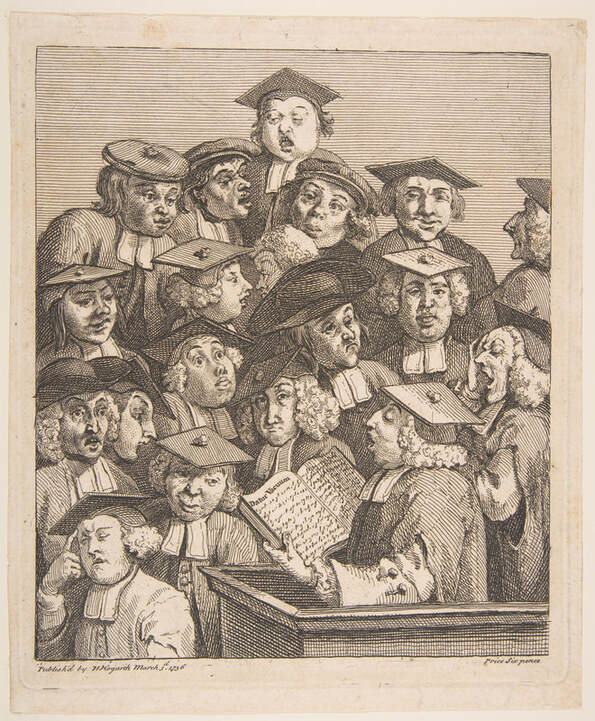 William Hogarth, Scholars at a lecture, 1736, etching and engraving, 23.4 x 19.5cm As far as I am aware, no such study has been undertaken, although presently, Paul Fletcher, the Minister for Communication (the Arts have been dropped from the ministry's name) has ordered an Inquiry into Australia's Creative and Cultural Industries and Institutions with submissions invited until October 22, 2020. Art schools in Australia have a venerable ancestry and appeared relatively early in the life of colonial Australia. The National Gallery Art School in Melbourne, for example, was founded in 1867 with the idea that it was the place where one could establish artistic standards and acquire the necessary skills through which to attain these standards. Many art schools in 19th century Australia were founded around individual artists who gave classes and these art schools vanished as quickly as they were established. The Julian Ashton Art School in Sydney is an exception, founded in 1890, it continues to the present day. The Victorian Artists' Society in Melbourne is another exception, founded in 1870, it also continues to operate and as part of its activities offers art tuition, although arguably it is not primarily an art school. There were a few well-established art schools in the capital cities of most Australian states and territories by the 1960s. In the 20th century, private art schools, especially those established by Max Meldrum, George Bell and Desiderius Orban, had a greater longevity and had a greater impact than most of the other private ventures. However, as a rule, art education had become principally a state-funded activity. 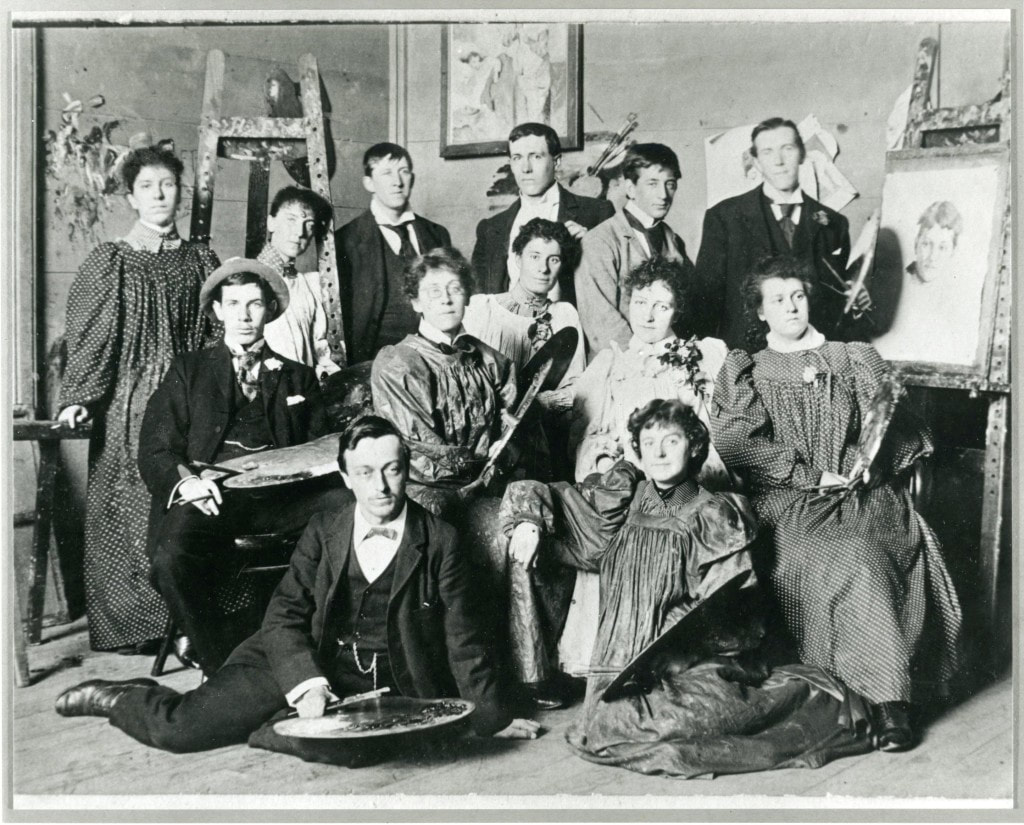 A group of students at the National Gallery School, Melbourne, 1896 [Back row: Amy Mann, Agnes Kirkwood, Leon Pole, George Coates, Albert Enes, Hugh Ramsay, middle row: James MacDonald, Dora Meeson, Jo Sweatman, Portia Geach, Isabel Hunter, front row: George Pontin, Ada Coutie] In the 1970s and 1980s the art school scene started to change quite markedly in Australia with a number of new institutions being established. Many were created within the context of Colleges of Advanced Education or TAFE colleges and some offered radical and progressive alternatives to those available in traditional existing art schools. Sydney College of the Arts, for example was conceived in 1974 as an independent College of Advanced Education and in contrast to other Sydney art schools adopted a more postmodernist perspective in its teaching. Minister John Dawkins' controversial reforms to tertiary education that commenced in 1988 had a huge impact on art schools in Australia in the drive to establish a unified national system. Most of the art schools lacked the scale to stand alone and lost any semblance of autonomy as they were forced into unions with universities. A rare exception is the National Art School in Sydney, traditionally known as East Sydney Tech and tracing its origins back to the Sydney Mechanics' School of Arts in 1843. It staved over many years attempts to be taken over or amalgamated and remains an independent art school with ongoing funding guaranteed by the NSW government as a State Significant Organisation. 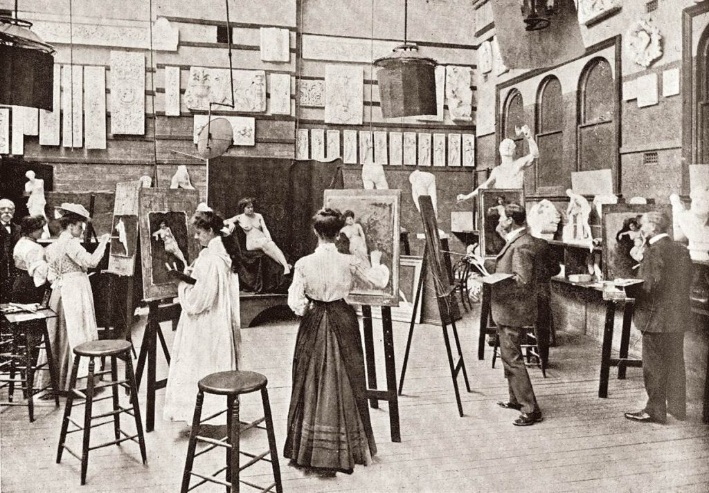 Life painting class, National Art School, Sydney, 1909 The West Australian artist and teacher, Paul Uhlmann, reflecting on the transition from an independent art school system to one subsumed within a university, observed, "Many art schools struggle to be understood, struggle for identity and autonomy within the framework and hierarchy of a university; for example, the particular languages of making through painting or graphic means are not readily understood as being valid modes of knowledge production in their own right." Presently there are about 39 art schools throughout Australia operating within universities. The largest of these is RMIT with 6537 undergraduate and postgraduate students and the smallest, Charles Darwin university with a total of 161 students. Su Baker, a long-term Chair of the Australian Council of University Art and Design Schools, observed in 2018, "In the last decade we have seen art schools morph into the institutional shape of their host university and in some cases the radical destruction of many of these once active institutions." The loss of identity within the broader university context has affected art schools on many levels. Similar strictures are now applied to an art school as to the broader university community with requirements for many of the staff to hold PhD qualifications, to teach similar class sizes as across the university and to have similar accountability and evaluation procedures for staff and students. Operating within a university, rather than a College of Advanced Education or a TAFE, did enable a member of staff to be promoted to the more senior academic ranks with the accompanying shift in administrative responsibilities. This also added considerably to the staff budget of the institution. 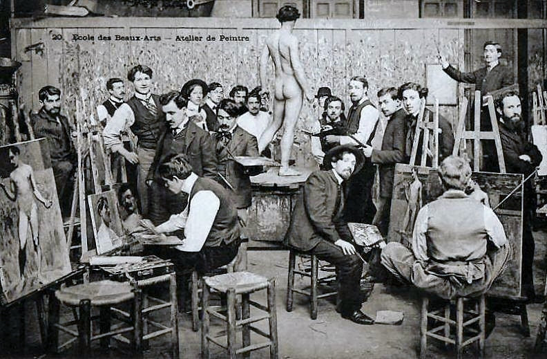 Ecole des Beaux-Arts - Atelier de Peintre, photograph c.1910 The economic realities within the universities now applied to art schools and the central university administration was forced into tough decisions whether to cut resources to their affiliated art school or to one of their more traditional discipline areas. Frequently it was the art school that suffered first and workshops that traditionally required four or five members of staff were forced to make do with one or two, Ten years ago, printmaking workshops in art schools had a number of teachers plus technical assistants, today they are lucky to have more than one full-time member of staff. Similar observations can be made about many ceramic workshops. When the Minister for Education in Scott Morrison's federal government, Dan Tehan, announced his proposed Job-ready graduates package in June 2020 with a proposed massive hike in student fees for humanities and arts students, this was a major blow for universities in general and art schools in particular. Most Australian universities were already in a financially weakened state following the impact of COVID-19 on their existing revenue stream. The Job-ready package has been introduced to parliament and now has been referred to the Senate Education and Employment Legislation Committee with a report due September 25, 2020. If passed, it will force many universities to make difficult decisions in the process of balancing the books. Art schools, through the Australian Council of University Art and Design Schools, immediately responded to this package by diplomatically stating: "Humanities course funding will certainly be impacted by the proposed changes, with a much higher student contribution (and increase in the overall funding to universities). While the creative arts may not experience such a negative impact, we acknowledge the high value of humanities and arts subjects to our sector and to society. Those proposed changes may have devastating consequences yet to be determined not only for the individual, but for the nation." 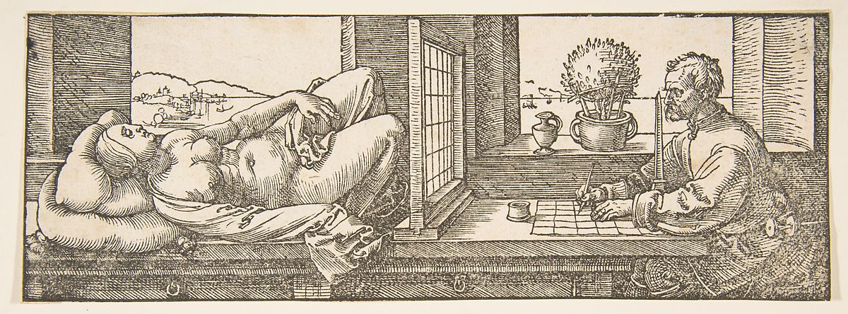 Albrecht Dürer, Draughtsman Making a Perspective Drawing of a Reclining Woman (The Manual of Measurement), 1525, woodcut, 7.7 x 21.4 cm In a hard-hitting media release, Professor Joy Damousi, President of the Australian Academy of the Humanities, wrote, "Evidence shows that the skills and knowledge from the humanities and social sciences training - including critical thinking, communication skills and understanding the impact of change on humanity - are highly valued by employers and in the workforce." One suspects that within some university budgets the viability of their art schools will come into question. Are art schools viewed as an integral part of the fabric of the university or as a desirable luxury that cannot be viewed as being on the same level of importance as schools of law or political science or business management? There is also disquiet within some of the art schools themselves. Have art schools within universities become too academic, too theory-based and insufficiently hands-on and technique orientated? Do graduates from art schools emerge with an adequate skills toolkit as well as a broader appreciation of the art making process - a creative mindset? Could more flexible atelier workshops, rather than art schools, be more responsive to the changing nature of the arts themselves? 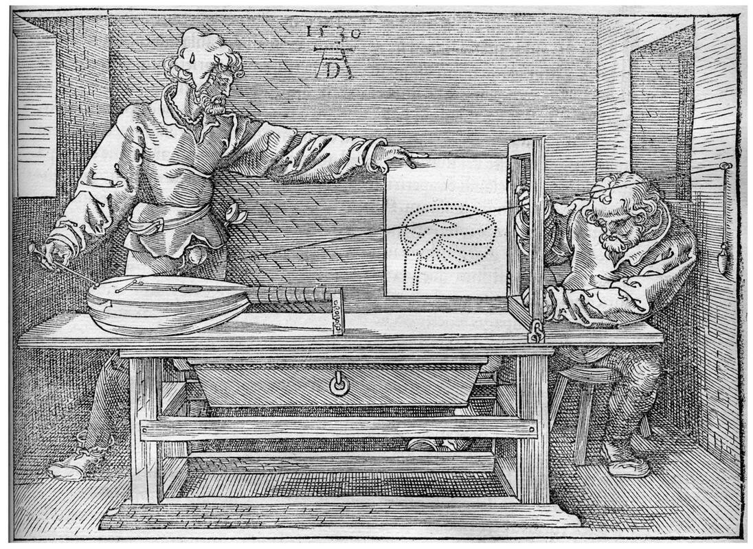 Albrecht Dürer, Draftsman Drawing a Lute (The Manual of Measurement), woodcut, 1525, 13 x 18.2 cm While the future of art schools in terms of structure, teaching strategies and broader philosophies of art should be on the agenda for future discussion, the current plight of art schools is an urgent matter for the present. Art schools in Australia are facing an existential threat. Decades of inadequate funding have left many of them in a perilous state and the present political and intellectual hostility to the creative arts from the present federal government and some state governments is threatening their very existence. Some art schools have thrived within their tertiary host institutions, however, many have not. If art schools are becoming an endangered species, then it becomes a collective responsibility for all of us to fight for their preservation and restoration. Art is not a luxury, but a necessity of life. 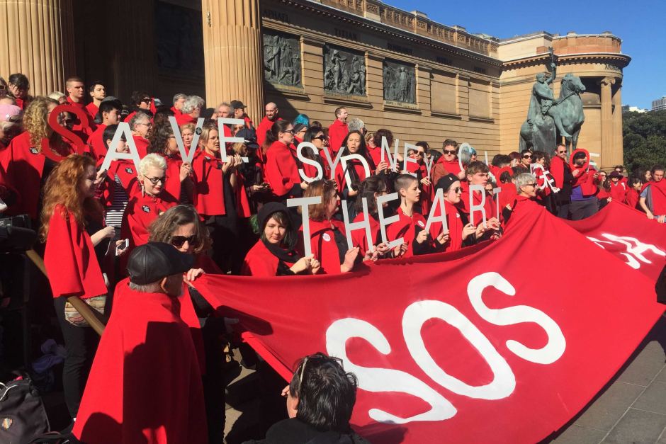 Sydney College of the Arts protest at proposed art school cuts and merger, July 2016 An earlier version of this art blog was published in The Conversation.
|
GRISHIN'S ART BLOG
Sasha Grishin AM, FAHA is the author of more than 25 books on art, including Australian Art: A History, and has served as the art critic for The Canberra Times for forty years. He is an Emeritus Professor at the Australian National University, Canberra; Guest Curator at the National Gallery of Victoria, Melbourne; and Honorary Principal Fellow, Faculty of Arts, at the University of Melbourne. Archives
June 2024
Categories
Keep up-to-date with Sasha Grishin's blog with the RSS feed.
RSS offers ease of access and ensures your privacy, as you do not need to subscribe with an email address. Click here to download a free feed reader |
 RSS Feed