Grishin's Art Blog (GAB)
Helen Maudsley: In praise of slow art 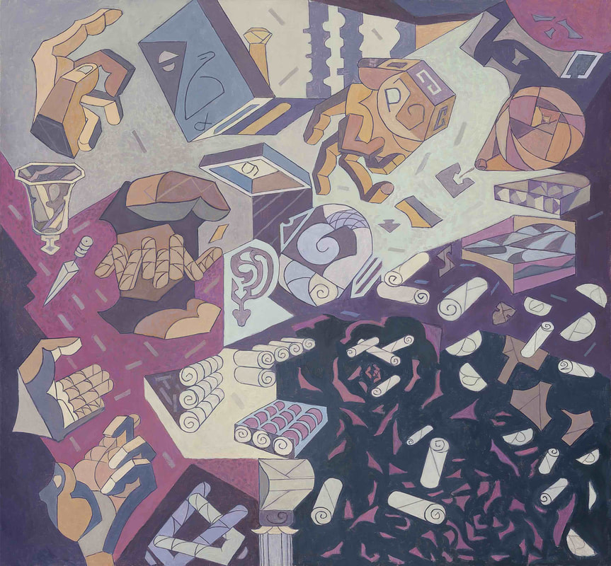 Helen Maudsley The Rose Petal Scrolls, become the Scrolls of our Ancient Past; of the Law; of Wigs, still worn. The Hands of Now, of Doing. The Pear that is Flesh and Heart. The Conflict with Arrogance. Also, the Flicker of Life, and the Question Mark., 2014 oil on canvas 74.5 x 80.5cm Collection of the artist, Melbourne. Courtesy of Niagara Galleries, Melbourne. © Helen Maudsley So much of what we experience in our daily lives is measured in nanoseconds and perceived in soundbites so that Andy Warhol’s promise of 15 minutes of fame increasingly appears as a utopian dream. Who nowadays has 15 minutes to spare? – and anyhow Warhol probably never said it. Viewers at art galleries, exhibitions and museums, on average, spend less than 30 seconds looking at an artwork, most of that time spent reading the caption, establishing the viewing distance or posing for a selfie. Although six million people a year may come to see the Mona Lisa in Paris, according to the Louvre, they spend about 15 seconds with it. Of course, some people spend much longer looking at art and even manage do it without a phone or camera in hand. 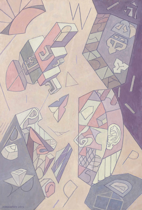 Helen Maudsley The Not Knowing. Each One There; Difference. Your experience of Me, is not Me. My experience of You, is not You., 2014 oil on canvas 59.5 x 41cm Collection of the artist, Melbourne. Courtesy of Niagara Galleries, Melbourne. © Helen Maudsley In the last few decades there has been a growing realisation that the world is out of joint, perhaps more so than ever before, and we simply have to slow down to comprehend things more fully, to more completely enjoy and digest our food, culture and even procreation. So we have the slow food movement, slow travel, slow sex and slow art. Museums around the world celebrate slow art day, where the invitation is to slow down and partake more fully of the art experience. Contrary to a popular argument that slow art almost entirely depends on the viewer’s perception, I feel that some artworks do not warrant more than a single glance and are designed for instant gratification and the immediate ‘wow’ factor, while others are not intelligible without prolonged viewing and contemplation. 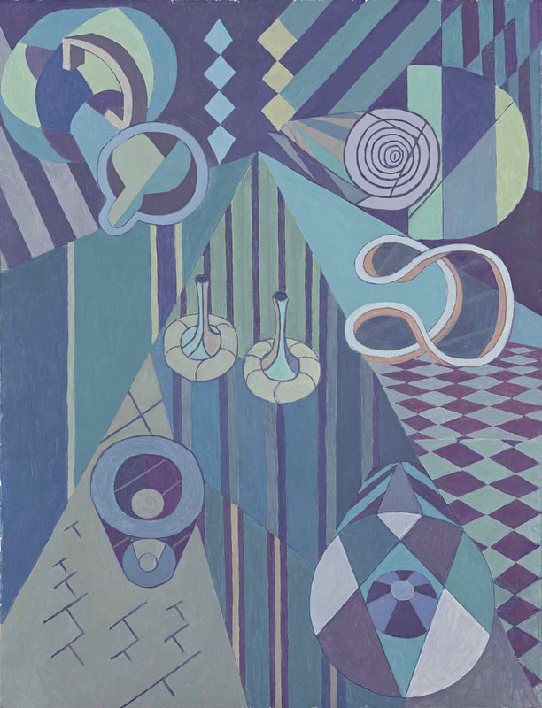 Helen Maudsley, AT; INTO; DOWN, ACROSS 2017 oil on canvas 52.5 x 40 cm Collection of the artist, Melbourne. Courtesy of Niagara Galleries, Melbourne. © Helen Maudsley Leaving aside installations, videos and controlled environments, for example The Aboriginal Memorial, Bill Viola, James Turrell and Richard Serra, where the medium makes a physical demand on the viewer to physically slow down to see the work, there are art objects that demand that you enter the work and engage with it, to see it. A Byzantine icon, a painting by Vermeer, Velázquez or Rembrandt are examples of traditional slow art that engage the spirit and the intellect. It is possible to walk past them casting only a cursory glance, but that is like saying that you know Bach’s The Well-Tempered Clavier because you have seen the record cover or heard the ringtone. A commercial jingle or commercial advertising design that passes as painting in some galleries may have an ephemeral popularity and can be fully comprehended within a matter of seconds as there is nothing beneath the surface, but slow art engages the spirit and the intellect and that requires time. 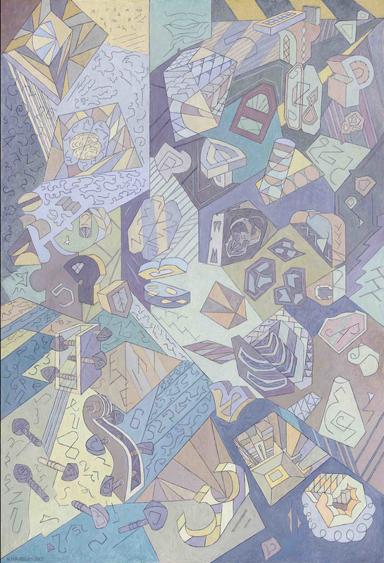 Helen Maudsley, Our Civilized Minds, Our Feral Mindlessness, Our Inherited Language; our Re-configuration. The Hyena Laugh., 2013 oil on canvas 125 x 58.5cm Collection of the artist, Melbourne. Courtesy of Niagara Galleries, Melbourne. © Helen Maudsley Helen Maudsley is a great master of slow art and is the subject of a major exhibition at the National Gallery of Victoria. Since I first encountered her work, about forty years ago, I was struck by its complexity, its quiet, reserved beauty and the intellectual engagement. It is unlike anybody else’s work – intricate and elaborate, lucid and cerebral – but at the same time aesthetically pleasing with its cool palette and pastel tones. The paintings do not leap off the walls crying for attention, but once you pause for a moment, look and enter the work, you are drawn into a visual and intellectual labyrinth of endless complexity. 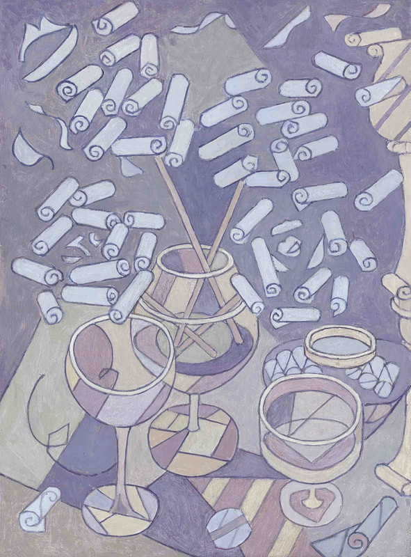 Helen Maudsley, 4 Roses in a Vase. 4 Heads and One Face. 4 People and the Golden Pillar., 2014, oil on canvas, 32 x 24cm Collection of the artist, Melbourne. Courtesy of Niagara Galleries, Melbourne. © Helen Maudsley The exhibition at the National Gallery consists of thirty works, predominantly oil paintings, but also a few pen and ink drawings, and is selected from the artist’s work from the past five years. Titles in her art are of critical importance, but they act as poetic evocations, rather than pointing us to objects to be located within a painting. One of the titles from the present exhibition reads, Our Civilised Minds, Our Feral Mindlessness, Our Inherited Language; our Re-configuration. The Hyena Laugh (2013), while another 4 Roses in a Vase. 4 Heads and One Face. 4 People and the Golden Pillar (2014). Other titles are more socially engaged and include, You’ve Got what I want, and I’m going to Get it (2015) and I. Me. You. ‘I don’t see You. You don’t see Me. You see Me as you want me to be. I see You as I want You to Be. Each one’s Separation and Difference’ (2017). 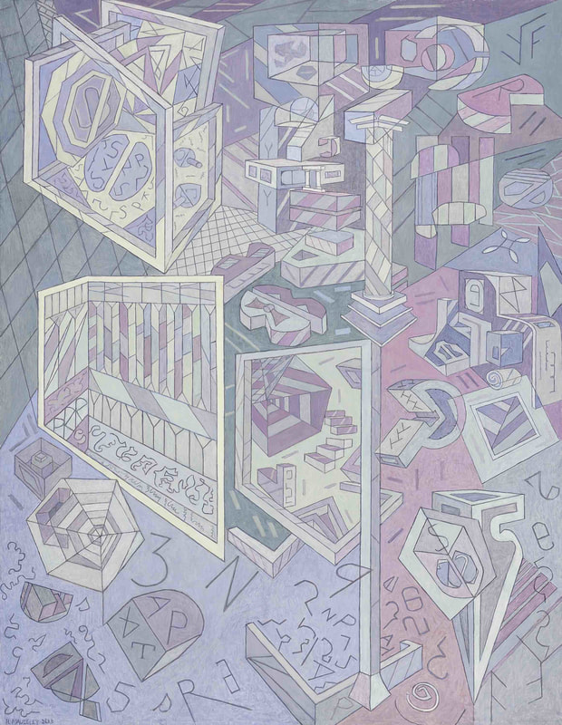 Helen Maudsley, The Heads; with Minds. The Mindless; The Feral. And The Warrior., 2013 oil on canvas 105 x 81.5cm Collection of the artist, Melbourne. Courtesy of Niagara Galleries, Melbourne. © Helen Maudsley Maudsley is not a difficult artist to appreciate, but there is a certain threshold to overcome before you can enter her intriguing and perplexing world. It is one that operates on a visual, rather than a literary level, where the individual ideographs assert their own lyrical magic and weave their philosophy of being and nothingness, of knowing and not knowing. This is a profound exhibition by a mature artist who over decades has devised a unique pictorial language of power, beauty and a haunting lyrical intensity. 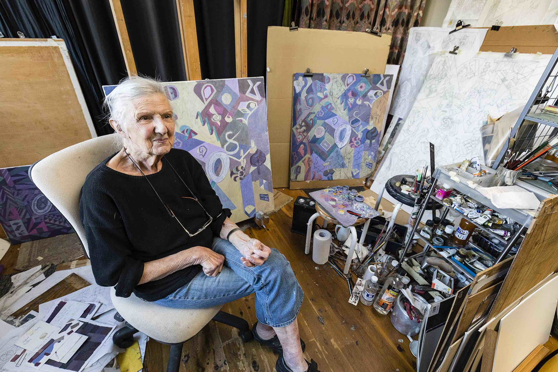 Helen Maudsley in her Melbourne studio. Photo: Selina Ou Helen Maudsley, Our knowing and not knowing is on at the National Gallery of Victoria – Australia, Federation Square, Melbourne, 17 November 2017 – 12 March 2018
4 Comments
The politics of exhibiting major international contemporary artists in Australian art galleries – Gerhard Richter in Brisbane 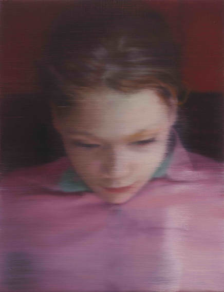 Gerhard RICHTER Germany b.1932 Ella (903-1) 2007 Oil on canvas 40 x 31cm Private Collection © Gerhard Richter 2017 Brisbane’s blockbuster exhibition Marvel: Creating the Cinematic Universe closed in September 2017 having drawn over 269,000 visitors, while Melbourne’s Vincent van Gogh and the Seasons closed a couple of months earlier with the staggering attendance figures of 462,262 ticketed visitors for its 76 day season. There is undoubtedly an audience for major art exhibitions, but does an audience exist for major contemporary international artists? The National Gallery of Victoria’s David Hockney proved a success, and now the QAGOMA is presenting a major retrospective of the work of the German maverick, Gerhard Richter. 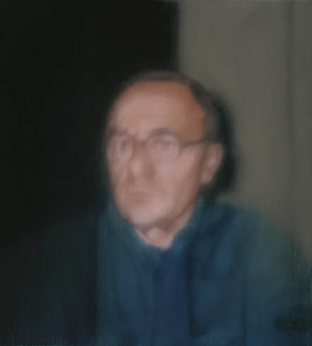 Gerhard RICHTER Germany b.1932 Self-portrait (836-1) 1996 Oil on linen 51 x 46cm Collection: Museum of Modern Art, New York, USA Gift of Jo Carole and Ronald S. Lauder and Committee on Painting and Sculpture Funds © Gerhard Richter 2017 Of the three giants of post-war German art – Joseph Beuys, Anselm Kiefer and Gerhard Richter – Richter is the most elusive, enigmatic and seemingly impossible to pin down. With his compatriots, Richter shares a basic Existential philosophy, where there exists no pre-ordained order or rationale for being and the artist is called upon through action to create meaning and an identity. However, unlike many of his compatriots, Richter rejects the binaries that so often define art practice – abstract versus figurative, conceptual versus object art, or painting versus photography – collapsing them into a continuum. In his practice, photography is inseparable from painting and each carefully crafted art object belongs within a framework of conceptual art. 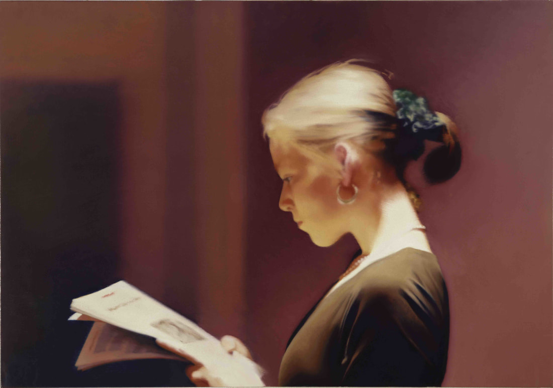 Gerhard RICHTER Germany b.1932 Reader (804) 1994 Oil on canvas 72 x 102cm Collection: San Francisco Museum of Modern Art, USA Purchase through the gifts of Mimi and Peter Haas and Helen and Charles Schwab, and the Accessions Committee Fund: Barbara and Gerson Bakar, Collectors Forum, Evelyn D. Haas, Elaine McKeon, Byron R. Meyer, Modern Art Council, Christine and Michael Murray, Nancy and Steven Oliver, Leanne B. Roberts, Madeleine H. Russell, Danielle and Brooks Walker, Jr., Phyllis C. Wattis, and Pat and Bill Wilson © Gerhard Richter 2017 Richter in 1986 observed that in his paintings motifs evolved as the painting progressed and as “there is no central image of the world (world view) any longer: we must work out everything for ourselves, exposed as we are on a kind of refuse heap, with no centre and no meaning; we must cope with the advance of a previously undreamt-of freedom. It also conforms to a general principle of Nature; for Nature, too, does not develop an organism in accordance with an idea: Nature lets its forms and modifications come, within the framework of its given facts and with the help of chance.” The exhibition at Brisbane’s GOMA, the largest Richter exhibition ever assembled in Australia and drawn from numerous collections internationally, highlights this slippery, mercurial quality of Richter’s practice. In a methodical, even Germanic manner, Richter assembles a huge personal encyclopaedia of sources and images that constitute his famous Atlas project. Commenced in 1962, when the artist was 30, it is a vast and on-going, unedited archive/scrapbook that stretches hundreds of metres and resides in the Städtische Galerie im Lenbachhaus in Munich. In Brisbane, we have a selection of approximately 400 panels titled Atlas overview (a bit under half of the original) exhibited as a facsimile colour reproduction of the artist’s photographs, media clippings, drawings and annotations. Richter observed in an interview with Dieter Schwartz in 1999, “In the beginning I tried to accommodate everything there that was somewhere between art and garbage and that somehow seemed important to me and a pity to throw away.” 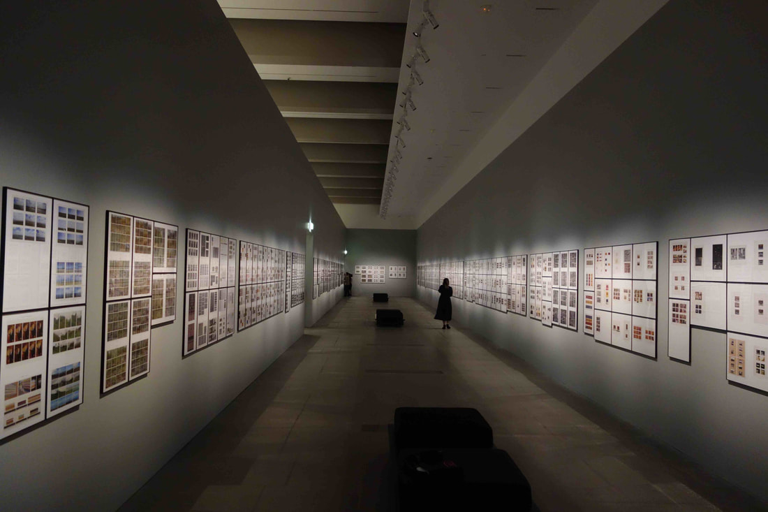 Gerhard Richter, Atlas Overview, installation, GOMA, Brisbane Richter’s interests are wide-ranging, including holocaust photographs, family snaps, hard-core porn, photographs of terrorists, houses, faces, landscapes, doors, and so on. They are all arranged in formal categories of shape and size, rather than thematically, leading to the uncomfortable juxtapositioning of bodies at Auschwitz and pornographic images of sexual acts. What is almost totally absent is images of works of art by other artists – paintings, sculptures, drawings – Richter appears to have ascribed to the idea so eloquently expressed by Jean Dubuffet: "Art ... loves to be incognito. Its best moments are when it forgets what it is called." Although Richter’s range of mediums is bewildering in its diversity, there are two prevailing aesthetic concerns throughout his practice. One is his love of blurring images, as he once famously pronounced, "I blur to make everything equal, everything equally important and equally unimportant." The other is his love of the colour grey where, in a much quoted 1975 letter to Edy de Wilde, the famous director of the Stedelijk Museum Amsterdam, he observed, “To me, grey is the welcome and only possible equivalent for indifference, noncommitment, absence of opinion, absence of shape. But grey, like formlessness and the rest, can be real only as an idea, and so all I can do is create a colour nuance that means grey but is not it. The painting is then a mixture of grey as a fiction and grey as a visible, designated area of colour.” 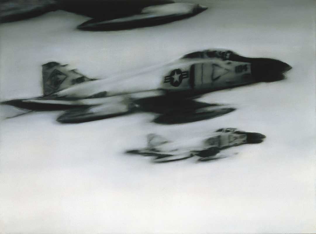 Gerhard RICHTER Germany b.1932 Phantom Interceptors (50) 1964 Oil on canvas 140 x 190cm Froehlich Collection, Stuttgart, Germany © Gerhard Richter 2017 In the exhibition, we have deliberately blurry grey paintings of much enlarged tourist snaps of the pyramids or fighter planes, as well as family photographs of Uncle Rudi (1965), shown in his Nazi military uniform, or Aunt Marianne (1965) holding the infant artist. Richter by deliberately blurring the image rescues it from the sameness of a media image and gives it a handcrafted personalised quality, which both reveals and conceals content. There is a certain matter-of-fact presence in these images that neither sentimentalises nor condemns the content. 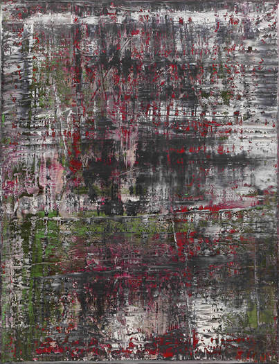 Gerhard RICHTER Germany b.1932 Birkenau (937-4) 2014 Oil on canvas 260 x 200cm Gerhard Richter Archive, Dresden, Germany. Permanent loan from a private collection © Gerhard Richter 2017 The four Birkenau paintings from the Auschwitz Cycle from 2014 form one of the highlights of the exhibition. The paintings refer to the Nazi concentration camp at Auschwitz-Birkenau and the four photographs smuggled out of the camp in a tube of toothpaste and included in his Atlas installation. The photographs Richter apparently drew onto the canvas in pencil, but soon gave up the idea of realising them as his usual blurry grey tone images. Instead, he covered the canvas with paint and dragged a squeegee across the surface, smearing the legibility of form, and the surface became a sombre mix of blacks, greys and ash white with occasional bursts of green and blood red. The Birkenau paintings assert a very powerful presence, simple yet haunting. They could be seen as a metaphor for history itself, where truth lies concealed underneath encrusted layers of time and can never be fully revealed. 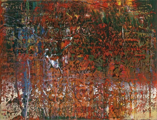 Gerhard Richter: The life of images GOMA, Brisbane October 14 – February 4, 2018 Gerhard RICHTER Germany b.1932 St Andrew (653-2) 1988 Oil on canvas 200 x 260cm Collection: Los Angeles County Museum of Art, USA, Modern and Contemporary Art Council Fund © Gerhard Richter 2017 This first retrospective exhibition of Gerhard Richter’s work in Australia is a brilliant and challenging event on the national arts calendar. Although it may not attract the huge crowds that may come to see an exhibition of comic strip heroes or pretty frocks, it will have a real impact on art making in this country and artists throughout Australasia will be making a pilgrimage to Brisbane. It is a show that should not be missed. 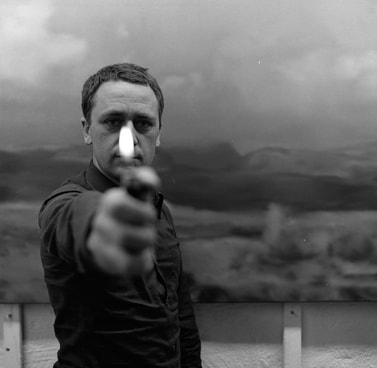 Gerhard Richter, 1970 © Gerhard Richter 2017 (23082017) Gerhard Richter: The life of images
GOMA, Brisbane October 14 – February 4, 2018 Australian Provincialism, Internationalism and the Art of Gareth Sansom 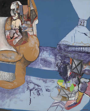 Gareth Sansom He sees himself 1964 oil, enamel paint, pencil, crayon, polyvinyl acetate, chalk and gelatin silver photograph on composition board 167.8 x 137.0 cm National Gallery of Victoria, Melbourne Presented by the National Gallery Society of Victoria, 1965 (1507-5) © Gareth Sansom/Administered by Viscopy, 2017 In 2014, Edmund Capon, the former director of the Art Gallery of New South Wales, was speaking at a conference at Beijing where he basically argued that for Australian art to receive recognition internationally it should cease being Australian and take on an international appearance. I was also speaking at the conference and argued that American art was not asked to lose its identity, or German art, French art or, for that matter, Chinese art and that great art nearly always carries the stamp of its origins. 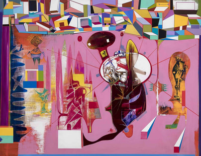 Gareth Sansom Wittgenstein’s brush with Vorticism 2016 oil and enamel paint on canvas 213.4 x 274.3 cm Courtesy the artist and Milani Gallery, Brisbane © Gareth Sansom/Administered by Viscopy, 2017 Art that lacks roots and seeks to be a global cosmopolitan product is like Esperanto, a good idea on paper, but lacking in conviction in its application. Shakespeare and Goethe translated into Esperanto will always remain a pale shadow of the original. American art was generally regarded as provincial before WWII and only in the 1950s was it seen to occupy a place on the world stage. It was a combination of quality art and a huge amount of money behind it. I would like to argue that contemporary Australian art, at its best, is world class, but we require serious money and intelligent guidance for its international advocacy. We have the depth of talent, but lack the political will, and private and public funding to make it happen. 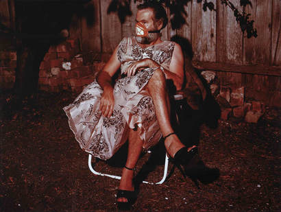 Gareth Sansom Figure studies triptych 1990 (detail) type C photographs (a-c) 80.0 x 105.0 cm (framed) Courtesy the artist © Gareth Sansom/Administered by Viscopy, 2017 Once again I was reminded of this provincialism and internationalism debate on seeing a very impressive exhibition at the National Gallery of Victoria. Gareth Sansom is a rare and an intimidating phenomenon in Australian art – an artist who thinks deeply, is fiercely independent, is visually literate and who has mastery over an extensive range of skills. 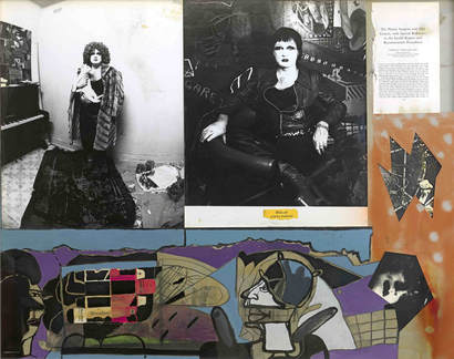 Gareth Sansom Siccolam 1976 collage of offset-photo lithographs, gelatin silver photographs, fibre tipped pen, enamel paint, polyvinyl acetate and charcoal on cardboard 81.0 x 101.0 cm Courtesy the artist © Gareth Sansom/Administered by Viscopy, 2017 His retrospective exhibition at the National Gallery of Victoria, Gareth Sansom – Transformer is bold, provocative, exquisitely crafted – and simply brilliant. Sansom is an artist who takes no prisoners, breaks all of the rules and leaves you spellbound. Sansom was born in 1939, the same year as George Baldessin and Brett Whiteley, a generation that took pleasure in risk taking and had little reverence for the conventions of the old order. Like Baldessin and Whiteley, he too was besotted with Francis Bacon, explored the dark side of the human psyche, and is prepared to work across mediums, splicing and collaging images like the montage images in film noir that so appealed to all three artists. However, unlike his two contemporaries, Sansom has been blessed with longevity and continues to work at the peak of his powers with some of the strongest, toughest and most uncompromising pieces amongst his most recent. 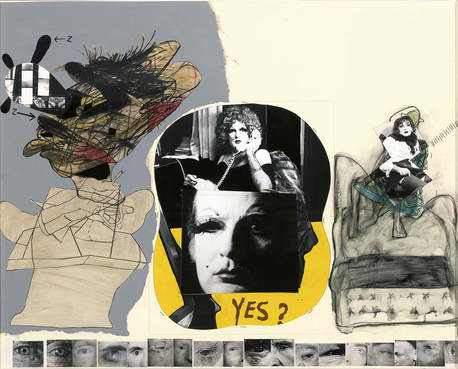 Gareth Sansom Yes? 1976 gelatin silver photographs, enamel, pencil, fibre-tipped pen and crayon on cardboard 82.0 x 102.0 cm Art Gallery of South Australia, Adelaide South Australian Government Grant, 1984 (848P26) © Gareth Sansom/Administered by Viscopy, 2017 Sansom creates complex multi-tiered narratives in his paintings, drawings and collages. There exists a seductive temptation to decipher the story and the artist willingly provides clues from his personal biography, art historical anecdotes and other lures and traps for the viewer. Many of these clues are brought together in the excellent accompanying catalogue edited by the exhibition’s curator, Simon Maidment. In some ways, one can become engulfed in this semiotic quicksand, which is instantly gratifying in the same way as gossip may be an antidote to curiosity. We learn of the artist’s juvenile fantasies, obsessions and possible sources, but these are all largely beside the point. Knowing that the cross-dressing Barry Humphries may have inspired the artist to do the same or that he used a room at home in Sorrento to stage and photograph a scene from the Bates Motel may satisfy some of our curiosity, but it adds little to the understanding of his work. 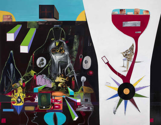 Gareth Sansom Transformer 2016–17 oil, enamel paint, graphite pencil and vinyl record on canvas 213.4 x 274.3 cm Courtesy the artist and Milani Gallery, Brisbane © Gareth Sansom/Administered by Viscopy, 2017 Sansom, for all of his transcultural references, is not in the final analysis a literary artist – an illustrator of verbal ideas – and for all of his reading and immersion in film and popular culture, his art is the triumph of visual intelligence. It speaks to us on a visual level that bypasses the verbal decoding. Like an alchemist, Sansom will mix a scene that can be traced back to Ingmar Bergman’s The Seventh Seal or Alfred Hitchcock’s Psycho, but he throws all of this into a creative cauldron in which image, text, difficult colours and acid colours that are painful to the eye and impossible to work with, plus a mass of other unexpected, startling imagery is brought together to shock, surprise and delight. 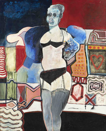 Gareth Sansom The blue masked transvestite 1964 oil and enamel paint on composition board 167.5 x 136.6 cm State Art Collection, Art Gallery of Western Australia, Perth Purchased 1989 (1989/0171) © Gareth Sansom/Administered by Viscopy, 2017 Sansom has been doing this for sixty years and I have been viewing it for about forty years and he has never failed to shock and surprise me. At its best, the work is brilliant. From very early collages of the 1960s through to the monumental paintings of the last few years, there is an enormous consistency, emotional intensity and a generous dose of whimsy in his art. Frequently, I forget that they are also quite funny paintings. Although we may have all now become somewhat resilient to being shocked through depictions of explicit sexuality, brutal violence, graffiti and the extreme manifestations of pop art, Sansom’s work can also seduce and emotionally disarm us before visually ambushing us. 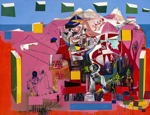 Gareth Sansom A universal timeless allegory 2014 oil and enamel paint on canvas 213.4 x 274.3 cm Private collection © Gareth Sansom/Administered by Viscopy, 2017 This exhibition has about 130 such visual ambushes and intellectual naughty pleasures. From early show stoppers, including He sees himself (1964) and The blue masked transvestite (1964), through to much more recent pieces, such as Wittgenstein’s brush with Vorticism (2016) and Transformer (2016-17), they are all works that contain a fair amount of humour – often black humour. There is also a cringe factor at play, as if the artist has caught you in the act of enjoying his work and for this you must be humiliated. For all of the notes of anarchy and praise of the temporary and the ephemeral, throughout the exhibition you also become conscious that you are looking at complex, sophisticated and well-structured works that are built to last. 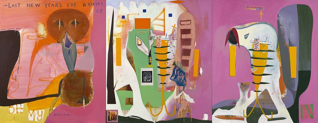 Gareth Sansom Sweeney Agonistes 2005 oil and enamel paint and collage of type C photograph on canvas (a-c) 213.0 x 549.0 cm (overall) Queensland Art Gallery, Brisbane The James C Sourris, AM, Collection. Gift of James C Sourris, AM, through the Queensland Art Gallery Foundation 2012. Donated through the Australian Government's Cultural Gifts Program (2012.472a-c) Where does this exhibition place Gareth Sansom? Much of this work – particularly that from the past twenty years – would look good in any international company. Although not shy of the fact that it is made in Australia, the imagery is definitely not made for Australian eyes only or as an export commodity that is stamped ‘Made in Australia’ for outside consumption. Just as Anselm Kiefer bears the impact of his German origins and Jean-Michel Basquiat of his emergence within the New York punk scene, Sansom is a Melbourne product of the 1960s, but has developed a unique and unmistakable artistic voice. He can comfortably take his place as an internationally significant contemporary artist. 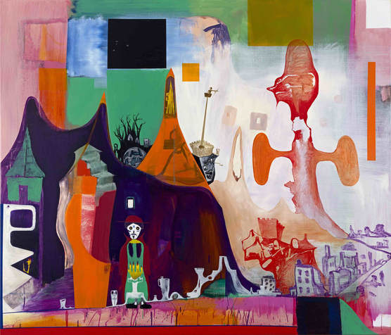 Gareth Sansom The Seventh Seal (i) 2007 oil and enamel paint on canvas 183.0 x 213.0 cm Private collection © Gareth Sansom/Administered by Viscopy, 2017 Gareth Sansom: Transformer, National Gallery of Victoria, Federation Square, Melbourne 15 September 2017 – 28 January 2018 The digital uncanny and the art of Pat Brassington 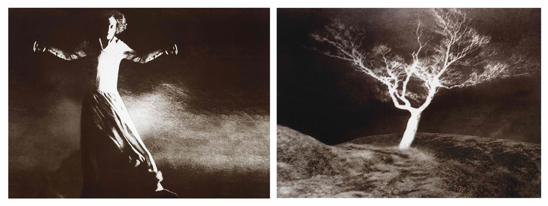 Pat Brassington, The Branching 2015, 2 pigment prints, diptych, 94 x 130 cm each, Art Gallery of New South Wales, purchased with funds provided by the Photography Endowment Fund, 2015 © Pat Brassington, Photo: Nick Kreisler, AGNSW Photoshop is less than thirty years old and yet it has become synonymous with the digital editing of images. About fifteen years ago, classes in Photoshop replaced life drawing in some art schools and it was argued that drawing was old technology, while Photoshop belonged in the new toolbox as most images used in art were “snapped”, rather than drawn. In more recent years, there has been a student revolt in some art schools and many students have demanded that they be taught drawing, as Photoshop was a skill that they had already acquired back in secondary school, if not at primary school. Digital technologies have permeated all branches of the visual arts, so that in painting, drawing, printmaking, sculpture and photography an image, or an effect, is derived in Photoshop or is digitally enhanced. 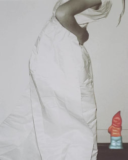 Pat Brassington, Drink me 1997, printed 2002, inkjet print, 100.2 x 80.2 cm, Art Gallery of New South Wales, Gift of Amanda Love 2011 © Pat Brassington, Photo: Nick Kreisler, AGNSW An implication of digital technologies is that an image no longer belongs to the realm of the hand, but it is something that is clicked. Another implication is that the digital erodes boundaries between the different art mediums and it has become a pointless exercise, for example, to decide if a digital print belongs to photography or to the realm of printmaking. One of the more fascinating implications of digital technology in photography is its ability to seamlessly splice unrelated elements into a new reality, which in turn has the facility to evoke the uncanny. For some artists, this has served as an invitation for a baroque exuberance in creating a fantasia land, for example Lieko Shiga, Marina Pinsky, Lucas Blalock and DIS; for others, it is quite a subtle transformation of the photographic image subverting its traditional assumed role as an accurate record of an existing reality or of a reality that once existed.  Pat Brassington, The permissions #3 from the series Quill 2013, pigment print, diptych, 20.9 x 18.1 cm, Art Gallery of New South Wales, purchased with funds provided by the Photography Collection Benefactors’ Program, 2013 © Pat Brassington, Photo: Christopher Snee, AGNSW Australia’s Pat Brassington (b 1942) was born in Hobart and studied both photography and printmaking at the Tasmanian School of Art, graduating with a Masters in Fine Arts in 1984. She was one of the original DARF (Digital Art Research Facility, Tasmanian School of Art), team which included, Bill Hart, Mary Scott, Geoff Parr*, Milan Milojevic, Troy Ruffles and Sarah Ryan. Here she perfected her technique of seamlessly combining scanned photographs to create images that dwell in the uncertain no man’s land where the real and the imagined collide, where fantasy seems to possess logic and authority and black humour and quirkiness are some of the most recognisable characteristics.  Pat Brassington, Candie from the series Quill 2013, inkjet print, 59.6 x 43.5 cm, Art Gallery of New South Wales, Anonymous gift 2015 © Pat Brassington, Photo: Nick Kreisler, AGNSW One of the characteristics of her digital prints is what may be termed digital restraint. It is a form of ‘slow art’, where the eye rapidly skimming the surface of her works may not immediately perceive the subtle elements introduced by the editing software so that the real is no longer completely real and the image may be attractive and charming, while at the same time somewhat menacing. Informed by the broader traditions of surrealism, feminism and well versed in the writings of Sigmund Freud and psychoanalytical school, her digital prints, frequently designed as objects of desire, negotiate the slippery territory built on a tension between feelings of attraction and revulsion, delight and the abject, and the sense of the familiar and the disturbing exotic. In the past couple of decades, Brassington’s reputation has grown substantially, being included in the Australian Perspecta 1989 and the Sydney Biennale 2004 and was the subject of a major retrospective at the University of Melbourne’s Ian Potter Gallery in 2002, which was followed by an excellent monographic study by Anne Marsh. In 2017, Brassington has been included in major exhibitions in Adelaide, Berlin, MCA, Art Bank, Sydney and is the subject of a separate dedicated exhibition at the Art Gallery of New South Wales, Pat Brassington: The body electric. The uncanny is possibly the best mindset through which to approach Brassington’s art. She shares with the British film director Peter Greenaway an aesthetic where humour and reality share the space and emotional ambiguity is the order of the day.  Pat Brassington, In my mother’s house 1994, 4 gelatin silver photographs, 52 x 35.5 cm each, Art Gallery of New South Wales, purchased 1996 © Pat Brassington, Photo: Nick Kreisler, AGNSW Brassington’s forms are polymorphic, sexuality and sexual organs can appear as unexpected orifices or strange protrusions, tufts of pubic hair seem to define part of a body only to be subverted by an unexpected anatomical inclusion. In compositional structure, the viewpoints are eccentric and the domestic interior settings, with patterned wallpaper, are strangely unsettling as is the juxtapositioning of interior and exterior spaces. It is as if we have been invited to witness the aftermath of some sort of ritual, the nature of which is never fully revealed. Truncated limbs, subversive pinks and female lingerie are all part of the repertoire of images that she introduces into her compositions as the literalness of the photographic image seduces the intellect, yet her digital interventions lie in wait, like hidden assassins, ready to upset our emotional equilibrium and the rational and literal reading of the digital print. Brassington’s art defies easy compartmentalisation – it may draw on the artist’s biography, but it is not autobiographical. The images possess a narrative, but it is not one that is easily deciphered or, for that matter, completely decipherable. They are deliberately enigmatic images, hauntingly memorable and deliberately disturbing.  Pat Brassington, Feeding time 1998, inkjet print, 67.9 x 35.5 cm, Art Gallery of New South Wales, purchased with funds provided by Rowan Ross and Annie Bleakley-Ross, Sydney 2000 © Pat Brassington, Photo: Ray Woodbury, AGNSW *Geoff Parr, Pat Brassington’s partner of many years, the former head of the Tasmanian School of Art and a very distinguished artist in his own right, died 6 January 2017. My heartfelt condolences to Pat and the family Pat Brassington, The body electric is on at the Art Gallery of New South Wales, 16 August 2017 - 11 February 2018 The plague of art prizes in Australia 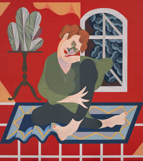 Archibald Prize 2017 winner, Mitch Cairns, Agatha Gothe-Snape, oil on linen 140.5cm x 125cm. Picture: AGNSW © the artist I am unfamiliar with any other country in the world where art prizes are so numerous and play such a public role in the art scene as in Australia. Is there any other country where there is a portrait prize that stops a nation? In Britain, the Turner Prize with a purse of £40,000, has been hyped to the rafters, but apart from a bit of ridicule from the tabloids, it is only big news or the subject of derision in art circles. On my count, there are somewhere about 548 art prizes in Australia, although the listing on the website seems to include a couple that are somewhat moribund and a few that have been suspended, but still over 500 art prizes must be a bit of an overkill. Obviously not all art prizes have been created equal and a win in the Archibald will bring more money and clout for the artist than the Hahndorf Academy Adelaide Hills Art Prize, but Australia’s appetite for art prizes appears insatiable.  Archibald Prize finalist, Madeleine Winch, Facing the canvas, oil on canvas, 100 x 100 cm. Picture: AGNSW © the artist Despite the plethora of art prizes, as a phenomenon in Australian art it has been inadequately studied with the only, almost-comprehensive study of which I am aware, by Dr Thea Exley in 2000, titled Patronage by proxy: art competitions in Australia during the twentieth century. Otherwise there is no shortage of references to art prizes, annual catalogues devoted to the prizes or individual publications devoted to the history of specific prizes such as the Archibald, Blake or the Dobell. What makes for a successful art prize competition? A generous purse may make it more attractive, but it is not a deal clincher. The Archibald has a winner’s purse of $100,000, while the Doug Moran National Portrait Prize is $150,000, but winning the latter hardly rates a mention, a blip on an artist’s c.v., while the Archibald remains a career highlight and in many instances has launched or relaunched an artist’s career. The calibre of the judges also seems to make little impact, for the Archibald it is the trustees of the Art Gallery of New South Wales, many of whom are there, quite appropriately, because they are people of influence or have particularly deep pockets, rather than any knowledge of art. The Moran Prize, particularly in recent years, has had highly qualified judges, but still it remains the neglected portrait prize. Controversy is great for the profile of an art prize, but someone really has to care about it in the first place for decisions to be controversial, otherwise it becomes a parochial in-house skirmish. Negative criticism is a must for art prizes to flourish, but this has really very little impact – the crowds still come and the art critics are ignored.  Karen Casey, Mapping Time, natural earth pigments and acrylic binder on fabric, 103 x 150 cm, Picture: Hadley’s Prize This year’s Archibald, with its 43 finalists, is as disappointing and a non-event as most of the Archibald shows of the previous few years. The winning entry, Mitch Cairns’ portrait of his partner Agatha Gothe-Snape, is an eye-catching, highly decorative pastiche of a Matisse-inspired formula. It is neither particularly interesting nor particularly adventurous, but Cairns, a local Sydney artist in his early 30s, has become a regular in the Archibald and had earlier secured the Brett Whiteley Travelling Art Scholarship. It is a clever, decorative painting that will be viewed as sufficiently progressive to keep the critics at bay, yet sufficiently safely anchored in early modernism not to antagonise the establishment. In this year’s selection, Tony Albert is one of the few conceptually adventurous portraits, while Nicholas Harding, Marcus Wills and Noel Thurgate have painted three of the most accomplished portraits. Madeleine Winch, Prudence Flint and Kate Beynon, are all artists who have their own peculiar and idiosyncratic visual language and have in each instance slightly extended their lexicon. 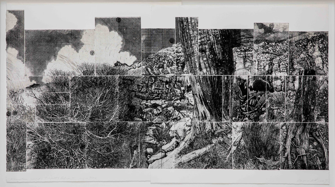 Raymond Arnold, Elsewhere World/Prospect and Refuge II, etching, diptych, 146 x 87 cm, Picture: Hadley’s Prize A newcomer to the art prize circuit is the Hadley’s Art Prize in Hobart, which commenced in July 2017 and, as far as I am concerned, has been flying under the radar despite its exceptionally generous prize purse of $100,000. It has a somewhat clunky theme: ‘History and place: For the best portrayal of the Australian landscape which acknowledges the past’. Named after the vintage Hadley’s Hotel in Hobart, the prize is yet to receive traction in the art world and although the 41 finalists produce a credible field, it is not of the calibre that would reflect the value of the prize. The winner is Peter Mungkuri from South Australia with his Ngura Wiru, which is a good, sprawling ink drawing of his home country. For me, the main highlights of this prize include Karen Casey’s golden glowing image of the land as history and memory in Mapping Time, a superb Ray Arnold etching diptych, Elsewhere world/Prospect and refuge II, Susanna Castledon’s Rottnest Sunrise with its striking play of coloured gesso on paper, Sue Lovegrove’s … and all hands danced together and a typically quirky Guan Wei, Reflection 5, where personal histories combine with general histories and observations. 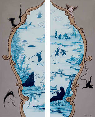 Guan Wei, Reflection No. 5, acrylic on canvas, 104 x 128 cm, Picture: Hadley’s Prize Down the road in Hobart, at the Colville Gallery in Salamanca Place, is the Lloyd Rees Art Prize with a much more modest purse of $20,000, but which arguably has attracted a stronger field than the Hadley Prize. This year the winning entry is a lovely small glowing oil painting by Philip Wolfhagen, Transitory Light. With at least half a dozen art prizes in Tasmania, the island is well served with these sporting fixtures of the art world. With such a crowded field of hundreds of art prizes and competitions in Australia and with the appetite for them not diminishing, I cannot but wonder why they should remain so popular with patrons, artists and the public. The last two categories are easiest to explain – artists are desperate for money and recognition, while the public are drawn to a game where they can argue with the judges’ pronouncements and generally own the whole art process.  Judging the Cossack Art Award, 2016, photo: S.Grishin The more perplexing is the role of the patron. Certainly, in the 1960s and 1970s when the whole art prize phenomenon exploded in its popularity, patrons quite often struck a profitable deal through the art prizes with acquisitive awards with modest purses – the organisers would capitalise on the publicity and would pocket the work for what was often a bargain basement price. Today, frequently the prizes are substantial and, even if they are acquisitive, as in the case of the Hadley Prize, their value easily eclipses the price of the work. With such a proliferation of landscape art prizes, publicity is limited. Outside the art community, who would know about the Fleurieu Art Prize for Landscape worth $65,000, the Glover Prize for landscape painting in Hobart of $50,000, the Wynne Prize for landscape of $50,000 or the Tattersalls Landscape Art Prize worth $30,000 with its successful touring exhibition? Is it possible that there could be smarter and more effective ways for patrons to channel patronage into the arts than to constantly organise art prizes? Art and Revolution 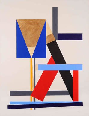 George Johnson, Construction with brown triangle 1986, acrylic on canvas, 186 x 140 cm., Courtesy of the artist and Charles Nodrum Gallery The Bolshevik revolution of 1917 was one of the most momentous events of the 20th century. It reshaped almost every aspect of our lives – politically, socially and culturally – and now, exactly a hundred years later, we can pause and examine its heritage. In Europe, the Royal Academy held its blockbuster exhibition Revolution: Russian art 1917-1932, the British Library its Russian Revolution: Hope, Tragedy, Myths show, Deutsches Historisches Museum in Berlin mounted its major 1917: Revolution: Russia and Europe exhibition and there is a plethora of exhibitions around the world including The Museum of Modern Art’s landmark exhibition A Revolutionary Impulse: The rise of the Russian avant-garde in New York. 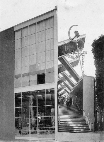 Konstantin Melnikov, Pavilion of the Soviet Union, 1925, Exposition internationale des arts décoratifs et industriels modernes, Paris In Australia cultural celebrations of the Russian revolution are more muted with an exhibition of Russian revolutionary graphics opening at the National Gallery of Australia in Canberra in late August, drawing on its internationally significant holdings of Russian avant-garde art, and a big exhibition Call of the avant-garde: Constructivism and Australian art at the Heide Museum of Modern Art in Melbourne. Constructivism was the art movement of the Bolshevik revolution, whose ideology reflected that of the fledgling socialist state, and whose forms swept into every aspect of cultural production including typography, book design, poster art, architecture, furniture, ceramics, textiles, theatre stage sets, cinematography, music, poetry as well as painting, sculpture and printmaking. For example, when the new Soviet state exhibited at the Exposition internationale des arts décoratifs et industriels modernes in Paris in 1925 the Soviet Pavilion was designed by the constructivist architect Konstantin Melnikov, while for the interior Aleksandr Rodchenko designed a constructivist workers’ club.  Aleksandr Rodchenko, Workers Club, 1925, Exposition internationale des arts décoratifs et industriels modernes, Paris (reconstruction) Constructivism was at the service of the revolution and the Soviet state, so that El Lissitzky’s famous lithographic poster, Drive the red wedge into the whites, 1920, commissioned by the Political Department of the Western Front, in many ways sums up the essence and principles of constructivism. If we examine this civil war image – the graphic elements are simple and geometric in character. The black and white trapezoidal areas are obliquely separated. A sharp aggressive red triangle – symbolic of the red army, literally deflowers the broken white circle (the tsarist army) – the simple sans serif lettering, obliquely placed in relation to the total geometry of the poster – reads "with the red wedge, destroy the whites" i.e. the Bolshevik army drives the red wedge into the ranks of the whites (also in Russian there is an alliterative quality in the words). Although economically the young Soviet state was a basket case with sanctions and economic blockade imposed by the surrounding imperialist powers, culturally it was a superpower and constructivism was a subversive export designed to spread the Communist revolution to the rest of the world. 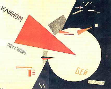 El Lissitzky, Drive the red wedge into the whites, 1920, lithograph, poster commissioned by the Political Department of the Western Front Soviet constructivist artists and their fellow travellers infiltrated the revolutionary Bauhaus in Germany and before long Kurt Schwitters and Laszlo Moholy-Nagy converted to Constructivism mainly through contact with El Lissitzky. Moholy-Nagy wrote in 1922 in his article ‘Constructivism and the Proletariat’: "Everyone is equal before the machine. I can use it, so can you ... There is no tradition in technology, no class consciousness. Everybody can be both the machine's master and its slave. This is the root of Socialism ... This is our century: technology, machine, Socialism ... The art of our time has to be functional, precise, all-inclusive. It is the art of Constructivism ... In Constructivism form and content are one ... Constructivism ... is not confined to the picture frame and pedestal. It expands into industry and architecture, into objects and relationships. Constructivism is the Socialism of vision." Constructivism and its socialist ideology were inseparable and every constructivist, to the woman – as many prominent Constructivist artists were women, including Lubov Popova, Varvara Stepanova, Olga Rozanova and Alexandra Ekster – felt that they were part of a global revolution. One difficulty with an exhibition such as the Call of the avant-garde is that most of the Australians were quick to copy the outside forms of Constructivism, but not the ideological content. The great Soviet poet and Constructivist artist and designer Vladimir Mayakovsky was to term such endeavours as “carrot coffee”, a reference to those who captured the outside form, but failed to understand the essence. The Heide exhibition includes a small handful of Russian works, the Rodchenko painting and photograph on loan from the Art Gallery of New South Wales and the El Lissitzky Proun lithographs from the Art Gallery of Western Australia are the most remarkable of these. 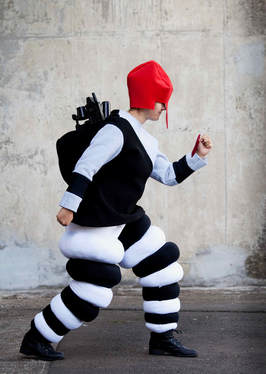 Justene Williams, The Worker (Costume from Victory Over the Sun) 2016, stretch cotton, felt, plastic toys, self- striped felt, drill, dimensions variable, Courtesy of the artist and Sarah Cottier Gallery, Sydney, © the artist There are also a few superb pieces by Erich Buchholz, a German artist who spent most of his life denying that he was a Constructivist, but came closest to them in spirit and ideology. The rest of the show consists largely of Australian and British artists, of a much later generation, who responded to some of the forms and ideas of Constructivism. Sally Smart made her own complex and multifaceted ‘Constructivist puppets’ that engage on a number of planes with ideas of Russian feminists, while Justene Williams recreates costumes for Victory over the sun (1913), the Russian Futurist opera written in a transrational language that celebrated the emergence of a number of Constructivist elements.  Ralph Balson, Constructive Painting 1963, oil on composition board, 90.2 x 136.6 cm, TarraWarra Museum of Art Collection, Victoria, Gift of Eva Besen and Marc Besen AO 2001, © Estate of Ralph Balson Ralph Balson, Frank and Margel Hinder, George Johnson and John Nixon in their art, in different ways, celebrate Constructivist forms. The exhibition curators, Sue Cramer and Lesley Harding, adopt a broad-brush definition of Constructivism, so that Inge King, Victor Pasmore, Anthony Caro, Gunter Christmann, Emily Floyd, Meredith Turnbull, Max Dupain, Olive Cotton, Melinda Harper and Raafat Ishak all somehow fit under the Constructivist banner.  Inge King, Solar Eclipse 2007, stainless steel and colour, 90 x 85 x 47cm, Private Collection, © Estate of Inge King Vladimir Lenin and his enlightened Commissar for Education and Culture Anatoly Lunacharsky may not have personally liked or understood Constructivism, but were happy to tolerate artistic diversity. Some of the subsequent Soviet leaders were incapable of accepting anything other than academic realism. Constructivism never died in the Soviet Union, seeking refuge in typography, filmmaking, photomontage and poster art, but it did take root in the West and ultimately permeated many aspects of art and design. Visiting art galleries and museums: some untimely thoughts 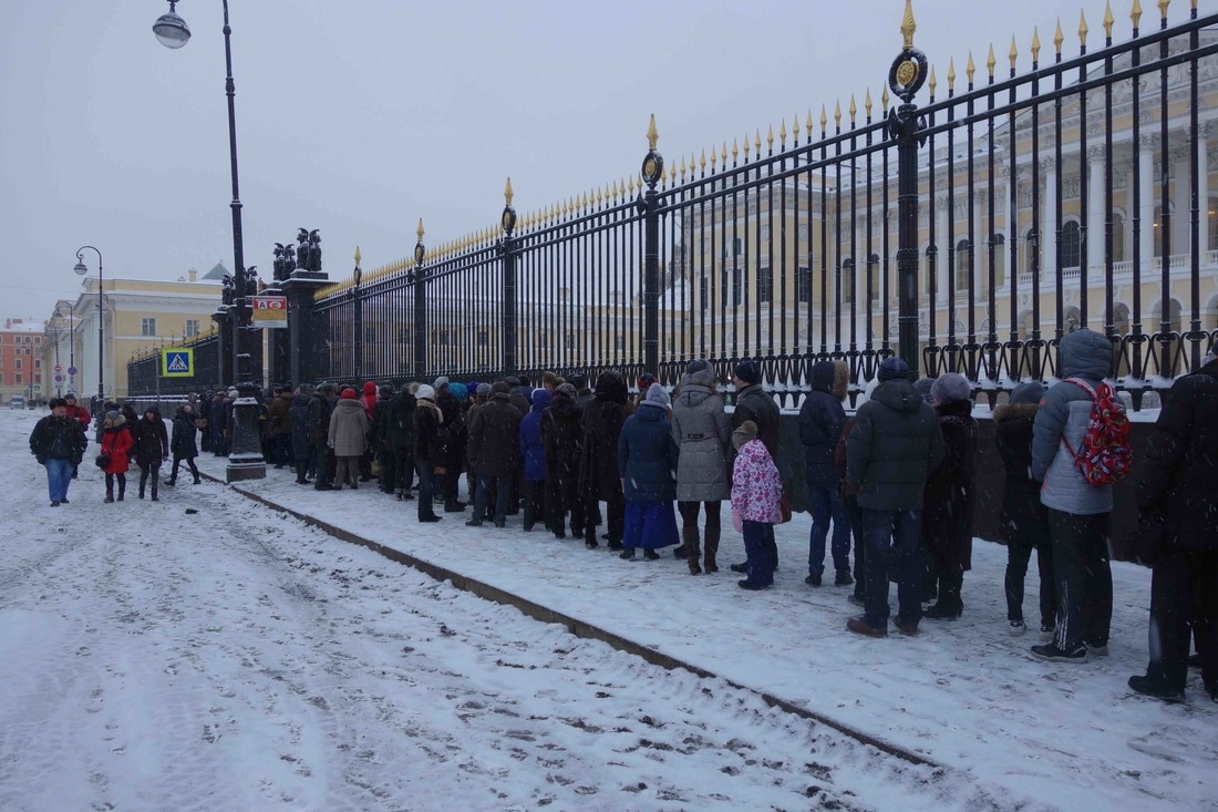 Museum queue in the snow, St Petersburg, Russia, 2017 Amongst museums in Australia, and frankly around the world, attendance numbers are seen as a barometer to success. Leaving aside the Palace Museum in Beijing, which boasted in 2016 an attendance of 16 million visitors, of the major art museums, the Louvre in Paris attracted 7,300,300 visitors, the British Museum a mere 6,820,000 visitors, while the Metropolitan Museum of Art in New York 6,700,000 visitors. The French and British museums saw last year as one of disastrous decline, blaming it mainly on the threat of terrorism, yet in reality all of these museums remained intolerably crowded. The visiting experience of these museums is like getting a cheap seat at the theatre, strategically positioned behind a column, where you can only partially see the stage and hear only a muffled sound. As a private confession, I avoid visiting these three museums unless I can get in outside opening hours or am attending a special function. 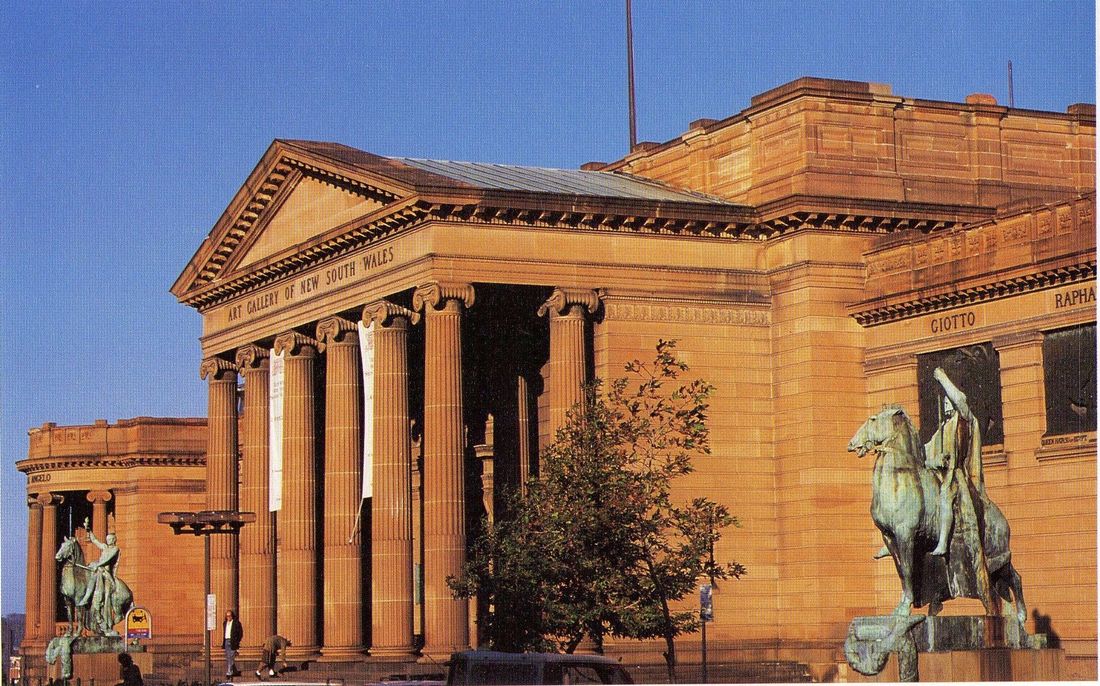 Art Gallery of New South Wales, Art Gallery of New South Wales, Sydney façade In Australia, the problem is still in its infancy with only one museum in the top 25 visited museums in the world, namely the National Gallery of Victoria, which is in the twenty-third spot with 2.3 million visitors in 2014/15. However, spread between two adjacent venues of St Kilda Road and Federation Square, it remains comfortably crowded except during their blockbuster shows, such as Andy Warhol/Ai Weiwei and Vincent van Gogh and the Seasons. After Melbourne, statistically, there is daylight with the Queensland Art Gallery and Gallery of Modern Art and the Art Gallery of New South Wales coming in with about a million fewer visitors. A question arises as to what you want from an art gallery experience. Should it be a quiet, contemplative encounter with art objects, some reserved, others interactive, or should it be more like visiting a fashionable shopping complex with a mixture of glitter, shopping and dining opportunities and the engagement with strong aesthetic experiences. It is difficult, although not impossible, to combine the two. Most of the major art galleries and museums in Australia exhibit only a fraction of their collection and there is pressure to expand to exhibit more of their holdings, to have bigger facilities to host major ‘blockbuster’ exhibitions, and to increase their market share of the lucrative cultural tourism industry. 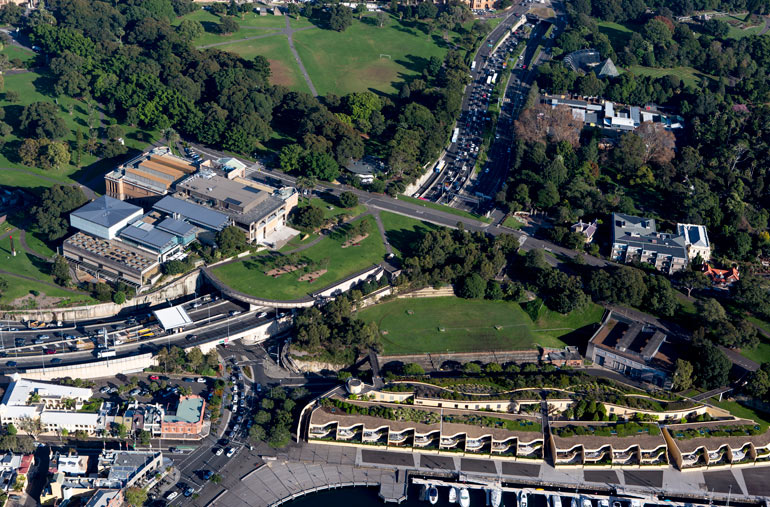 The project site, aerial view of the Gallery, 2015 courtesy AGNSW Both the National Gallery of Victoria and the National Gallery of Australia in Canberra have advanced proposals for major expansions for their respective buildings and are seeking funding, but it is the Art Gallery of New South Wales that has attracted greatest attention. Sydney’s proposal is to build an extension to its existing building, which would be called Sydney Modern, and which would roughly double its floor space. The proposal has been met with considerable vitriol directed as much at the proposal as at its main instigator, Dr Michael Brand, the director of the gallery. Brand, a Canberra boy who trained at the Australian National University and then at Harvard University, came to the Art Gallery of New South Wales in 2012, after a stellar career in Australia and the United States, which included the directorship of the J. Paul Getty Museum in Los Angeles. He succeeded the long-serving Edmund Capon, the flamboyant director who over his 33 years in the job transformed a sleepy provincial institution into a thriving major art institution. It was always going to be a hard act to follow by the media-shy Michael Brand in the footsteps of the self-confessed media junkie Edmund Capon. Brand is a scholar-curator with a brilliant eye and Australian audiences still remember the outstanding exhibitions he curated as the inaugural head of Asian Art at the National Gallery of Australia, including The Age of Angkor: treasures from the National Museum of Cambodia (1992) and the sublime Vision of Kings: art and experience in India (1995). In Sydney, Brand inherited a poisoned chalice where the gallery had lost most of its long-serving curatorial staff, largely under the stewardship of Anne Flanagan, the gallery’s deputy director. There was also pressure to expand the building that saw the birth of the Sydney Modern dream, which would be completed in time for the gallery’s 150th anniversary in 2021. There were a couple of ideological objections to the project and others that were simply born out of personal malice to the new director. The first objection was to the concept of an extension as opposed to a second venue, possibly somewhere in western Sydney. As a personal view, I feel that Sydney needs a one-stop-shop for visual culture; it lacks the depth of collection to parallel the Tate in London, where both Tate Britain and Tate Modern can stage absolutely brilliant exhibitions simultaneously. In the same breath, I would argue strongly for the building of filial branches in Parramatta and Liverpool to show parts of the gallery’s collection. 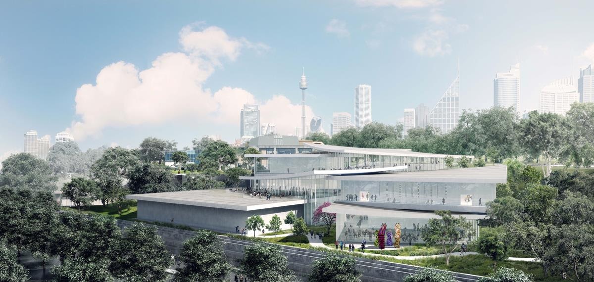 In-progress image of Sydney Modern Project, view from north-east as produced by Kazuyo Sejima + Ryue Nishizawa / SANAA, courtesy AGNSW The second objection is to the site and the proposed building. Some see it as a land grab in the contested territory of The Domain and the building itself as not in harmony with the existing neo-classical mausoleum-like structure.
These are valid objections, but it is difficult to suggest an alternative adjacent site and there will always be objections to architecture that seeks to transform that which we cherish, particularly a shrine to high culture. The pyramid at the Louvre was a costly controversy that in retrospect became a much-copied masterpiece. The architectural team Kazuyo Sejima + Ryue Nishizawa / SANAA for Sydney Modern is highly credentialed and the light-filled ambience of the proposed interior and exterior spaces will create bold and engaging spaces. The criticism of Michael Brand’s managerial style that has been summed up in the recently published little polemical volume Culture Heist: Art versus money by Judith White, the former director of the Art Gallery Society of New South Wales, is not something on which I am competent to comment. Usually there are several sides to arguments of this nature and we certainly have here one side forcibly presented with no shortage of personal vitriol. However, the hope that funding for the project will never be found has evaporated. The NSW government in its June 2017 state budget pledged $244 million dollars to the project leaving the gallery to find the remaining $100 million, of which the gallery has already identified $70 million, which includes a commitment of $20 million from the Susan and Isaac Wakil Foundation. I have little doubt that the extensions will be built and that the crowds will come, but hopefully something of the quiet sanctity of the gallery, and the collegiality of its staff and enthusiasm of its volunteers will be preserved into the future. Brett Whiteley – the film 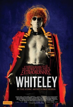 The caption on the poster for this film reads: “If there’s no meaning to life, then you might as well make it extraordinary. Whiteley in the iconic artist’s own words.” Brett Whiteley (1939-1992) was certainly the most public and media-celebrated Australian artist of the 20th century. Following in the footsteps of an authoritative biography on the artist by Ashleigh Wilson in 2016 comes this new feature-length film. While it is advertised as being in the artist’s own words, the director James Bogle skilfully blends rare documentary footage with actors playing the role of Whiteley as a child (Jack Barns), as a youth (Campbell Greenock) and as an adult (Andy Blaikie). The film is presented as the great love story between Brett and Wendy (the latter played by Wendy herself for recent footage and by Jessica White for earlier evocations). The story is set against the background of a spectacular and turbulent artistic career that starts in provincial Sydney, comes to an early culmination in London, where the Tate buys a major painting from the 21-year-old artist, the glitter of New York in the 1960s, where the Whiteley family lives in the penthouse of the Chelsea Hotel, and the subsequent Sydney years where reference to alcohol and drug use adds to the artist’s notoriety and popular cult-like status.  Wendy was not only Brett’s lover and wife, but also his muse and the most significant model in his oeuvre from the mid-sixties through to the 1980s. Her early training at art school provided her with a degree of visual literacy, so that she was not simply the artist’s passive companion, but a knowledgeable collaborator who could share his passions in his journeys through art, his excitement and ultimately his vices. The film sits midway between a documentary and an imaginative re-evocation of the artist’s life and work. Whiteley was more opinionated, than articulate. He was constantly in the public eye giving countless interviews and making sense of the world from his own very idiosyncratic perspective. Art was his real language of expression and here he found a creative freedom in his graphics, huge sprawling paintings, sculptures and installations. The single most important achievement of the film is the exposure it provides to Whiteley’s art, including actuality footage of the artist at work and explaining his creations, but most significantly images of the artworks themselves. The device constantly adopted throughout the film of zooming in on the detail in the work and pausing at length on lush passages of paint or the fluid sensuous line that only hints at form, is effective and at times spectacular. 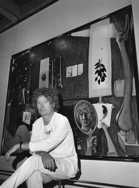 Whiteley is an artist whose colourful biography frequently obscures the seriousness and consistency of his work. He may have produced much painting that was poor and uneven and possibly designed to feed his and Wendy’s drug addiction. These paintings were aimed at art collectors who collected with their ears rather than their eyes and on hearing the magic name of Whiteley opened their wallets like obedient Pavlovian dogs. At his best, Whiteley was brilliant and a major achievement of the film is that it focuses on Whiteley at his best. A viewing of it reminds us that that there is substance in Whiteley’s art and that at times it was terrific. A film of this nature does invariably raise the question whether Whiteley was a completely autobiographic artist. One could argue that Vincent van Gogh, for example, was an obsessively autobiographic artist, where his correspondence with his brother Theo has provided us with a vital clue as to how to interpret his paintings, both in terms of their imagery as well as their emotional and spiritual content. I think that this is equally true in the case of Whiteley. When in Italy or the South of France, London, New York, Fiji and Sydney, the surrounding environment to some extent determined not only what he painted, but also how he painted. In London, it may have been the swinging sixties, but when he came to paint the Bathroom series or the Christie series, it reflected not only the physicality of London, but also the impact of Francis Bacon and the exposure to the art of Pierre Bonnard.  In New York, Whiteley responded both to the excitement and violence of the place in his American Dream (1968-69), a masterwork that drained him of his energy to the point of physical and spiritual exhaustion. While he grappled with American Pop Art and such political artists as Leon Golub, he was also responding to the reports of daily violence in the Vietnam War and the assassinations of President Kennedy and Martin Luther King. This film to some extent attempts to bring together cause and effect in Whiteley’s art, lucid and incisive in places such as when discussing his life in New York, less satisfactory in its treatment of Whiteley in Sydney at Lavender Bay. Here we are introduced to the physicality of the place, but little is said of the surrounding artistic milieu. Although the mentorship of Lloyd Rees is discussed at some length, other artists surrounding Whiteley, including Martin Sharp, are passed over in silence. Whiteley was the most sociable of artists and a larger-than-life figure in the Sydney art scene. James Bogle’s Whiteley is a seductively attractive film that offers us an unusual insight into the life and art of the creative and troubled maverick in Australian art who held our attention for over three decades. With time, we will forget about the drugs and the lifestyle and will come to focus on Whiteley’s art and its lasting legacy. Whiteley: Directed by James Bogle A Northern Pictures Production distributed by Transmission Films The Schoolgirls of Charles Blackman 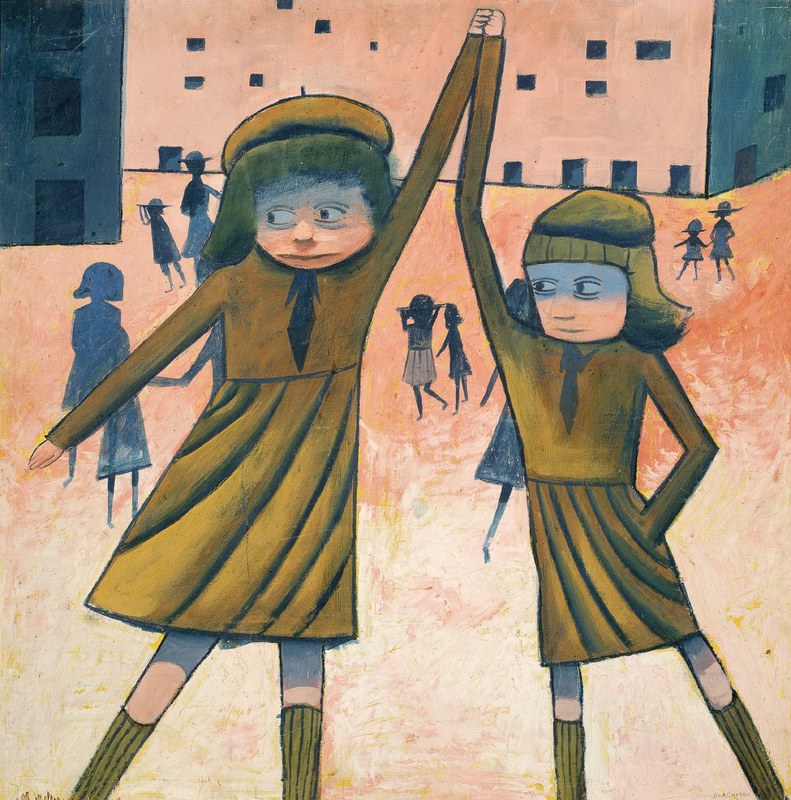 Charles Blackman, The Exchange 1952, oil on plywood on composition board, 91.7 x 91.7 cm, National Gallery of Victoria, Melbourne, Purchased through The Art Foundation of Victoria with the assistance of Dr Joseph Brown AO, OBE, Honorary Life Benefactor, 1997 © Charles Blackman Charles Blackman first came to prominence in the early 1950s when he exhibited his schoolgirl series of paintings and drawings in Melbourne. Although subsequently his Alice in Wonderland series gave him national acclaim, the schoolgirls remained an ongoing source of inspiration and, for the first time, a good cross-section of these paintings and drawings has been assembled at the Heide Museum of Modern Art. 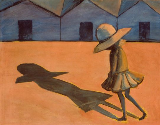 Charles Blackman, The Shadow 1953, tempera on cardboard, 59 x 75 cm, Heide Museum of Modern Art, Melbourne, Purchased from John and Sunday Reed 1980, © Charles Blackman The paintings have aged, perhaps not particularly gracefully, and in their style, conception and execution appear very much of their time. While all art may be a witness of its epoch, Sidney Nolan’s Ned Kelly pictures of 1946-47 are to some extent ageless and today have a contemporary freshness and immediacy of the here and now. The Blackmans belong to the 1950s. The mixture of enamel with oils or tempera on cardboard or masonite is of its time, as is the middle ground on which figurative expressionism, surrealism and traditional representational art meet and combine in an uneasy association. The long-cast shadows, huge eyes, simplified palette and the sense of patterning have a multitude of parallels in preceding European painting, especially Odilon Redon and Marc Chagall, the work of the American Ben Shahn, as well as the Australians Danila Vassilieff, Bob Dickerson, Arthur Boyd, Sidney Nolan, Leonard French, Jon Molvig, Joy Hester and John Brack. 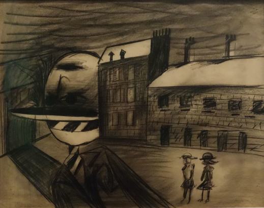 Charles Blackman, Playground at Night (1952), charcoal and crayon frottage on paper, 68.5 x 86.4 cm, Queensland Art Gallery| Gallery of Modern Art, Brisbane, Gift of the Queensland Art Gallery Society 1985, © Charles Blackman The Sydney-born Blackman, by the time he was twenty, moved up to Brisbane where he met his future wife Barbara née Patterson with whom he moved and settled in Melbourne in 1951. Speaking of his schoolgirl series, in retrospect, to the poet Thomas Shapcott, Blackman observed “I just started drawing my schoolgirl pictures; they just came out. That was it. It takes a long time to get to the door; once you pass through the veil or once you pass through the surface of the idea then it all comes pouring out. The schoolgirl pictures had a lot to do with fear, I think. A lot to do with my isolation as a person and my quite paranoid fears of loneliness and stuff like that; and indeed you could almost say why I painted them.” Apart from this cathartic quality, while already working on the series, Blackman was introduced to the wonderful verse of John Shaw Neilson by Sunday Reed, that seemed to give him permission to project his own feelings for loneliness and alienation into his subject. In fact, he quoted Neilson’s Schoolgirls hastening, as the epigraph for his exhibition: Fear it has faded and the night. The bells all peal the hour of nine. Schoolgirls hastening through the light Touch the unknowable divine 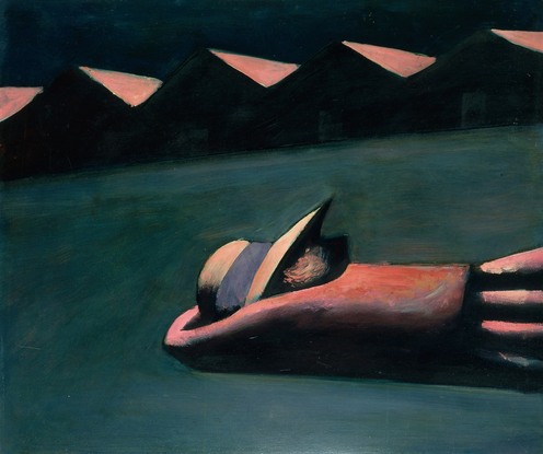 Charles Blackman, Prone Figure 1953, enamel on hardboard, 79 x 93.5 cm Heide Museum of Modern Art, Melbourne, Purchased from John and Sunday Reed 1980, © Charles Blackman It has been well-documented that Blackman was aware at the time of the abduction and murder of children, as well as of the murder of a student friend of his wife, and a menacing and sinister note permeates many of the works. There is a quality of a haunting presence, where the schoolgirls seem trapped within a disturbing claustrophobic space – the encounter of innocence with a world in which danger and an oppressive feeling of unease lurk. However, for all of this sense of imminent menace, Blackman’s schoolgirls exist within an age of political innocence.  Charles Blackman, Schoolgirl at Kooyong c.1953, charcoal on paper, 68.9 x 76.9 cm, Heide Museum of Modern Art, Melbourne, Purchased from John and Sunday Reed 1980, © Charles Blackman Today, the idea of a male artist making a major series of paintings about schoolgirls, or about any sort of children, sits uncomfortably with the public. It may have been the unenlightened stupidity of politicians that gave oxygen to the shameful Bill Henson episode, but there was enough public suspicion and vitriol to permit the issue to run in the public arena. I remember once asking John Brack why there were so many images of schoolgirls in his art and that of his contemporaries in the 1950s and, instead of some profound existential answer, he simply sighed and pointed out to me that at the time he had four young daughters and many of his peers also had children and, coincidently, most of them had a predominance of daughters. Blackman may not have been portraying his own children; his first daughter Christabel was not born until 1959 and his first son Auguste in 1957, and may have projected his own fears and anxieties onto schoolgirls as a convenient visual metaphor, but public perception has swung so markedly that it leaves little room in serious art making for a Chagall or Blackman painting adolescent girls. Back in the 1950s Blackman was more under attack for his style and technique, than for his imagery.  Charles Blackman: Schoolgirls, installation view, 2017, Heide Museum of Modern Art, Melbourne, Photograph: Christian Capurro As I moved around the exhibition what I admired the most was Blackman’s ‘awkwardness’ in draughtsmanship, the images may have flowed out once the floodgates of the imagination opened, but the drawings have the quality of constant toughness.
About the paintings, the artist noted his “great struggle with the paint” and one can see evidence of constant experimentation, grittiness of the surfaces and a fecundity of invention. I think of them as some of the best paintings that he ever made, at a time before his style became mannered and the sugar content in the imagery increased. While it is possible in Blackman’s Schoolgirl series to detect a myriad of sources and influences, which one would anticipate in the work of an artist aged in his early twenties, they are some of the most memorable and original works to appear in Australian art in the early 1950s. Charles Blackman: Schoolgirls Heide Museum of Modern Art 4 March – 18 June 2017 This blog is being published in conjunction with The Conversation https://theconversation.com/profiles/sasha-grishin-143423 Institutions exhibiting contemporary Australian art 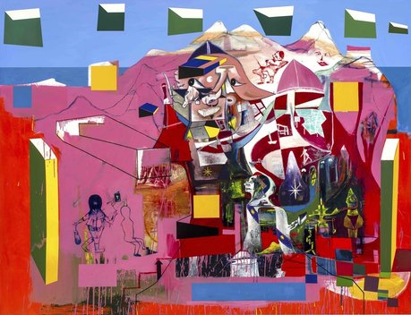 Gareth Sansom, A universal timeless allegory, 2014, oil and enamel on linen, 213 x 274cm; Private collection, Brisbane. Courtesy the artist and Milani Gallery, Brisbane. photo: Sam Cranstoun [Adelaide Biennial 2016] When the National Gallery of Victoria presented its Melbourne Now exhibition, late in 2013, it was greeted with a mixed critical reaction. Personally, I was very supportive as I love going to a high calibre exhibition in a major art institution where more than half of the 450+ participants are unfamiliar to me. It was dazzling and with a huge ‘wow’ factor even if, in retrospect, it may have appeared somewhat rushed with many major artists excluded and some of the more marginal ones given too much emphasis. What was exciting was the broad-brush approach and the preparedness for a leading Australian art institution to put on its walls and gallery spaces new, emerging and established local artists and designers. Later in 2017 the Melbourne gallery will present its inaugural NGV Triennial which will bring together 78 artists from 32 countries, but with only nine artists from Australia. 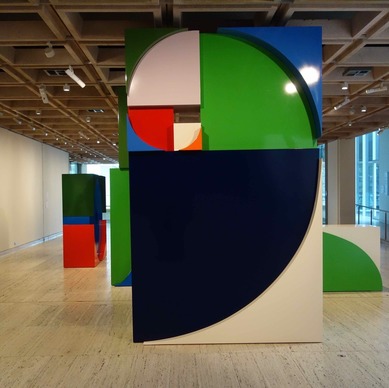 Emily Floyd, Kesh alphabet, 2017, aluminium, two-part epoxy paint, steel fixtures, screen prints on paper, AGNSW The Adelaide Biennial kicked off in 1990 and, apart from the Art Gallery of South Australia, by 2016 it had spread to the Anne & Gordon Samstag Museum of Art at UniSA, JamFactory, Carrick Hill and the Santos Museum of Economic Botany in the Adelaide Botanic Gardens. More tightly curated than Melbourne Now and national rather than regional in its orientation, the focus has been on the more established names, rather than the emerging and potentially surprising revelations. Highlights in 2016 included Abdul-Rahman Abdullah, Pepai Jangala Carroll, Louise Haselton, Loongkoonan, Danie Mellor, Nell, Ramesh Mario-Nithiyendran, Gareth Sansom, Robyn Stacey, Garry Stewart and the Australian Dance Theatre, Tiger Yaltangki and Michael Zavros. The appointment of Erica Green (Director of the Anne & Gordon Samstag Museum of Art) as curator of the 2018 Adelaide Biennial means it will be in a safe pair of hands with another strong crowd-pleasing selection. 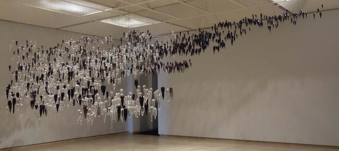 Yhonnie Scarce, Death Zephyr, 2017, hand blown glass yams, nylon and steel armature, AGNSW Australian art has always been the Achilles’ heel of the Sydney Biennale since its inauguration in 1973. Its primary function was to bring Australian artists and art audiences up to date with the latest developments in international art (such a 1950s notion!) and include Australian artists that would usually make the international selection look good. Despite the generosity of its main sponsors, the Sydney Biennale has always been poorly funded and appeared as the poor cousin of the big biennials and triennials abroad and decisively shabby compared with big art fairs such as the Frieze circuit and the Art Basel circuit. The Australian Perspecta commenced as a biannual exhibition in 1981, held in alternate years to the Biennale, and designed as a showcase for contemporary Australian art practice. When the Australian Perspecta moved out of its home at the Art Gallery of New South Wales to take on other venues in Sydney, following in the footsteps of the Biennale, it seemed to lose focus and definition and quietly folded in 1999. Since then Sydney has had no regular exhibition dealing exclusively with contemporary art practice, at least until now. 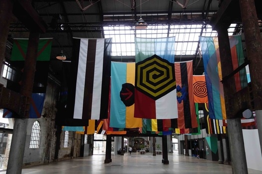 Archie Moore, United Neytions series, 2014–17, polyester, nylon, zinc-plated alloy, Carriageworks The National: New Australian Art opened across Sydney in April 2017 at three venues – the Art Gallery of New South Wales, the Museum of Contemporary Art and the Carriageworks. The name is silly, as I pointed out in my review for the Fairfax media, a cross between a political party and the antiquated idea of a national school of art, but it is accompanied with a sensible catalogue and an excellent website. It is a collaborative exhibition, which is equally funded by the three venues, with funding committed for six years, in other words for two more biennials. It is national, with artists selected from every state and territory, and the selection was made by five curators from these institutions, namely, Anneke Jaspers and Wayne Tunicliffe from the Art Gallery, Lisa Havilah and Nina Mial from the Carriageworks and Blair French from the Museum of Contemporary Art. Apparently, these curators established a checklist of about 200 names, which was whittled down to the 48 artists included in the exhibition. For the next biannual there will be a new set of curators. Unlike Adelaide, there are no ‘golden oldies’ in the mix but, unlike Melbourne Now, there are no real surprises. They are all artists known around the traps with an average age in the forties. The geographic spread also dilutes any real focus and, to betray a personal prejudice, I feel that the state galleries should in shows of this nature first and foremost represent artists from their region and leave the national picture to the national institutions in Canberra. This said, there is much in the selection of artists to recommend the exhibition. Going by institution, at the Art Gallery in the foyer are powerful and confronting large-scale paintings by the late Gordon Bennett interrogating the use of Aboriginal patterns in decorative arts for white people proposed by Margaret Preston. 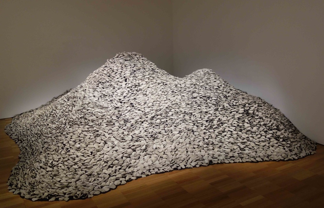 Megan Cope, RE FORMATION part 3 (Dubbagullee), 2017, Sydney rock oysters, copper slag and hand cast concrete, AGNSW Emily Floyd’s Kesh alphabet, for all of its imposing polychrome monumentality, is really quite a funny piece about a female orgasm as expressed in the fictitious feminist language of Kesh. Downstairs is Yhonnie Scarce’s amazing installation Death Zephyr, where a vast array of hand-blown glass elongated long yams, bush bananas and bush plums, relating to this artist’s Kokatha and Nukunu heritage with her land adjoining the prohibited zone of the test site at Maralinga. The whole thing hovers like a menacing dark, toxic cloud. Megan Cope, a Quandamooka Nation artist, in her Re Formation part 3, (Dubbagullee) builds a large mound of cement-cast oyster shells layered with black sand and copper slag. Indigenous shell monuments made of oyster shells were destroyed by colonial settlers and were frequently burnt for lime to make cement. It is one of those pieces where the attractive bewildering intricacy of detail conceals a dark force, a sense of longing for that which is now lost. One could observe that each venue carries the traces of its own DNA, the sense of tradition and collection at the Art Gallery, for example Bennett references Preston in his paintings; at the Museum of Contemporary Art, the sense of design, installation and the conceptual, for example Gary Carsley, Marco Fusinato and Peter Maloney; while at the Carriageworks, the idea of performance, industrial scale and Indigenous heritage, such as the flags and banners of Archie Moore and the brilliant performances by the veteran Kimberley artist, Alan Griffiths. 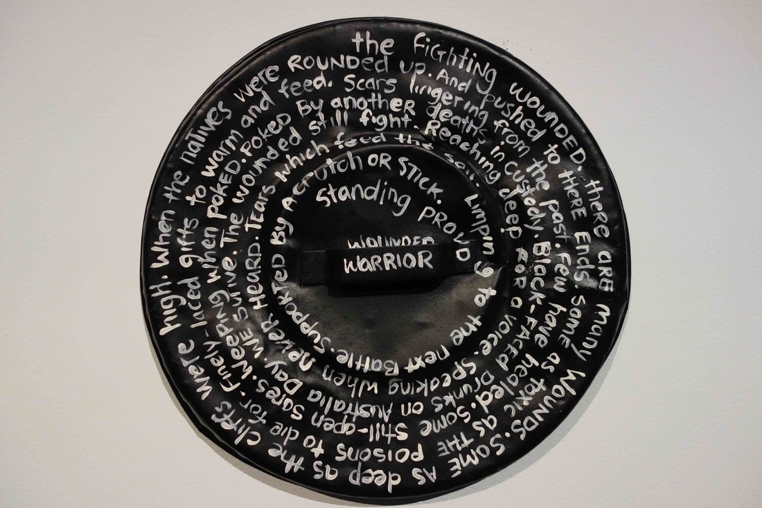 Karla Dickens, Fight Club series, 2016 synthetic polymer paint on steel, Carriageworks At the Carriageworks, I was captivated by the work of the Wiradjuri artist Karla Dickens. I was familiar with her fabric work, but the Fight Club series is striking and unexpected. The series consists of eight metal rubbish bin lids, painted black, on which are inscribed in white lettering powerful blank verse as a continuous clockwise script. The lids appear like modern urban shields highlighting the culture of violence in Australian society.
The Museum of Contemporary Art has a number of memorable pieces including Julia Gough’s The gathering, a powerful and evocative video installation about loss in her native Tasmania and Matthew Bradley’s wacky homespun installation, like a handmade junk heap. Ronnie van Hout, a New Zealander based in Melbourne, creates a complex room-size installation on the principle of “when in doubt, put it in”. Highly self-referential in many of its aspects, the piece negotiates a space where gothic horror meets the uncanny and the surreal. It is powerful, disturbing, eerie and quite unsettling, even in small doses. For me, the brickbat award goes to Khadim Ali’s Arrival of demons mural in the entrance staircase of the museum. The only redeeming feature is the knowledge that it will be replaced in twelve months and, in the meantime, it will attract countless selfies for those who are drawn to pretty glam horror. Khadim Ali’s piece is an acquisitive site-specific installation, however many of the other exhibits are non-acquisitive commissions made for this exhibition. The National is a serious attempt made to revive the Australian Perspecta model and highlights the critical need for dedicated exhibitions of contemporary Australian art practice, which lack the constraints of commercial art galleries and art fairs and the hidden irrelevance of many of the small art spaces. Although it is largely dedicated to ‘biennale-style art’ it is a step in the direction of making local Australian visual culture accessible to the local population. The fact that major art institutions can collaborate on a single show must be a good thing for the future health of Australian art. |
GRISHIN'S ART BLOG
Sasha Grishin AM, FAHA is the author of more than 25 books on art, including Australian Art: A History, and has served as the art critic for The Canberra Times for forty years. He is an Emeritus Professor at the Australian National University, Canberra; Guest Curator at the National Gallery of Victoria, Melbourne; and Honorary Principal Fellow, Faculty of Arts, at the University of Melbourne. Archives
September 2023
Categories
Keep up-to-date with Sasha Grishin's blog with the RSS feed.
RSS offers ease of access and ensures your privacy, as you do not need to subscribe with an email address. Click here to download a free feed reader |
 RSS Feed