Grishin's Art Blog (GAB)
Sydney Contemporary 2023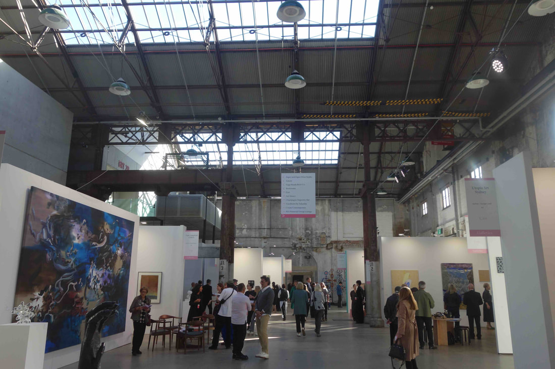 Sydney Contemporary, 2023 photo S. Grishin Globally, art fairs have moved from a sideshow in the art scene to becoming the main game in the arts calendar, frequently making a critically significant contribution to the financial viability of many a commercial art gallery. Sydney Contemporary this year boasts of representing 96 galleries (mainly from Australia, New Zealand and Asia), displaying the work of over 500 artists through several thousand artworks. Sydney’s Carriageworks, home for many art exhibitions, is not ideally suited for an art fair with many galleries squeezed into unsympathetic spaces, but somehow the whole crazy event just works. 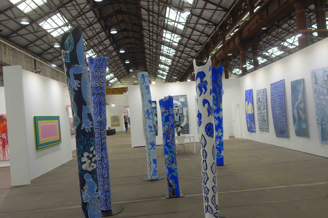 Roslyn Oxley9 Gallery, Dhambit Munuŋgurr, Sydney Contemporary, 2023 photo S. Grishin Art galleries with deep pockets, for example, Roslyn Oxley9 Gallery, can stage a memorable display, such as the work of the Yolgnu artist Dhambit Munuŋgurr, but most are stuck in smaller and unsympathetic booths. A basic 30 square metre booth will set a gallery back $18,750 + GST, while the hire of a larger space, like 110 square metres, costs $68,750 + GST. Add to this freight, installation costs, furnishings, staffing, insurance and electrical connections and the total cost becomes formidable for this five-day event. The benefits for a commercial art gallery are fairly obvious – visibility, sales and networking. According to Sydney Contemporary marketing, last year the event attracted over 28,000 visitors and art sales over the five days amounted to about $23 million. Public visitation does not come cheaply with a basic admission ticket $39, while if you wish to come to the art night, it will cost you $65. 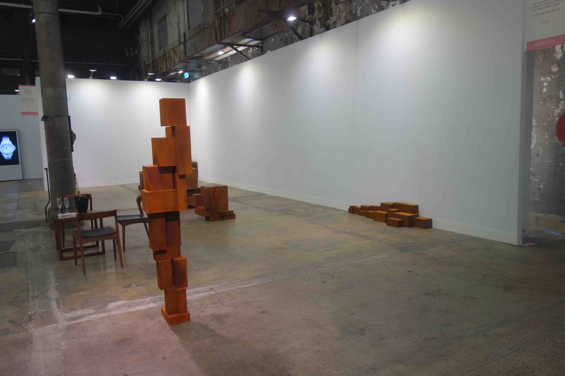 Antony Gormley’s installation, Wrestling with Modernism, Sydney Contemporary, 2023 photo S. Grishin This year’s iteration of Sydney Contemporary does not appear quite as ‘dazzling’ as some of the earlier events, but it is densely packed and, to some extent, it is the place to be if you want to take the pulse of the contemporary, non-institutional art scene. After four-and-a-half hours, I cannot swear that I visited every gallery or saw every artwork on display, but I was suffering from a severe case of visual overload. There is some good art – even great art – tucked away amongst the stands, as well as a fair amount of rather thin, glittering dross. This year is less a case of large, stellar pieces that etch themselves in your memory and more the case of tucked away gems within the labyrinth of booths. The highly promoted Antony Gormley installation, Wrestling with Modernism, is not displayed to advantage and you have to free yourself of the surrounding visual distractions to enjoy the undoubted power of the work. 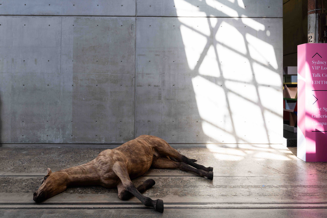 Abdul-Rahman Abdullah’s wooden Dead Horse, photo Wes Nel Abdul-Rahman Abdullah’s wooden Dead Horse is a virtuoso piece in execution, but a little tiring after the conceit of the materials is realised. Similarly, Alex Seton’s series of chandeliers in Trying to Reinvent Themselves and Their Universe is clever, rather than convincing. Sam Jinks’ Iris – the messenger was originally commissioned by the Hellenic Museum five years ago, now other copies in the edition are for sale at Sydney Contemporary. The supersized, hyperreal crouching female nude with improbably huge golden wings gazing into a pool is over-the-top in any frame of reference. It is certainly exquisite in execution and would probably feel at home in some exclusive suite in Trump Tower in New York. 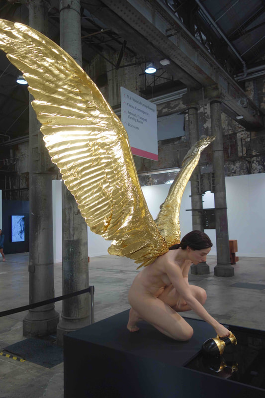 Sam Jinks, Iris – the messenger, Sydney Contemporary, 2023 photo Wes Nel All of these pieces command immediate attention, a bit like hotel foyer art, and then are promptly forgotten. Possibly betraying a personal bias, I found the Paper fair at Sydney Contemporary, (down the corridor from the main entrance), a breath of fresh air. Curated by the remarkable Akky van Ogtrop, within this large room and a foyer space, there must be about twenty booths that celebrate some of the best in contemporary printmaking. It is also here that you can pick up brilliant original contemporary artwork for a couple of hundred dollars directly from the makers at the Print Council of Australia and the individual printing presses from throughout Australia. It is some of the smaller gallery booths, for example Charles Nodrum Gallery, Art Collective WA, Michelle Perry Fine Arts and Nicholas Thompson Gallery, that are more densely packed with visual surprises of a high order. Galleries generally grapple with the problem of whether to present a ‘showbag’ of artists from their stable, or to focus on a knockout single-artist show. My impression is that the new economic reality may have encouraged more galleries to adopt the first path in the hope that there will be at least something that may seduce some of the visitors. 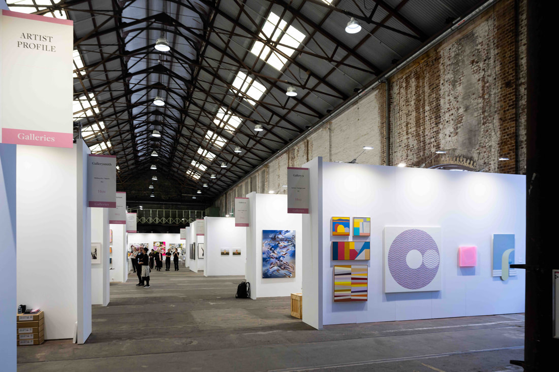 Sydney Contemporary, 2023 photo Wes Nel In an art fair, where you are largely looking at the work of established artists represented by the major commercial art galleries, you are unlikely to discover new blood – young emerging artists. What you do find is artists that you know, but whose new work you have not seen recently. In this category, with great delight I enjoyed the recent paintings of Tim Bučković, the brilliant stitched collages of Eveline Kotai and the quirky knitted sculptures of Troy Emery. There are a lot of things that I don’t like about art fairs, but if you are interested in contemporary art and have the need to feel the pulse of contemporary art, a visit to Sydney Contemporary is a must. Sydney Contemporary, Carriageworks, September 6-10, 2023 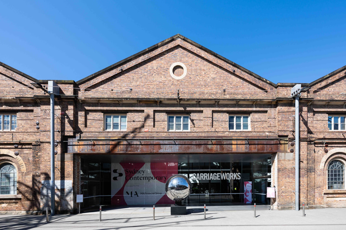 Sydney Contemporary, exterior, 2023 photo Wes Nel
8 Comments
The Canberra Times – an end of an era 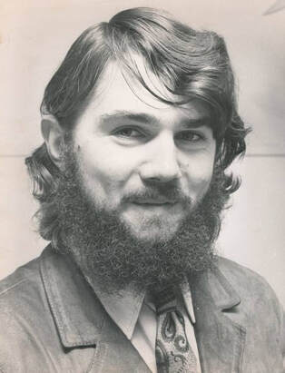 Sasha Grishin, 1977, photographer not known Late in January 1977, I received a phone call from Ian Mathews introducing himself as the editor of The Canberra Times and inviting me to pop into the office for a chat. The chat was as rewarding as it was surprising. I had just been appointed to the ANU, after studies in art history at the universities of Melbourne, Moscow, London and Oxford, to set up a Department of Art History, initially called the Fine Art Program. Of the many people I met in my first days at the university was the amazing Arthur John Birch, the world-famous organic scientist. Birch apparently mentioned me to Ian Mathews and Mathews promptly offered me a job as the Senior Art Critic for The Canberra Times. Having a passion for contemporary art, it was an invitation too good to turn down, but being aged in my mid-twenties and with quite a bit on my plate, I asked if I could ‘appoint’ specialist writers to write alongside me in dedicated areas such as crafts, photography and new media. Mathews, a man of great charm, intellect and integrity, readily agreed and my fruitful collaboration with The Canberra Times commenced. By fruitful, I mean it lasted for over 46 years and resulted in about 3,500 exhibition critiques, articles, interviews and book reviews. 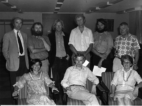 Sasha Grishin with ANU colleagues 1977, photographer not known I have not researched the history of art critics writing for this paper, but I gather that it goes back about seven decades. Professor Donald Brook started writing for the paper in 1962 and my immediate predecessor was the distinguished painter and teacher Geoffrey de Groen. On my watch, until very recently, there was an arts editor at the paper who fought on all fronts to give the arts a high profile in the nation’s capital and, within the paper, fought against the encroachments from other interest groups. The Canberra commercial art gallery scene, as well as the institutional galleries – tertiary, local government and federal – thrived on the public discourse. I have heard many times, artists telling me that they exhibited or performed in Canberra because they knew that they would be reviewed, unlike in some other cities. Arts critics, theatre critics, music critics, dance critics and book reviewers were all professionally trained in their areas of expertise and clocked up many years of experience. 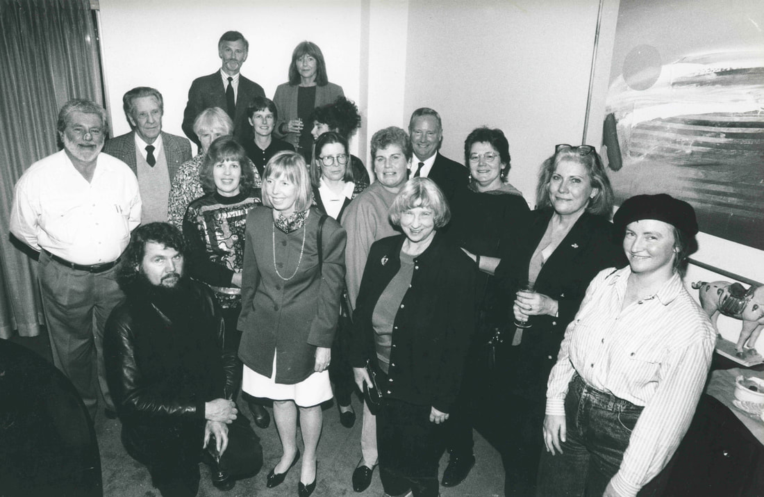 Arts Editor and some contributors to The Canberra Times, not dated, photographer not known The paper’s journalists were great in attending media previews and interviewing artists, curators, directors, authors and musicians and drumming up publicity for the various events, but they were certainly not part of the critical discourse. They informed readers that an event was on or a book had been published or an exhibition was about to open, but they were not in a position to assess it, evaluate it and inform professionally the newspaper’s audience. One of the few pieces of guidance provided to me by Mathews was not to use, as a critic, an expression like ‘cutting edge’, ‘it was too journalistic’. The Canberra Times was at the centre of the city’s cultural hub and was relevant to the lives of Canberrans interested in the arts and that was, and remains, the majority of Canberrans. More people in Canberra are interested in the arts and attend arts events than sports events, although one does not exclude the other - I go to both. It follows that more of a newspaper’s pages should be devoted to the arts than to sports, unless a case can be made that people interested in the arts in Canberra choose not to read this paper and those interested in sport do.  Sasha Grishin with Betty Churcher and friends, 1993, photographer not known As an art critic writing over the past 46 years, I cannot claim that I got it right every time, but I did write with honesty and to the best of my abilities. My near annual trips abroad, to Europe and New York, meant that I was largely up to date with what was happening in the art world and writing for about 30 other art journals nationally and internationally did provide a critical context for what I was saying domestically. Nevertheless, I always keep in mind what Clement Greenberg told me when, very early in the piece, I asked him what it was like to be an art critic; he said it was ‘the experience of a person who learns in public.’ On 15 May 2023 I received an email from The Canberra Times’ Features Editor that the paper is “cutting a lot of physical pages from the print product, and cutting down drastically on outside contributors across the board” and could I come in for a chat. It sounded ominous and I had already heard of cuts in music, dance and theatre reviews. I anticipated that this would be the end of my career as an art critic for the paper. Friends debated whether after 46 years of faithful service and being paid only a symbolic remittance, I would be given a gold watch or some suggested a gold-coloured biro. Both proved wrong and at our meeting I was told not to take it personally that this was purely a cost-cutting measure. From now on, there would be no reviews published in the paper, except on exceptional occasions where they could possibly call on me. Otherwise, they would only be publishing previews written by the paper’s reporters. No watch, biro or even cup of tea, not even a word from the editor.  Sasha Grishin at the NGA 2014 photo Andrew Sikorski Each newspaper makes its own financial decisions based on marketing data and assumptions not available to the rest of us. The proof will lie in the pudding. If there is no widespread outcry and only a few hundred subscribers will not renew their subscriptions and a few galleries will withdraw their limited advertising the matter may end there. If there is a major outcry and the paper’s existence looks as if it is under threat, decisions may be reversed. The paper has abandoned the arts community and the arts community will abandon the paper as it has become a paper without a soul. There is also now an opportunity for one of the major interstate media players to move in and bring out a weekend Canberra edition complete with arts coverage – time will tell. Personally, I’m saddened by these developments when 70 years of tradition is discarded for very minor savings, especially in this digital age where column space is no longer expensive. Surely a simple option would be for the arts to go digital and to encourage the arts community to take out digital subscriptions. For myself, there are other publishing outlets that I will keep on using and I will look out for others, however, I feel sad that the Canberra art scene has lost an important cultural voice in The Canberra Times. Rembrandt: True to Life  Rembrandt, Self-portrait 1659, oil on canvas, 84.5 × 66.0 cm, National Gallery of Art, Washington, DC Andrew W. Mellon Collection Photo: National Gallery of Art, Washington, DC Few would dispute that Rembrandt is one of the greatest artists in the Western tradition of art. His wonderful oil paintings, The Jewish Bride, The Night Watch and some of the superlative self-portraits are amongst the gems that illuminate any traditional account of art history. What is less well-known is that Rembrandt was an outstanding printmaker, arguably the greatest etcher of all time. Some would argue that perhaps Rembrandt’s greatest contribution to art was not as a painter, but as a printmaker. 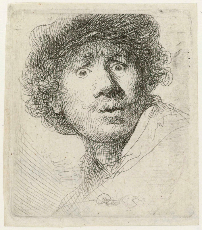 Rembrandt, Self-portrait in a cap, wide-eyed and open-mouthed 1630, etching 5.0 × 4.5 cm. Rijksmuseum, Amsterdam, Photo: Rijksmuseum As a young art history student in Melbourne, I had the privilege of taking Ursula Hoff’s course on Rembrandt and she, as the Keeper of Prints and Drawings at the National Gallery of Victoria, had an unrivalled knowledge of Rembrandt and was partly responsible for building up one of the greatest collections of Rembrandt’s etchings anywhere in the world. This exhibition, Rembrandt: True to Life at the NGV brings together about 100 prints from the gallery’s collection with significant loans of paintings, prints and drawings from the Rijksmuseum in Amsterdam, the National Gallery of Art in Washington DC, the Louvre Museum in Paris, the Kunsthistorisches Museum in Vienna, and the Teylers Museum in Haarlem. It is a brilliant exhibition that is worthy of the trip to the NGV and although physically it is a discreet show – it is intense and focused – it will require several hours of inspired viewing. What was it about Rembrandt that made him into such a brilliant etcher? He made over 300 etchings and drypoints, so seeing about a third of his print oeuvre at this exhibition, accompanied by some of his drawings, oil paintings and contextual pieces, makes this into a significant Rembrandt show by international standards. 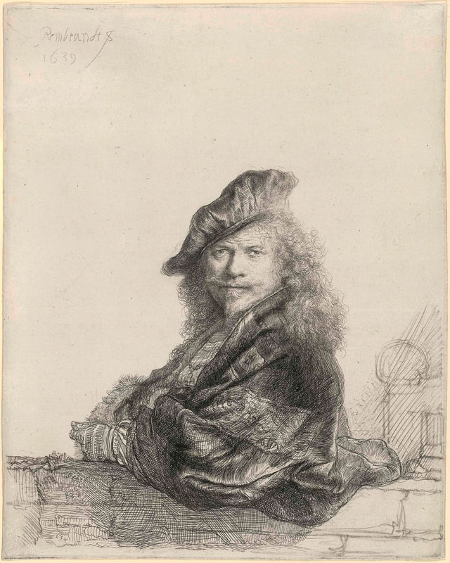 Rembrandt, Self-portrait leaning on a stone sill 1639, etching, touched with black chalk, 1st of 2 states, 20.5 × 16.4 cm (plate), National Gallery of Victoria, Melbourne, Purchased, 1891, Photo: NGV In the 17th century, many of Rembrandt’s contemporaries, including Peter Paul Rubens, made some of their money through reproductive engravings and etchings of their paintings. Rembrandt, after a couple of early failed attempts, realised that he was incapable of copying himself, and for him painting and printmaking ran as parallel but separate streams of creativity. What he attempted in painting, he did not repeat in etching, and some of his greatest achievements in his etchings, he did not attempt in his paintings. In other words, Rembrandt realised that painting and etching had their own unique pictorial languages, and one should not attempt to do in painting something that is unique in etching. There are no bad Rembrandt etchings and each work in this exhibition calls for special discussion. Rather than presenting a chronological survey and pausing on the tragic circumstances of the artist’s life, I mention a few prints that I truly love. 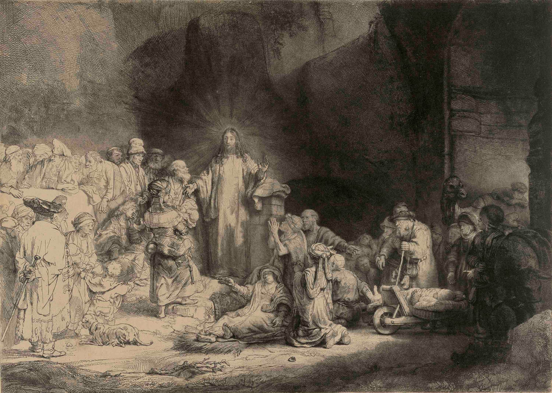 Rembrandt, Christ with the sick around Him, receiving little children (The hundred guilder print) c. 1648 etching, drypoint and burin on Japanese paper, 2nd of 2 states, 28.1 × 39.4 cm (plate) National Gallery of Victoria, Melbourne, Purchased, 1891, Photo: NGV Rembrandt’s Christ with the sick around Him, (The hundred guilder print) c 1648, an etching with drypoint on Japanese paper, is one of his most celebrated works. People who are given to hyperbole describe it as his equivalent in printmaking to his Night watch in painting, while the popular title, the 100 guilder print, in part refers to a literary tradition that Rembrandt had to buy back a copy of this print for this huge sum of money, and in part refers to the difficulty in identifying the subject matter. This is Rembrandt’s most ambitious religious composition in any medium and one on which he worked for several years. The literary source appears to be the Gospel according to St Matthew, chapter 19, where he married together several episodes. On the right-hand-side of the etching is the reference to the great multitudes who followed Christ and “he healed them”. On the far left are the Pharisees who tempted Christ to condemn divorce, with two mothers bringing their children to Christ to be blessed and when the apostles try to restrain them, Jesus rebukes them “Suffer little children, and forbid them not, for such is the kingdom of heaven.” Between the two mothers we see the pondering figure of the rich young man who wishes for eternal life, but who is troubled by the thought that he must sell all his possessions and give them to the poor. This may explain the strange image on the right of the camel in the gateway that it is easier for a camel to go through the eye of a needle than it is for a rich man to enter the Kingdom of God. The chapter in the Gospel ends with the words: “many that are first shall be last, and the last shall be first” and in Rembrandt’s etching the humble and the afflicted are visually dominant over the rich and the powerful. 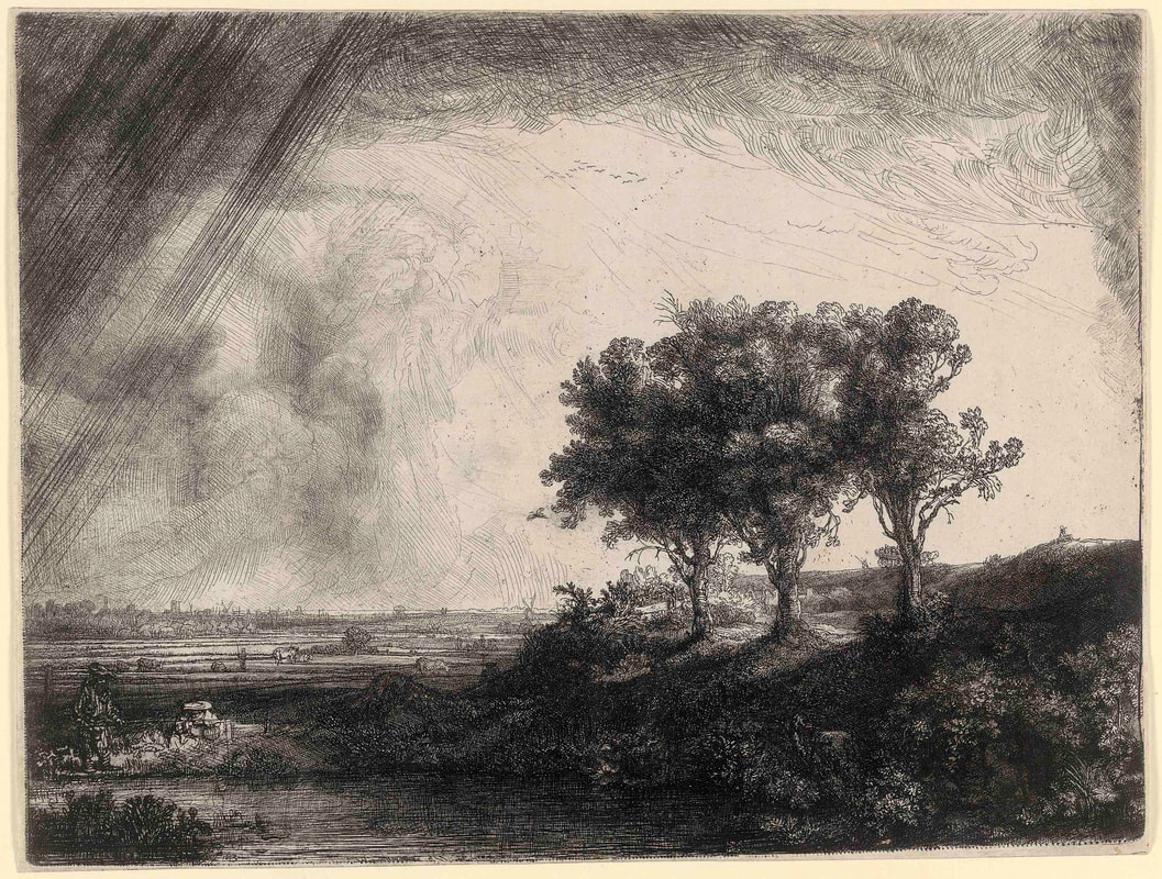 Rembrandt, The three trees 1643, etching, drypoint and burin, only state, 21.3 × 28.0cm, National Gallery of Victoria, Melbourne, Purchased, 1891, Photo: NGV Rembrandt worked on this composition over several years with preparatory drawings dating from 1639 to 1649. Despite the studies, the final resolution of the print Rembrandt worked out on the plate itself and numerous scholars have noted the changes and trace elements of earlier impressions. Christopher White in his masterly analysis of this print in the two-volume publication Rembrandt the etcher notes: “Rembrandt, having bitten the plate at least twice to obtain a contrast in tone, went to work directly on the plate. The figures of the Pharisees on the left are most lightly bitten, and tonally present the one discordant note … The group of figures immediately below them, and to the right of them, are in the same style but have been partly redrawn in drypoint … the figure of the rich man … appears to have been drawn entirely in drypoint and burin in an extremely fine mesh of strokes … This is the first major work in which light and shadow were to attain such expressive power.” It is also worth noting that this was the first print which he made on Japanese paper which was being for the first time imported to the Netherlands – less absorbent and less coarse fibred than European papers, Japanese papers were ideal for registering every nuance in tone in impressions which Rembrandt painted with printer’s ink on the copper plate. Rembrandt’s The landscape with three trees, 1643, is the largest and most ambitious of the master’s landscapes (22 x 28 cm), where the dramatic chiaroscuro which he had developed for the interior religious scenes, he has applied to an outside setting and to nature. The title, one given to the print in the 18th century, somehow takes away from the full complexity of the composition. Although the scene may be set within the recognisable countryside outside of Amsterdam, it is more to do with the dramatic grandeur of nature. Here indicated by the mobility of light as the towering clouds in the distance seem to be drawing up water from earth, with visible streaks of rain, something which had never been attempted earlier in printmaking. Although it is the landscape which dominates all, it is nevertheless an inhabited landscape which the viewer will explore – like in the lower right, in the gap in the shrubbery are two lovers; on the left, on the edge of the foreground body of water are a fisherman and his wife; in the dale beyond the three trees is a cottage, while on the crest on the horizon is a wagon filled with travellers, on the far right is a seated draughtsman sketching the landscape. Cattle and herders can also be made out, as well as the outlines of a great city, but all reduced to insignificance by the grand landscape and the huge sky above it. Rembrandt here employs etching, drypoint and engraving and gives the landscape the dignity usually reserved for narrative history paintings. 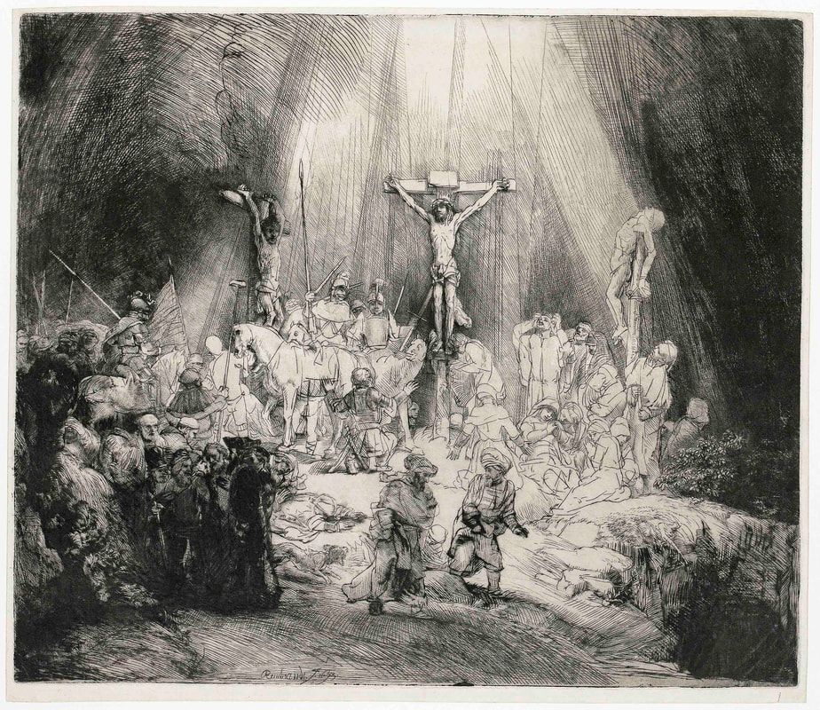 Rembrandt, Christ crucified between the two thieves: (The Three Crosses) c. 1653–55, drypoint, burin and plate-tone, 3rd states, 38.6 × 45.3 cm (sheet, trimmed to platemark) Rijksmuseum, Amsterdam Photo: Rijksmuseum Rembrandt’s culmination as a printmaker is generally associated with a very large drypoint plate, Christ crucified (Three crosses) on which he worked from 1653 (first state) to 1660 (final state) measuring 39 x 45 cm. As art historians have pointed out “The Christ crucified involves one of the most radical revisions of a plate in the history of printmaking” The first state appears to illustrate the passage in Luke 23: 44-48 “And it was about the sixth hour, and there was darkness all over the earth until the ninth hour. And the sun was darkened, and the veil of the temple was rent in the midst. And Jesus had cried with a loud voice, he said, Father, into thy hands I commend my spirit: and having said thus, he gave up the ghost. Now when the centurion saw what was done, he glorified God, saying, Certainly this was a righteous man. And all the people who came together to that sight, beholding the things which were done, smote their breasts and returned”. 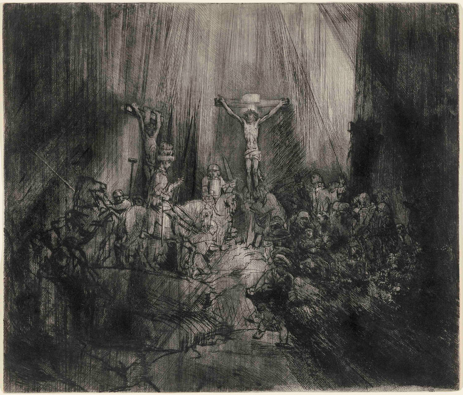 Rembrandt, Christ crucified between the two thieves: (The Three Crosses) 1653, drypoint and plate tone, 4th state, 38.6 × 45.3 cm (sheet, trimmed to platemark), National Gallery of Victoria, Melbourne Felton Bequest, 1949, Photo: Selina Ou / NGV In the first state there is clarity of detail, we see Christ and the crucified thieves, the followers of Christ like the Magdalene who embraces Christ’s feet, the swooning Mary, His mother, and the kneeling centurion, while in the bottom right-hand corner is a pool of darkness, alluding to the entombment of the body of Christ. In the fourth state the darkness has the full power, it is a scene of chaos and confusion as the darkness seems to stream from above. The moment which Rembrandt has chosen is that of the “darkness over all the land”. On the right-hand-side, a hail of deeply gouged drypoint marks threaten to obliterate Christ’s followers and the thief on the cross is almost totally swallowed up by the darkness. Figures have been scraped and radically altered, on the left a man reins a rearing horse, while on the right John flings out his arms in despair. A departing figure in the right foreground plunges into darkness and a stately mounted centurion holding a lance has been added. All is cast into shadow with the brightest spot in the composition being Christ’s halo. The figure of Christ has been redrawn, but he is the only one with what one may term a sculptural definition. It could be as Christopher White suggests that Rembrandt has now altered the interpretation of the scene to illustrate the episode narrated by the Evangelists Mark and Matthew “Now from the sixth hour there was darkness over all the land unto the ninth hour. And about the ninth hour Jesus cried with a loud voice saying … My God, my God! Why hast thou forsaken me?” 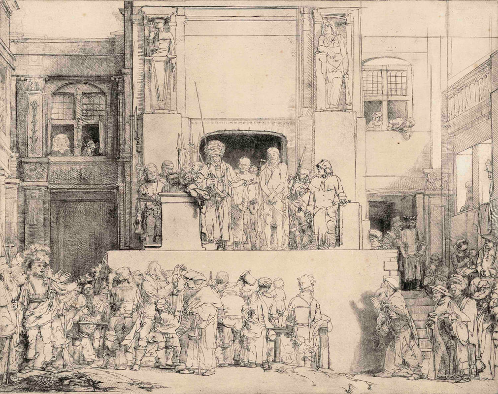 Rembrandt, Christ Presented to the People: oblong plate 1655, drypoint and plate-tone, 35.8 × 45.6 cm (plate) National Gallery of Victoria, Melbourne Felton Bequest, 1940, Photo: National Gallery of Victoria, Melbourne In Christ presented to the people 1655, the revisions may appear to be less radical in the eight states of the print. Iconographically, it is an unusual image where Pilate presents Christ to the people who egged on by the Jewish priest cry “Crucify him!” Watching on from the top left-hand corner is an elegantly dressed woman, whose identity remains unclear, while the man of sorrows is presented on a platform for public abuse. 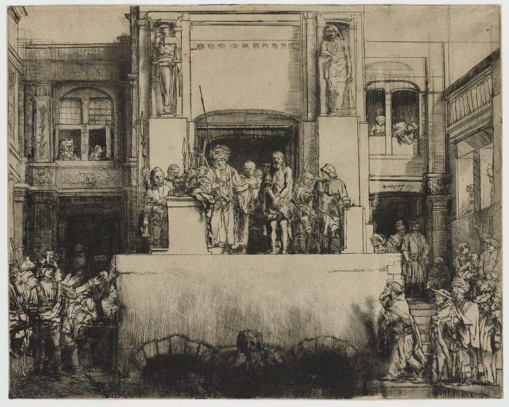 Rembrandt, Christ presented to the people: oblong plate 1655, drypoint with plate tone and pen in black on Japanese paper, 7th state, 36.0 × 45.0 cm (plate), Rijksmuseum, Amsterdam, Transfer, 1816, Photo: Rijksmuseum Rembrandt largely changed the nature of the art medium, etching was no longer thought of as being in the service of another medium, it became an art form in its own right with infinite flexibility and creative originality. Rembrandt demonstrated for the first time that there were things which you do in etching which you could not attempt in any other medium. It was a unique challenge which was not again taken up until the modern era and artists as different as Whistler, Picasso, Matisse and Baldessin, could all turn back and call Rembrandt their teacher.  Rembrandt’s Wunderkammer – cabinet of curiosities – recreated by the NGV, photo S Grishin Exhibition:
Rembrandt: True to Life NGV International, St Kilda Road | 2 June – 10 September 2023 | Erwin Fabian (1915-2020) 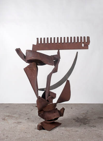 Erwin Fabian, Lethes comb, 2016, steel and stainless steel, 135cm x 112cm x 95cm, Estate of Erwin Fabian Three years ago, Erwin Fabian passed from this life in Melbourne – he was 104 years old. I knew him since 1980 – for forty years – for some artists you could say that you knew them for lifetime – for Fabian, I knew only a flake of his long, complex and multifaceted existence. 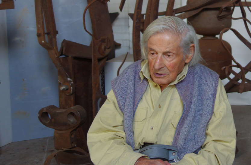 Erwin Fabian in his studio, North Melbourne 26 February 2018, photo: S. Grishin Erwin Fabian was born in Berlin in 1915, the son of the distinguished and well-established German-Jewish academic expressionist painter, Max Fabian. Coincidently, exactly three weeks later and in Berlin was born Inge King– another German-Jewish sculptor who was also to have a profound impact on Australian art. Fabian’s childhood was made up of art – art surrounded him on the walls of his family home, his father worked in his studio from dawn to dusk, while his mother, Else Boehm, was also an artist, who was one of his father’s painting students whom he married in 1913. The house was filled with artists and with talk about art, art commissions, art exhibitions and art politics – to be an artist seemed a natural progression and visiting art galleries was a natural pastime. Fabian recalled, “I regarded looking at paintings, the concern with painting, as the normal life, it wasn’t questioned.” In March 1926, when Erwin was ten, his father died suddenly aged fifty-three. Things became more difficult for the young Fabian as he trained as a house painter and sign writer taking life drawing classes in the evenings. As the Nazis came to power, admission to the Academy was barred to him as a Jew and general racial persecution intensified. 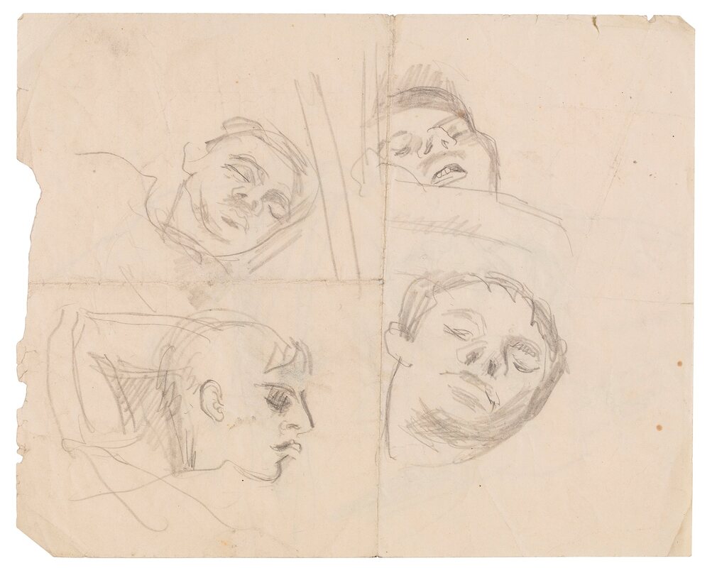 Erwin Fabian, Heads of sleeping men on the Dunera, 1940, pencil on paper, 20 x 25cm, Estate of Erwin Fabian On the eve of Kristallnacht, Fabian fled his homeland and took refuge in Britain, where his younger sister, Lilo, and some cousins from Munich, had preceded him. This was in 1938 when he was twenty-three-years-old. In London he mixed in the circles of the German Jewish diaspora and got some work in commercial graphic design and designed book covers. He also drew and studied art at the V&A and attended life drawing classes at the London Polytechnic. A few months later, he was joined in London by his mother, who had fled Berlin and managed to bring out with her a considerable amount of his father’s work. The Fabian family shared a cramped little flat, so all Max Fabian’s bigger paintings and other larger artworks were stored separately in a warehouse and only work in the portfolios stayed in the flat. The warehouse was subsequently bombed by the Nazis during the blitz, and everything stored there was destroyed. When war was declared on 3rd September 1939, some 70,000 British resident Germans and Austrians were termed ‘enemy aliens’. Tribunals classified them into three categories, from Nazi sympathisers in category A, to refugees from the Nazis, like Fabian, in category C. However, as the threat of a German invasion of Britain loomed, the newly installed Winston Churchill government panicked and virtually all the males, regardless of category, were deemed as of potential threat and more than 7,500 internees were shipped to internment camps in Canada and Australia. Fabian was one of these – so that by the age of twenty-five he had lost not only his father and his homeland, but also his family and his freedom and was sent off to prison camps in Australia on the infamous Dunera. In the Australian Galleries’ exhibition, we have an immensely rare sketch that Fabian made on board of the Dunera of sleeping inmates. 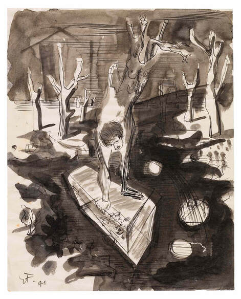 Erwin Fabian, Untitled (Self-portrait with coffin), 1941, pen, brush and ink on paper, 25 x 32.5cm, Estate of Erwin Fabian The Dunera Boys were mainly German and Austrian Jewish refugees, many of whom were professionals – musicians, academics, architects, historians and artists – and most of whom were brutalised by the remnants of the British military who were sent to escort them. In contrast, the prison camps in Australia, in the remote locations of Hay, Orange and Tatura, were far more relaxed, where the internees rapidly organised for themselves lectures, art and music classes, concerts and the like. It was here that Erwin Fabian made his first monotypes with improvised materials in a curious technique. He covered a hard surface, like a pane of glass, with ink, then placed a sheet of paper on top of this and drew on this, on the back of the paper, creating a sort of traced image in reverse – a unique impression with a rich play of different textures and lines, where masses suggest faces, figures and forms.  Erwin Fabian, Untitled, October 24, 1941, monotype on paper, 32 x 40cm, Estate of Erwin Fabian As with much of his work, it is immediately memorable and visually exciting. In the Australian Galleries’ exhibition, there are two very rare monotypes from 1941 made while in prison camps and two unique ink and wash sketches from the same period where there is a strong surrealist element. I am somewhat surprised that these are not already in major institutional collections.  Erwin Fabian, Untitled, 1960-61, colour dye inks on paper, 45 x 28cm, Estate of Erwin Fabian One of the monotypes that he made in 1942 was included in a Red Cross Army Exhibition where it was spotted by Dr Ursula Hoff, a German Jewish scholar who had recently been appointed to the staff of the National Gallery of Victoria as the keeper of the department of prints and drawings and it was acquired for the gallery’s collection by the director Daryl Lindsay. This was Fabian’s first work in a public collection, subsequently the British Museum in London acquired 21 of his works, the National Gallery of Australia 15 works and there were numerous acquisitions made by many other public art collections in Australia and internationally. The NGV presently holds 12 of his works and other works are held at the Art Gallery of NSW and in other state galleries. 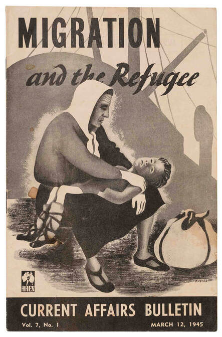 Erwin Fabian, Migration and the refugee, 1945, printed cover for Current Affairs Bulletin, vol7, No 1, March 12, 1945, 22 x 14.5cm, Estate of Erwin Fabian Fabian, in 1942, finally had the chance to swap internment for military service with the Australian army and he enlisted as part of the Eighth Australian Employment Company. The following year, he was transferred to the Australian Army Education Service where he worked on the magazine Current Affairs Bulletin, primarily designing its covers. He continued doing this for the next decade, long after he was demobbed in 1946, the same year he became a naturalised Australian citizen. One of his most memorable cover designs is for the Migration and the Refugee issue from March 1945 that appears remarkably contemporary to us today. 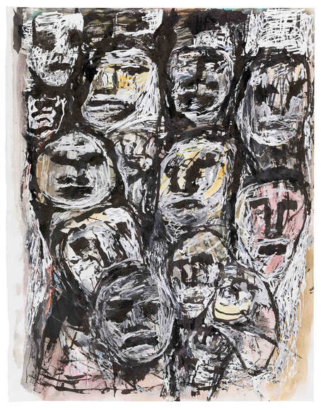 Erwin Fabian, Untitled (Faces in a crowd), c2016-19, watercolour and correction fluid on paper, 35 x 27cm, Estate of Erwin Fabian I have paused on Fabian’s biography for the first three decades of his life, in part because these circumstances are not widely known, and, in part, because they are so crucial for our understanding of the subsequent seven decades of his life when he emerged as an artist of international significance. I will not discuss Fabian’s biography any further other than to mention in passing his marriage, the birth of his two children Sarah and Daniel – the tragic and crippling death of Sarah as a child – and the establishment of a strangely semi-itinerant existence suspended between Europe and Australia for the rest of his life. 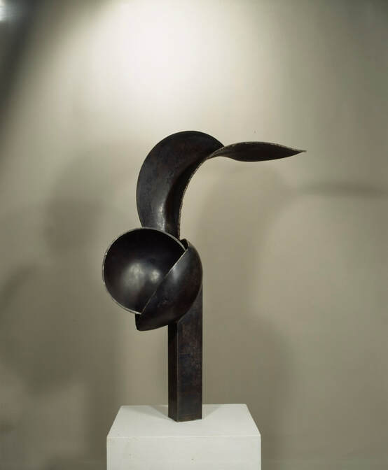 Erwin Fabian, Arc, 1989, steel, 88cm x 57cm x 22cm, Estate of Erwin Fabian Although after he spent a dozen years in London between 1950 and 1962, working mainly in commercial art and teaching at the London School of Printing and Graphic Arts, he returned and settled in Melbourne and started to actively exhibit his art in a series of solo exhibitions held in Sydney, Canberra and Melbourne. He first started to exhibit with the Australian Galleries in 1991 with his first solo exhibition held at this gallery in 1995. Fabian would return annually to Europe to visit his family and he maintained a studio in London and had many friends in the European art world – mainly in England, France and Germany. Included in the Melbourne exhibition is a selection of graphics that Fabian made over seventy years with examples of his famous non-figurative monotypes, the expressive dye drawings that he made in a medium to which he was introduced by Sidney Nolan, and his late ink and correction fluid drawings, many of which have never been exhibited before. 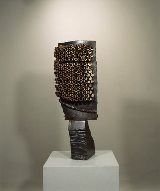 Erwin Fabian, Oracle, 1997, steel and copper, 68cm x 24cm x 19cm, Estate of Erwin Fabian Fabian over the years had become a significant Australian artist and an artist of international standing. As a sculptor, he worked almost exclusively with scrap metal that was allowed to sit on the concrete floor of his studio, frequently for years, waiting to mature, like ripening fruit. Then the alchemy commenced as forms were arranged and rearranged until they seemed to belong. This was an ineffable quality of belongingness that is the key to his artmaking, sometimes a process that stretched over a number of years or, occasionally, it found an almost instant resolution. I feel that the essence of Fabian’s creative process was his ability to create a new natural order, where all the elements appear as if they belong, as if they have been found this way in nature, without actually resembling any specific form found in nature. 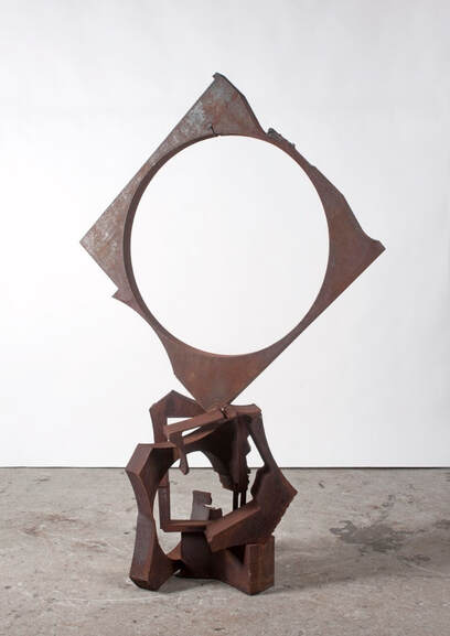 Erwin Fabian, Panorama next time, 2017, steel, 163cm x 103cm x 56cm, Estate of Erwin Fabian Fabian had that rare ability to create a new and convincing reality through which the viewer can be seduced and captivated. His sculptures, in the final analysis, belong to the grand tradition of humanist sculpture – in other words, they interact with us on a human and emotive level – we come to believe in their existence not only as aesthetic objects, but as metaphors for the human spirit. Take, for example, the beautifully expressive sculptures Arc, 1989, Oracle, 1997 or his stunning late masterpiece, Lethe’s comb, 2017 – we have at the Australian Galleries a cross-section of 30 years of Fabian sculptures. Over the many years that I have spent visiting Fabian’s studio, I have always been struck by how memorable his non-figurative sculptures are, and whenever he would change a piece (something that happened constantly in his practice), I was struck by how noticeable that change would be. His sculptures became like a cast of characters, each endowed with its own personality, features and set of unique characteristics, each has its own voice and temperament. It is a hallmark of a wonderful artist the ability to create an alternative reality – one that seems real and believable – Fabian had this ability in spades. 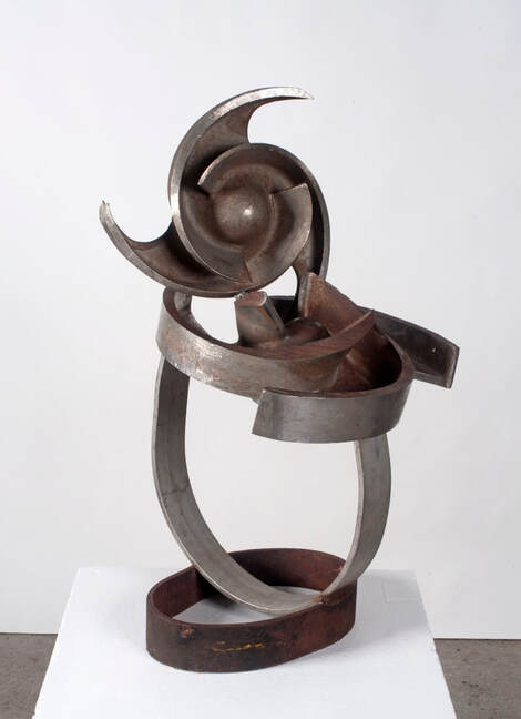 Erwin Fabian, Circumvolution, 2017, steel and stainless steel, 85cm x 54cm x 50cm, Estate of Erwin Fabian abian was a very complex, passionate and intellectual being who never lost a sense of humour, freshness and naïve enthusiasm both in life and in his art making. He had always a quality of freshness and discovery, an unbridled joy in the intuitive process in the creative act. He knew that art was something that really mattered – it was something that was permanent and had to last the ages – he was in it for the long haul.
Last time I visited him, it was in his studio off Arden Street, he had been down the street to buy some sweet pastries for our cup of tea and was anxious that I see his latest creations. I remember there was a very heavy table sculpture on the bench that I sought to move. Fabian, intervened and said, “Sasha, it’s too heavy for you, let me move it.” My pride may have been injured, but this centenarian with an iron grip lifted the sculpture and move it effortlessly off the bench. That afternoon, Fabian and I agreed that he had more than enough work for another solo exhibition. As I left that day, he escorted me to the door and said, “I do hope that I have time to make work for a few more exhibitions – I think that I am making some of my best work ever – I just need a little bit more time”. In this I do agree – some of Erwin Fabian’s best work was some of his late work – with the years his vision deepened and became more profound. I conclude on a curious note, those who knew Fabian’s studio in Arden Street may also know that directly across the road lived one of his early champions, James Mollison, the legendary director of the Australian National Gallery. Mollison and Fabian both died on 19 January 2020. Exhibitions: Erwin Fabian, Australian Galleries, 35 Derby Street, Collingwood, 30 March – 22 April 2023 Erwin Fabian, Robin Gibson Gallery, 278 Liverpool Street, Darlinghurst, Sydney, 15 April – 6 May 2023 Summer of art in Sydney 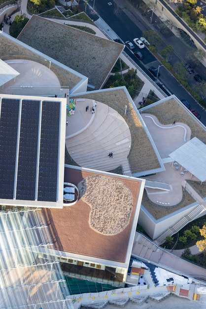 Aerial view of the Art Gallery of New South Wales, new SANAA - designed building, 2022. Photo © Iwan Baan I spent last week in Sydney, primarily enjoying the opening of Sydney Modern. I thought that it would be worthwhile to share some of the art highlights that I encountered in the harbour city. The headline act is certainly the new extension to the Art Gallery of New South Wales, the outcome of the Sydney Modern Project and now known somewhat prosaically as the North Building. Already people are referring to it as ‘the birdcage’ in contrast with the stately neoclassical South Building.  Installation view of Lorraine Connelly-Northey’s Narrbong - galang (many bags) 2022 © Lorraine Connelly-Northey. Photo S Grishin Michael Brand, a year after he was appointed as the director of the Sydney art gallery, launched the unfunded plan for a new building in 2013, the Tokyo firm SANAA won the architectural competition in 2015 and construction commenced in 2019 with a budget of $344 million. Architecturally, it is an ‘understated’ building conceived as a three-storey luminous birdcage with suspended hanging gardens and an extensive crypt below. The main architectural concept is that of three limestone clad cascading pavilions leading down towards the water with a huge supporting rammed earth wall. 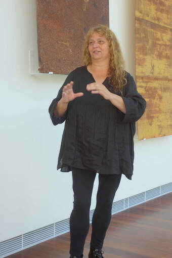 Lorraine Connelly-Northey, Photo S Grishin In the birdcage there are about 900 exhibitors in the opening exhibitions with women artists making up 53% of the total number of exhibitors. Hype aside, and in Sydney you get it by the spade load from politicians with an eye to the state elections next March describing the new extensions as the greatest art gallery in the world exhibiting the greatest collection of Aboriginal and Torres Strait Islander art in the world, this is an excellent functional extension that almost doubles the exhibiting space of the old building. Indigenous art is a major highlight in the new building (and I love the newly commissioned woven huge metal handbags made from discarded well-weathered metal sheets from the outback by Lorraine Connelly-Northey) with a good mix of contemporary Australian non-Indigenous art, Asian art and other international art. Despite the huge storm of controversy that the building project initially caused, it has to be seen as a resounding success as a space for exhibiting art. It is also accompanied by excellent green credentials in this fully sustainable building with its 6-star Green Star design rating. 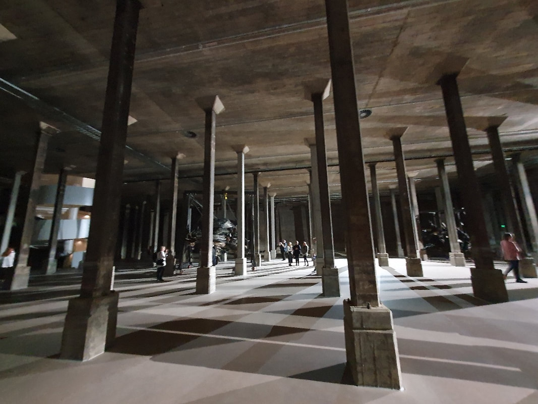 Crypt (tank) of the new building of the Art Gallery of NSW. Photo S Grishin While visiting the birdcage, do pop into the old building that has been substantially rehung and see the impressive Daniel Boyd Treasure Island survey exhibition (closes January 29, 2023). It is the first major survey of his art and enhances his standing as a significant Australian artist who explores in his art the interconnected histories of First Nations peoples. 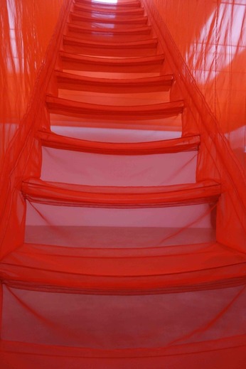 Do Ho Suh, Staircase III, 2010, polyester fabric, stainless steel, Tate at Museum of Contemporary Art exhibition. Photo S Grishin The Museum of Contemporary Art is hosting a substantial survey exhibition of the South Korean artist, Do Ho Suh. I first encountered his work at an APT exhibition, which has been a gateway for many of us to encounter contemporary Asian art. Do Ho Suh is particularly memorable for his large-scale sculptural installations playing with memory and the idea of the body suspended in space. 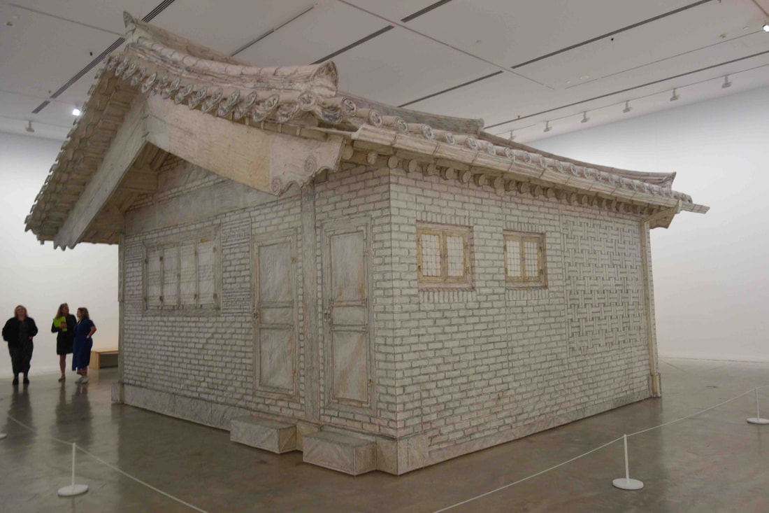 Do Ho Suh, Rubbing/Loving Project: Seoul Home, 2013–2022, graphite on mulberry paper, aluminium, Museum of Contemporary Art. Photo S Grishin This exhibition spans three decades from the 1990s through to the present. Do Ho Suh in many of his pieces explores ideas connected with home and identity from an obsessive self-referential perspective. Although there are prints, drawings and miniatures, the most impressive pieces are full-scale replicas interpreted in unexpected materials. 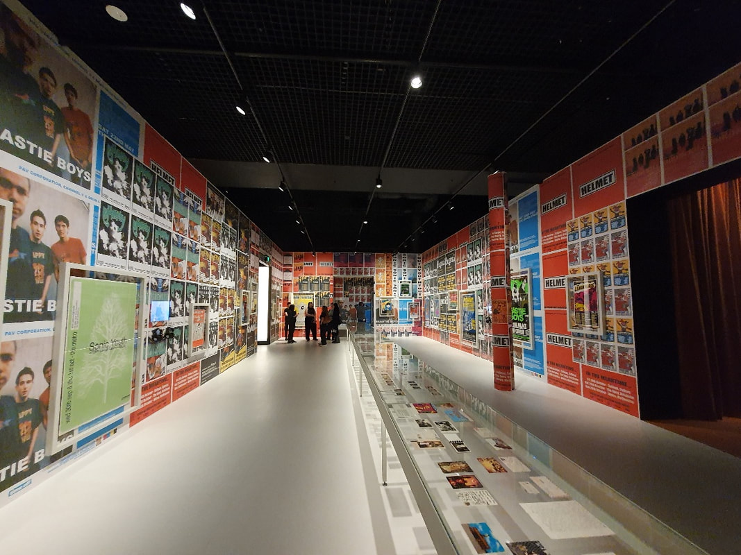 Installation view of part of the Unpopular exhibition, Powerhouse Museum, Ultimo. Photo S Grishin At the Powerhouse at Ultimo – there is a great extensive exhibition dedicated to the Australian designed Carla Zampatti (until June 11, 2023) and an immersive show ‘Unpopular’ (until June 3, 2023) examining the music scene in Australia with some brilliant footage of the Nirvana tour of Australia and documentation of Sonic Youth, Beastie Boys, Mudhoney, Nirvana, Bikini Kill, Fugazi, Pavement, The Lemonheads and many more. What I found as a spot disappointing is the glitzy Gucci Garden Archetypes show (until January 15, 2023) that comes across as one huge commercial for the company and its products that are available in the accompanying gift shop.  Installation view of part of the Gucci exhibition, Powerhouse Museum, Ultimo. Photo S Grishin Possibly reflecting my personal poor taste in music, I found Opera Australia’s production of Carmen on Cockatoo Island simply amazing. It is one of the best productions of this evergreen classic that I have seen in recent years and is set within the spell of Cockatoo Island. It is not so much the motor bike stunts, crashed cars or the fireworks that carry the show, but the calibre of the singers and the choreography that provide a new lease of life to Georges Bizet’s popular music. 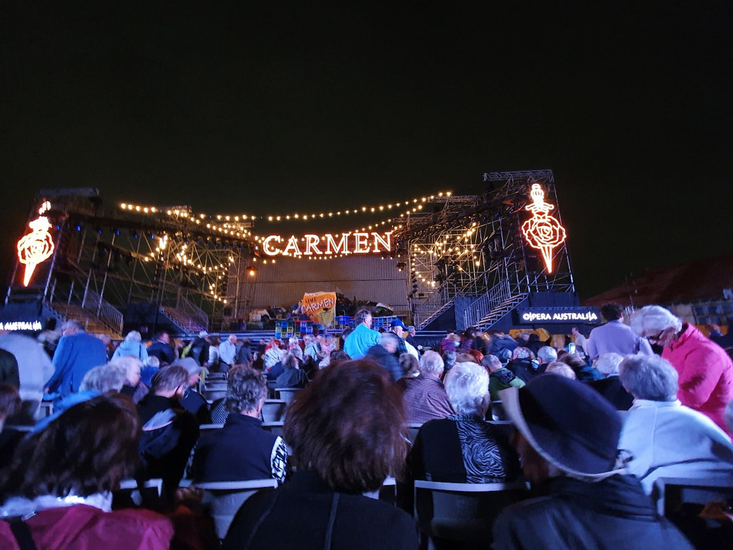 Opera Australia, Carmen on Cockatoo Island, until December 18 Photo S Grishin If the intensity of the art scene starts to tire the gaze, you can always escape on a seaplane and examine the sights of the city from a fresh perspective. 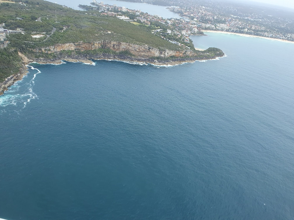 A Sydney view from a seaplane. Photo S Grishin Earth Canvas 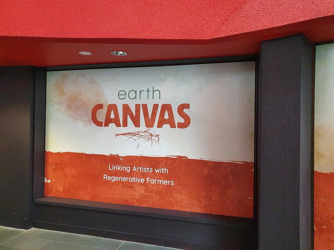 Earth Canvas, National Museum Australia, photo: S. Grishin Should art be weaponised? While it has been fashionable to march under the banner of ‘art for art’s sake’ and to draw a line of demarcation between art and politics, more and more artists are being drawn into major social issues of our time, including climate change, plight of First Nations people, pandemics, global famines and various military conflicts. Some artists, in taking up social causes, have adopted an overt political stance, William Kelly, Ann Newmarch, Noel Counihan and Mandy Martin are amongst the many names that spring to mind, others in their art aim for a more implicit message. It seems to me that in recent years global developments have become so dire that artists, who are the prophets of our society, feel increasingly compelled to take a social and political stance in their art. 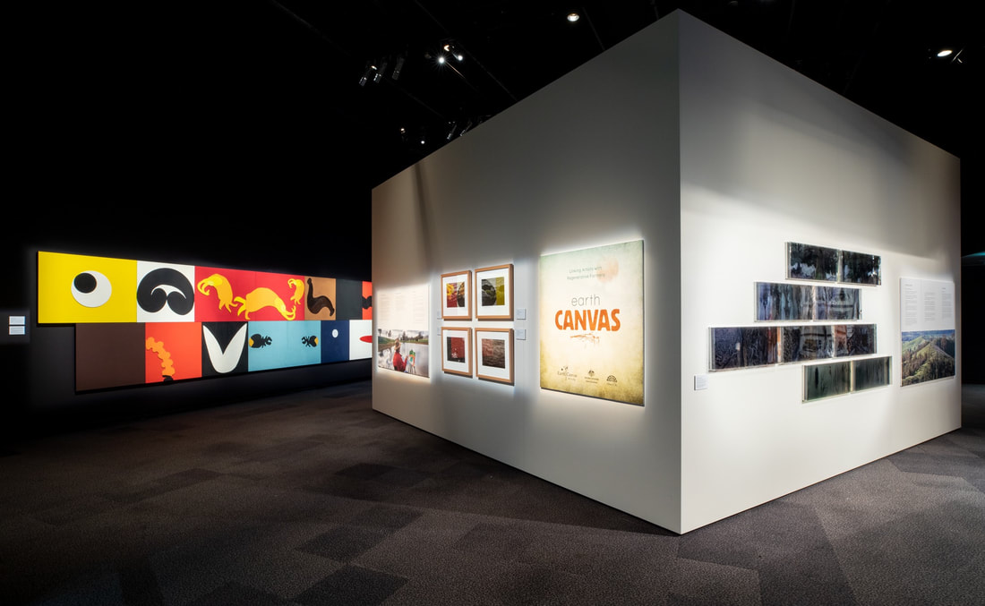 Earth Canvas, installation view, photo: National Museum Australia Industrial agriculture in Australia with factory farms (concentrated animal feeding operations or CAFOs) appear increasingly unsustainable, destructive to our environment, potentially harmful to our health and a major contributor to climate change. The intensive production of crops and animals may involve the use of huge quantities of chemical fertilisers and pesticides, sometimes inadequately tested genetic modification of crops, widespread use of antibiotics on animals and have an adverse impact on biodiversity, quality of soils and cause the pollution of waterways and impact on climate change. It has been argued that certain pesticides, for example glyphosate-based products, go far beyond eradicating weeds but also wipe out species of insects and may have a long-term impact on human health. One response to Industrial agriculture is regenerative farming that could be described as a system of farming principles and practices that seeks to rehabilitate and enhance the entire ecosystem of the farm. The basic idea is to heal farmlands that are now quite sick. There is an emphasis placed on a holistic approach with a focus on soil health and water management, plant diversity, general biodiversity and reforestation as well as the storage of carbon. In Australia, it has taken off in a big way and has been popularised in publications including Charles Massy’s Call of the Reed Warbler. 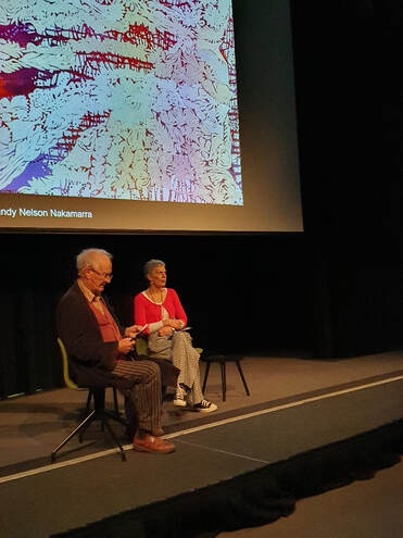 John Wolseley and Jill Sanbrook at the National Museum Australia, 27 August, 2020 photo: S. Grishin Earth Canvas arose from a chat between the regenerative farmer Gill Sanbrook and the distinguished environmental artist John Wolseley in 2019. The idea was quite simple – to match up specific regenerative farmers with specific visual artists and in each case imbed the artist on the farmer’s property where they would make work about their experience. The ‘list’ as it emerged is quite impressive: Rosalind Atkins, working with the Wearn Family at Yammacoona, Little Billabong; Jenny Bell, working with the Coughlan family at Mount Narra Narra, Holbrook; Jo Davenport, working with the Austin Family at Mundarlo, Mundarlo; Janet Laurence, working with Rebecca Gorman and family at Yabtree West, Mundarlo; Idris Murphy, working with the Coghlan family at Eurimbla, Gerogery and John Wolseley, working with Gillian Sanbrook at Bibbaringa, Bowna. These regenerative farms were located between the Murray and Murrumbidgee rivers in southern New South Wales with the artists drawn from Victoria and New South Wales. 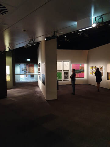 Earth Canvas, installation view, photo: S. Grishin The next step was to involve a regional gallery and the Albury Library/Museum stepped into the fray with their curator Kate Eastick assembling a credible exhibition and securing Visions funding for a tour of regional galleries in South Australia, Victoria and New South Wales over the past two years. In each venue, a local artist working with a local regenerative farmer was added to the mix to give the travelling show a peculiarly local flavour. I caught up with the show in Canberra where it opened at the National Museum of Australia with considerable fanfare and was accompanied by two days of symposia and artist’s talks. It is spectacular in a quiet way and not at all preachy that is the downside of many exhibitions tied to causes. What many of the artists appear to have taken out of the experience was that these regenerative farms were involved in healing – healing the land and, in a few instances, the artists themselves experienced part of this healing process. 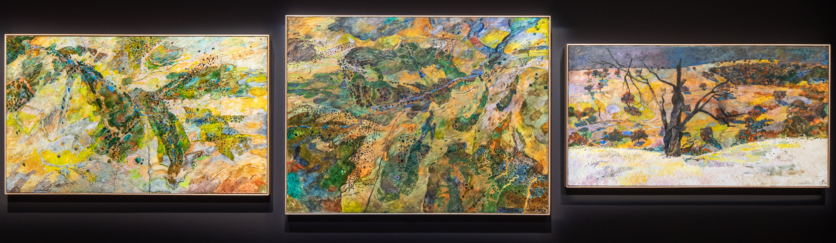 John Wolseley, Chains of ponds, contour banks and the return of the reed warbler, Bibbaringa 1, 2019 (left), What would the world be, once bereft of wet and wildness? Let them be left, O let them be left, wildness and wet, long live the weeds and the wildness yet – G M Hopkins. 2019-20 (centre), Slow water and the rufous songlark, Bibbaringa 3, 2019-20 (right), Courtesy of the artist and Roslyn Oxley9 Gallery, Sydney, photo: National Museum Australia Janet Laurence, who has been such a significant environmental warrior north of the Murray, produced a series of dark immersive mirrors that recorded the devastation of the land as well as the healing process. While difficult to see in the tightly packed reflective installation in Canberra, they radiate a contemplative peace. Ros Atkins, the wonderful Melbourne-based printmaker, has been a tree hugger for decades, but on the farm her wood engravings, woodcuts and monotypes convey a strong sense of healing, in the sense of healing the land in this farm and, also healing herself after a period of loss and turmoil in her life. Jo Davenport has produced strong expressive paintings and drawings that combine a sense of anger, frustration and protest at what is happening to the land and the rivers, but also convey an expression of joy at the process of love and regeneration by the farmers with whom she was involved. Jenny Bell, who comes from a farming background and lives on a farm, translated her transformative experiences on the farm near Holbrook into an abstracted painted code that marks a significant departure from her usual art practice.  Idris Murphy, Pink Water with Log, 2019, courtesy of the artist and King Street Gallery on William, Sydney, photo: National Museum Australia Idris Murphy, who incidentally has a large travelling exhibition on at the Drill Hall Gallery in Canberra, translated his evocations of place into his own idiosyncratic language with colour-saturated paintings tinged with melancholy. John Wolseley, who is Australia’s most distinguished environmental artist and the most senior artist in this group, charts the topography of his farm noting the throbbing regenerative energy. There is something quite magical and transformative about his paintings that invite the viewer to enter them and contemplate the gravity of the situation and yet see the path to salvation. 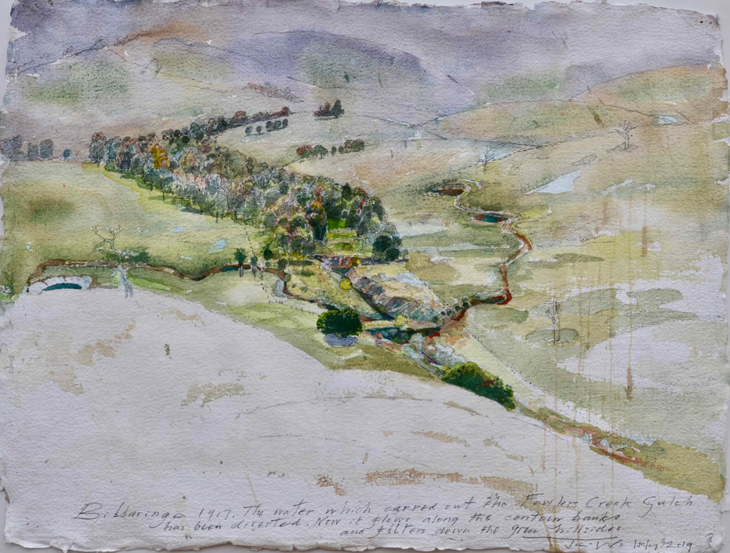 John Wolseley, Healing the Fowlers Creek gulch, Bibbaringa 8, 2019- 20, Courtesy of the artist and Roslyn Oxley9 Gallery, Sydney, photo: National Museum Australia The local artist for Canberra is Alexander Boynes, also the youngest artist in this group, and he was matched with the Watson clan farming at the Millpost farm – a sustainable 1,200 ha property on Ngunnawal/Ngambri country between Queanbeyan and Bungendore. This is his first project since the passing of his mother Mandy Martin with whom in recent years her has frequently collaborated. In Canberra, Boynes followed his established artistic strategy of painting a canvas and projecting over it a video ‘animation’ and having this accompanied by a music score by his brother-in-law Tristen Parr. It is quite a moving work that pays homage to the Indigenous people who own the site on which the farm is located. The photographer, Tony Nott, who passed from this life last year and who documented much of the venture is also represented in this exhibition. 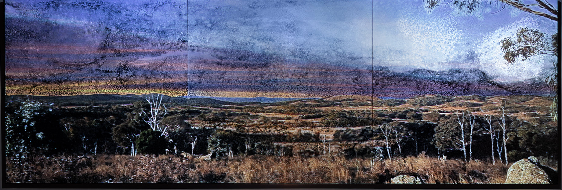 Alexander Boynes, Listening Across Time, 2022, courtesy of the artist, photo: National Museum Australia Earth Canvas celebrates a struggle that is taking place in our own backyard to explore regenerative farming. Although it presently lacks the scale to take over mainstream agriculture in Australia, I suspect that it and other developments similar to it have to be the future if we are to restore our natural environment, turn back climate change and secure our food sources. Earth Canvas, National Museum Australia, Canberra August 26 – October 30 Who are you: Australian portraiture 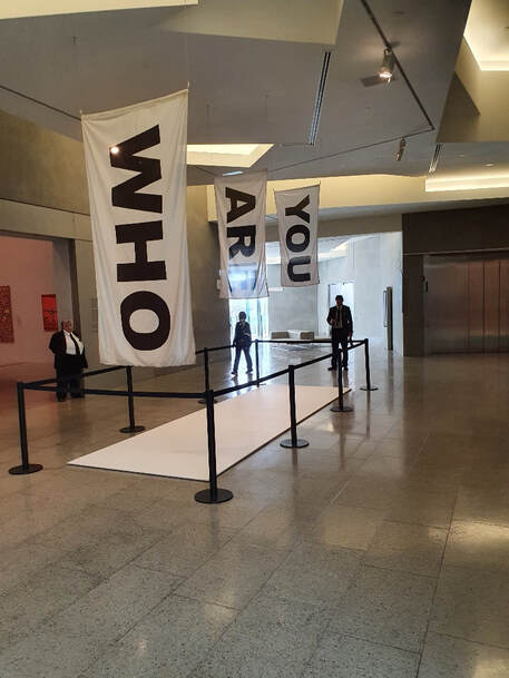 ‘Who are you’, NGV entrance installation, photo S Grishin “The cursed face business … the nature of face painting is such, that if I were not already cracked, the continual hurry of one fool upon the back of another, just when the maggot bites, would be enough to drive me crazy”. Thus wrote the great portrait painter Thomas Gainsborough in a letter to his close friend James Unwin in 1770. The sentiments he expressed sum up perfectly our popular concept of portraiture as the making of flattering likenesses. 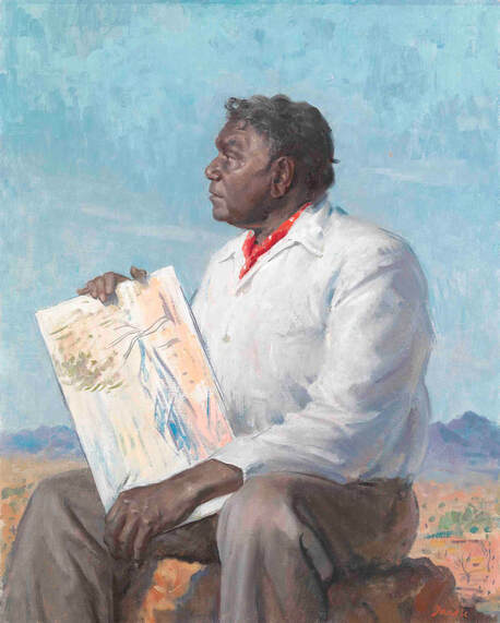 William Dargie, Albert Namatjira 1958, oil on canvas laid on composition board 76.4 x 61.2 cm, National Portrait Gallery, Canberra Purchased with funds donated by Marilyn Darling AC and with the assistance of Philip Bacon Galleries 2000 © Roger Dargie and Faye Dargie The exhibition at the National Gallery of Victoria, drawn from the collections of the NGV and the National Portrait Gallery in Canberra, has the intriguing title ‘Who are you?’ This sounds more like a title for a tv mystery show than for a portrait exhibition and conceptually it moves the focus of portraiture away from the making of likeness to exploring identity. 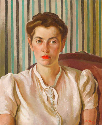 Adelaide Perry, Rachel Roxburgh 1939, oil on canvas, 61.0 x 51.0 cm, National Portrait Gallery, Canberra Purchased 2018, © Estate of Adelaide Perry It is a very large show that challenges the idea of what constitutes portraiture, both in its historic context as well as advancing some of the more contemporary interpretations. The late Andrew Sayers, the visionary inaugural director of Canberra’s National Portrait Gallery, challenged portraiture conventions by arguing that for an Indigenous person a landscape, a portrait of their country, constituted a portrait as a marker of identity. It was a radical concept when he advanced it, now it has been adopted as part of the accepted conceptual framework of portraiture in Australia as advocated in this show. 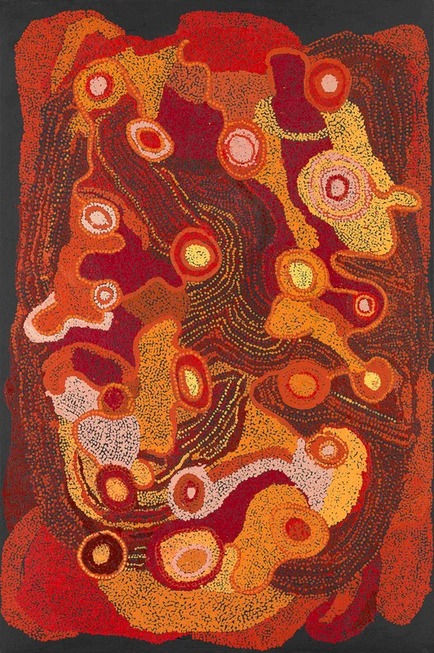 Kunmanara Burton, Pitjantjatjara 1925–2021, Ngayaku Ngura (My Country) 2009 synthetic polymer paint on canvas 101.4 x 152.0 cm, National Gallery of Victoria, Melbourne Felton Bequest, 2011, © Kunmanara Burton Estate/Copyright Agency, 2022 Shirley Purdie’s multi-panelled evocation of identity in Ngalim-Ngalimbooroo Ngagenybe, 2018 and Kunmanara Burton, Ngayaku Ngura, 2009 are examples, another is Kaylene Whiskey’s Seven Sisters Song, 2021 with its funky humour. A non-Indigenous artist, John Nixon, conveys as his self-portrait one of his iconic interpretations of Malevich’s emblematic crosses that is a long way from being a transcription of his own features. 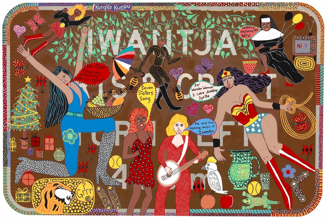 Kaylene Whiskey, Seven Sisters Song 2021, water based enamel on SA tourist attraction road sign 120.0 x 180.0 x 3.0 cm, National Gallery of Victoria, Melbourne, Purchased, Victorian Foundation for Living Australian Artists, 2021, © Kaylene Whiskey. Courtesy of the artist, Iwantja Arts and Roslyn Oxley9 Gallery, Sydney The veteran broadcaster, Phillip Adams, writes in the catalogue in a light-hearted manner on the tradition of self-portraiture as a collection of ‘selfies’. The now iconic image, an early John Brack painting showing the artist shaving, is the standout work in this part of the show. Frank and disarming in its honesty, Brack illustrates the morning ritual for men of his generation and the cruel confrontation with the mirror. 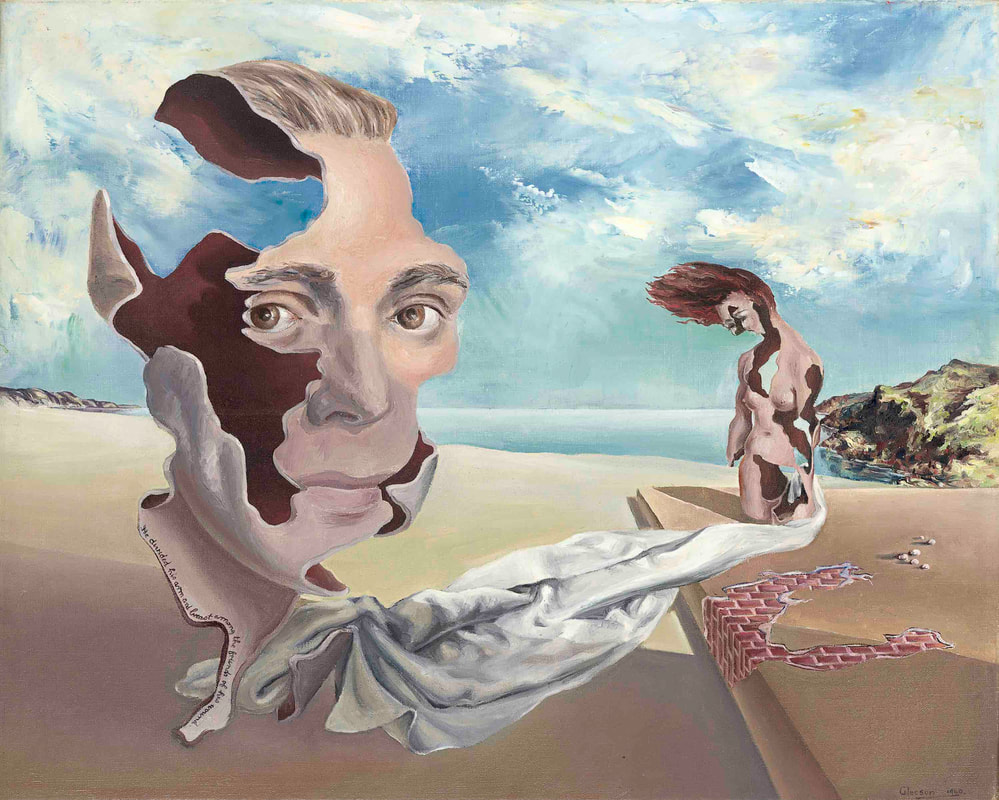 James Gleeson, We inhabit the corrosive littoral of habit 1940, oil on canvas, 40.7 × 51.3 cm, National Gallery of Victoria, Melbourne Anonymous gift, 1941, © Courtesy of the artist For an artist, these ‘selfies’ were frequently the result of a cheap and ready model as well as, on occasion, a journey into flattery and flights of fancy and self-aggrandisement. Rupert Bunny, Sam Jinks, William Yang, Vernon Ak Kee and James Gleeson all fail to smile for the camera, the canvas or silicone and resin, as the case may be, and are shown resolutely as heroic artists. 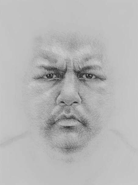 Vernon Ah Kee, Self-portrait (possesses some of the attributes of an artist) 2007, 240.1 x 179.3 cm, charcoal and synthetic polymer paint on canvas, National Gallery of Victoria, Melbourne Purchased, Victorian Foundation for Living Australian Artists, 2008, © Courtesy the artist and Milani Gallery, Brisbane This exhibition can be described as a thought adventure where well-known images from the two collections are juxtaposed with the new and unexpected. We see the historic spread from daguerreotypes to digital photographs, from academic naturalism to postmodernist explorations. 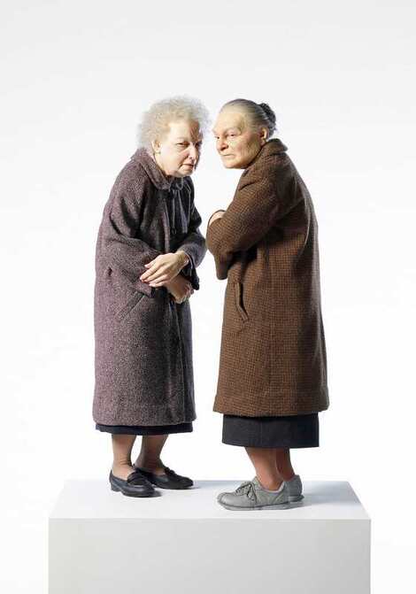 Ron Mueck, Two women 2005, polyester resin, fibreglass, silicone, polyurethane, aluminium wire, steel, wool, cotton, nylon, synthetic hair, plastic, metal, 82.6 × 48.7 × 41.5 cm (variable) National Gallery of Victoria, Melbourne Purchased, Victorian Foundation for Living Australian Artists, 2007 © Ron Mueck, courtesy Anthony d'Offay, London There are few portraits in this exhibition that would have been defended by Thomas Carlyle in the 19th century as examples of virtue that would inspire the young to lead virtuous lives. On the contrary, many of the portraits on show could lead people to question stereotypes concerning gender, race, sexuality and ethnicity. A few decades ago, it was fashionable amongst art students to dismiss portraiture as an antiquated art form designed either for the circus of the Archibald Prize or the power politics of corporate boardrooms or the watering holes for politicians. The wonderful Joshua Reynolds had warned us in his Discourses in the late 18th century, that “A history painter paints man in general; a portrait painter, a particular man, and consequently a defective model.” So many exhibitions of portraiture are collections of defective models. 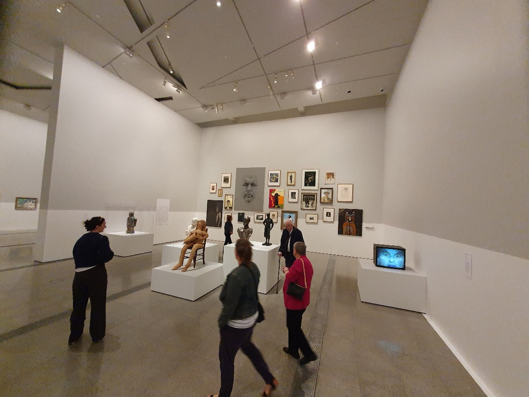 Who are you’, NGV installation, photo S Grishin ‘
Who are you: Australian portraiture’ is a show about the journey that Australian portraiture has travelled over the past two hundred years and hints at its prospects for the future so that portraiture can remain relevant as an art form. ‘Who are you: Australian portraiture’ National Gallery of Victoria: The Ian Potter Centre: NGV Australia, Fed Square Level 3, 25 Mar 22 – 21 Aug 22, Open 10am–5pm daily National Portrait Gallery, Canberra, October 1 2022 – January 29, 2023 Sculpture by the Sea at Cottesloe and elsewhere 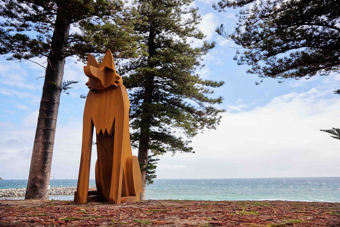 Jimmy Rix, Lone Dingo, corten steel, 222x113x202cm, photo Jessica Wyld courtesy SXS Sculpture by the Sea (SxS) first saw the light of day 25 years ago as a ‘one night stand’ at Bondi in 1997. Now it has clocked up 50 exhibitions distributed between Bondi in Sydney and Cottesloe in Perth with a few held in Denmark. The idea is relatively simple. A large exhibition of big sculptures sprinkled along a spectacular stretch of coast. The exhibitions are free, democratic and secular and each location has its ‘peculiar’ and distinctive feel about it. The coastline from Bondi to Tamarama is steep, elevated and has performing whales and dolphins thrown in as a backdrop. Cottesloe has a flat sandy shore surrounded by grassy areas and a pier with the wonderful Indian Ocean as a backdrop with its stunning sunsets.  SxS Cottesloe 2022 general view with Nicholas Samartis’s Mother in the foreground, photo S Grishin The realisation of this simple idea is exceptionally complex and has been the life’s work of the SxS founding CEO and artistic director, David Handley AM. The alchemy involved in fundraising for each event, the environmental and engineering logistics involved in siting each sculpture and the whole curatorial process of selecting the sculptors from a huge national and international pool keeps a permanent and large volunteer staff occupied throughout the whole year. Handley is a charismatic personality with youthful handsome features who manages to infect others with enthusiasm for his projects and has drawn a professional staff into his orbit, has enthused thousands of volunteers and has persuaded many private sponsors to open their wallets. His success with government arts funding organisations at both state and commonwealth levels has been less successful at times although he did secure for SxS a $2 million grant in RISE funding.  Haruyuki Uchida, Thinking Red, stainless steel, magnet, paint, 406x104x119cm, photo S Grishin How does one assess the worth of SxS? There are obvious economic benefits to the participating artists as well as the local economies. The artistic benefits are more difficult to fathom. There is a view in some quarters that SxS is insufficiently ‘elitist’ – that is, the selection process is not always conducted with the same stringency as within a public art institution and that there are too many concessions to popular taste. Some describe it as the ‘Archibald’ of sculpture. Where this parallel holds good is that indeed hundreds of thousands of people turn up to see the shows and many who come are not regular art exhibition goers. In some SxS exhibitions, there are anywhere up to $2 million in sculpture sales. It can be argued that SxS has created and continues to create and foster new audiences for sculpture, a new breed of collectors of sculpture, and it sends an economic lifeline to keep some sculptors solvent in what is often lean times. 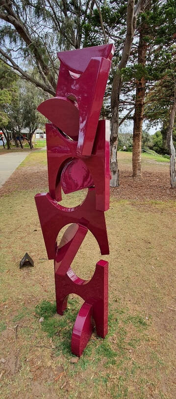 Philip Spelman, Shuffle, mild steel, automotive paint, 220x65x45cm, photo Jessica Wyld courtesy SXS The argument in defence of the artistic integrity of SxS is that it shows the broad church of contemporary sculptural practice with the wacky, ephemeral and environmental installations, monumental structures in heavy metals and stone as well as some more conceptually experimental work. Being an out-of-doors exhibition with massive crowds and limited security, other factors including safety to the public, durability and longevity also need to be taken into consideration before work is accepted for the show. The recent show at Cottesloe, the 18th at that venue, illustrates the multifaceted nature of SxS. There are about 70 major outdoor pieces that hug the coast and are situated along the beach, in the water, the surrounding grassy areas and the pier. A bit under half of the sculptors come from Western Australia, about 15 come from elsewhere in Australia (predominantly from NSW) and the rest are international with a substantial contingent from Japan as well as participants from Taiwan, the Czech Republic, France, Spain, Italy, India, South Korea, Switzerland, Norway and Singapore. 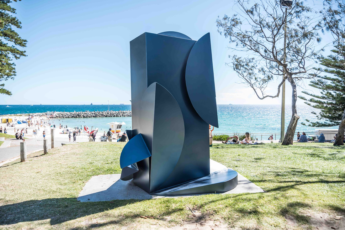 Michael Le Grand, Reveal, painted steel, 217x176x165cm, photo Richard Watson, courtesy SXS How do I assess this year’s Cottesloe? I have only been to three of the 18 SxS exhibitions held at this venue and this is not the finest of the three. Nevertheless this is a formidable show with plenty of interesting highlights. A crowd favourite, as well as one of my favourites, is the work of the Victorian sculptor Jimmy Rix, Lone Dingo. It is figurative, but not literal, at over two metres it is monumental, and made of corten steel it possesses a natural rusty colour. It smacks of rustic humour and the disposition of planes makes it work from all angles. In his artist’s statement the artist provides us with a narrative: “The Lone Dingo stands apart from its pack, keeping its distance. Watching and waiting to be accepted back into the pack when the leader allows it - mirroring our experiences of social distancing and lockdown.” 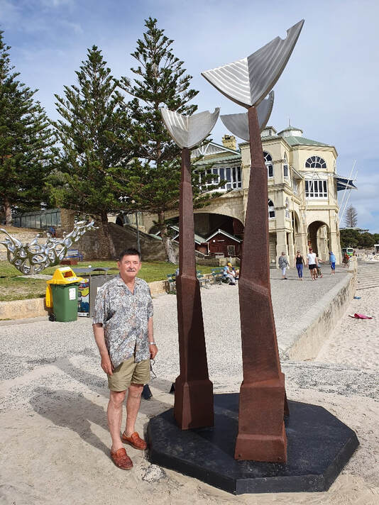 Ron Gomboc with his sculpture ‘Bez reche’ (Without words) corten steel and stainless steel, 350x190x175cm, photo S Grishin The welded steel sculptures, a feature of all SxS exhibitions, include a brilliant swaying falling pillar by Haruyuki Uchida from Japan, titled Thinking Red, fabricated of stainless steel and held to some extent by magnets at four metres it is most imposing. Philip Spelman, who lives on the outskirts of Canberra in his mild steel Shuffle finished in shiny automotive paint has a brilliantly effective collapsing column of strict geometric shapes seemingly defying gravity. It is one of the most accomplished works that I have seen from this artist. His neighbour, Michael Le Grand has created for the show what for him is an unusual block-like steel sculpture with elements as if peeling away from the main body. It is possibly more effective located within a shallow niche rather than seen completely in the round. 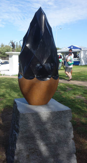 Takahiro Hirata, Dark Night Shine 2021, black granite, 221x76x71cm, photo S Grishin The wonderful veteran WA sculptor, Ron Gomboc who has been making sculpture for half a century has made a three-and-a-half metre high work where suspended on corten steel organic pillars are three stainless steel birds that can rotate with the breeze. Simple in concept, but effective and a work of soaring beauty. Greg Johns, from SA, has a swaying corten steel structure that unlike some of his work is not overstated. At three-and-a-half metres it has a delicacy and sense of grace. Linda Bowen, from NSW, revisits an earlier piece of a construction of an open architectural space in mild steel and automotive paint. It has a somewhat uncanny feel here on the grass. 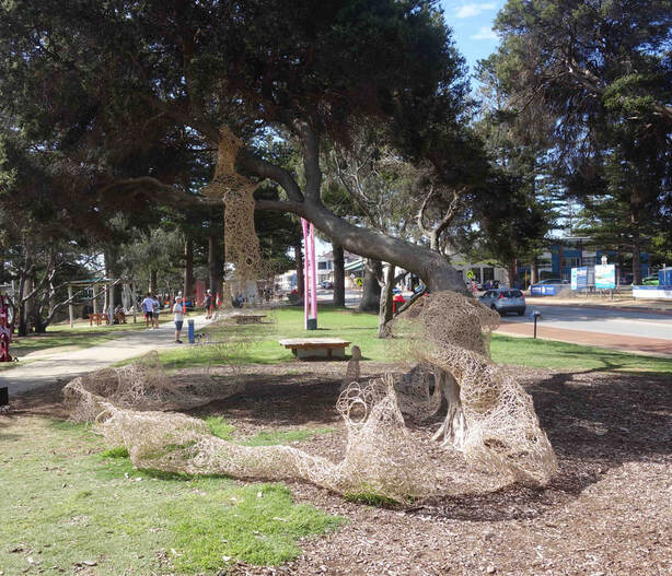 Fiona Gavino, From chaos comes order, cane, 400x400x600cm, photo S Grishin Another local WA sculptor, Kevin Draper has a remarkably clever and effective work in the form of a large tree that has been intersected with a red and white grid structure. It is about regrowth after a bushfire and I spent several occasions contemplating its solemn majesty. It works both on a purely emotional level, as well as a cerebral puzzle. Another WA sculptor/printmaker is the fibre artist Fiona Gavino who weaves with cane a wondrous spreading maze measuring four by four by six metres that envelops the surrounding vegetation. It is a sensuous piece that throws a veil over nature to present an emotional and cerebral labyrinth of possibilities. 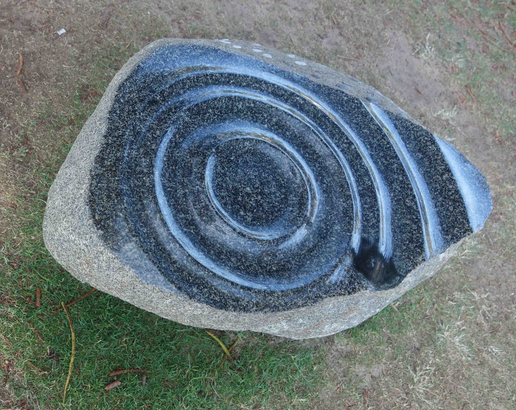 Takeshi Tanabe, Origin 21-1, black granite, 90x135x90cm, photo S Grishin The Japanese contingent of artists, who have been a feature of many SxS exhibitions, especially in carvings from hard stone, are again prominent at Cottesloe. Takeshi Tanabe carves in black granite a superb contemplative work. His artist’s statement hints at the profundity of his piece. He writes: “This work focuses on the water on the earth as the origin of life. Water collected from oceans across the world has been sealed in the stone in an attempt to tell the world about the importance of protecting the earth’s water environments.” Contemplating these droplets of water releases some of the power of the piece. Keizo Ushio carves out of green granite his knotted wreaths and Takahiro Hirata carves a black granite arrow head over two metres high in resolved splendour. Wataru Hamasaka carves a slab of granite as if a reclining couch on which Socrates administered hemlock to leave this life – it is a work of transcendental beauty. 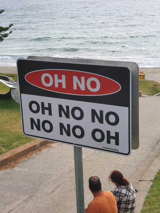 Richard Tipping, Oh No, reflective tape, aluminium poles, 60x90x5cm, photo S Grishin Richard Tipping, from NSW continues with his famous aphorism road signs – in Cottesloe it is “Oh No” and “Oh Yes” that are very appropriate for our times. The veteran WA sculptor, Mark Grey-Smith, has produced a knotted riddle in his Germination in aluminium and terrazzo. A different art critic would produce a different selection of highlights, but it is enough to say that there is much in this exhibition to delight the eye and to engage the mind. SxS sails on with the Bondi exhibition opening on October 20 this year and the challenging Snowy Valleys Sculpture Trail, funded by a $4 million grant from the NSW Bushfire Local Economic Recovery Fund, is opening later this year. 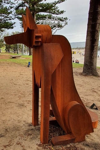 Jimmy Rix, Lone Dingo, corten steel, 222x113x202cm, photo S Grishin ‘Tarnanthi 2021’ at the Art Gallery of South Australia 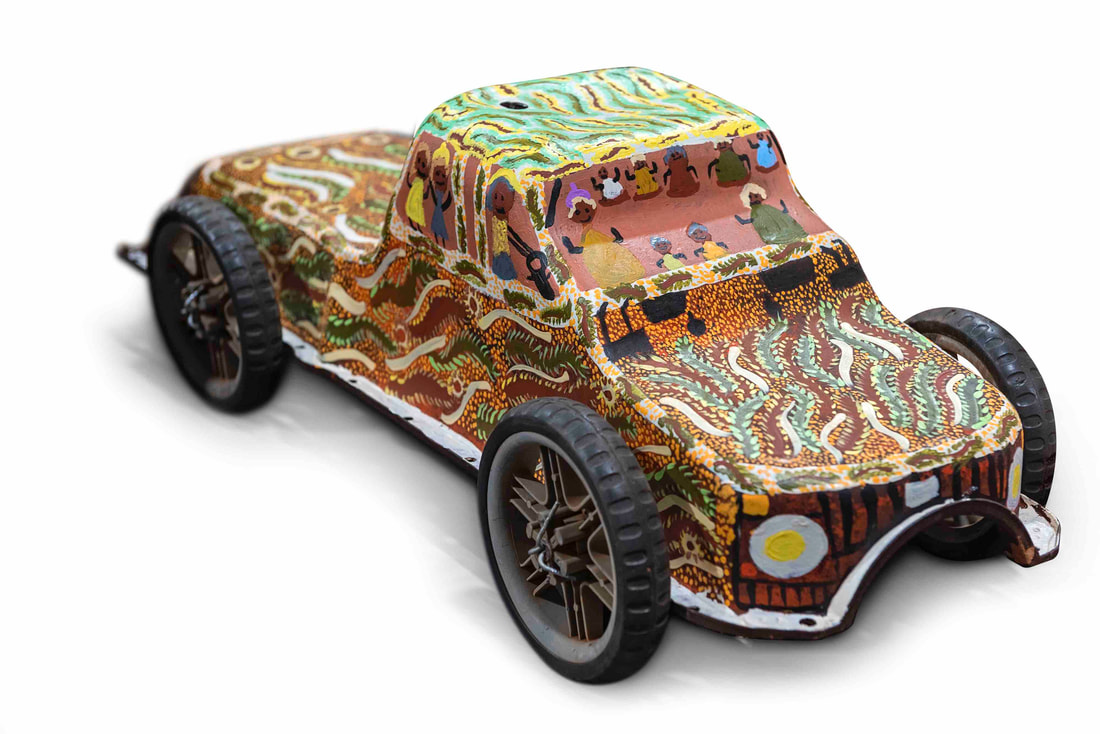 Eva Anyupa Baker, Bush trips to Mitutu Homeland, 2020, synthetic polymer paint on found object, 30.0 x 70.0 x 26.0 cm, © Eva Anyupa Baker/Minyma Kutjara Arts Project, photo: John Montesi What’s in a word? The word ‘tarnanthi’ in the language of the Kaurna people, the traditional owners of the Adelaide Plains, means to spring forth or appear – like the sun and the first emergence of light. It is the name given to the festival of contemporary Aboriginal and Torres Strait Islander art at the Art Gallery of South Australia and spreading to other participating venues. It commenced in 2015 and its sixth iteration opened in October 2021. However, the word ‘tarnanthi’ is not simply a snappy title, but according to its artistic director, Nici Cumpston, it also represents a new curatorial attitude. Cumpston writes in the lavish exhibition catalogue, “this curatorial approach is far from conventional. Western museology dictates that the curator is author and grand selector … Tarnanthi jettisons this way of working in favour of a practice that encourages excellence and innovation to spring forth and appear.” The curator becomes like a participating collaborating artist and a more collaborative, organic and fluid approach evolves for the selection of participants and exhibits.  Nici Cumpston at Tarnanthi 2021, December 2021, photo S. Grishin The proof of the curatorial pudding always lies in the exhibition and this one is interesting. There is some unexpected work from some well-known artists, including Nyunmiti Burton, Teho Ropeyarn, the irrepressible Kaylene Whiskey, Maree Clarke, Alec Baker, Angelina Karadada Boona and John Prince Siddon. There are also some fairly ‘predictable’ pieces from Kathy and Tracey Ramsay, Julie Gough, Kent Morris and Doris Bush Nungarrayi. Then there are some unexpected highlights, brilliant pieces from less well-known artists, including Timo Hogan, Minyma Kutjara Arts Project, Gail Mabo, Karen Mills and Waringarri Aboriginal Arts. The visual excitement of the exhibition in part lies in its freshness and unpredictability and in part in the exceptional calibre of some of the exhibits. For example, the room full of Tiwi papers is simply breathtaking. Unglazed and in a dense salon hang, there are some great works by some iconic and interesting emerging artists including Timothy Clark, Kaye Brown and Alison Puruntatameri. 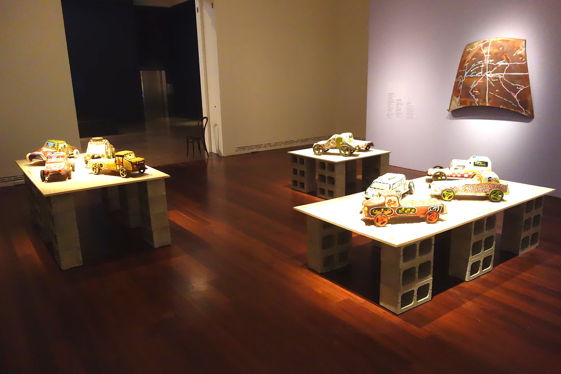 Minyma Kutjara Arts Project, Mutaka, 2020, installation view, photo S. Grishin One of the most quirky and memorable installations at the show is the Minyma Kutjara Arts Project – Mutaka (motor car). The eight artists from the remote Irrunytju community in South Australia near the tri-state border have picked up oil sumps from abandoned cars, added pram wheels and painted them as cars with their passengers and personalised narratives. A rusty car bonnet serves as a panel for a useful hand drawn map of the area and an animated video with these painted cars relates a broader narrative. All sorts of post-colonial narratives can be attached to these exhibits and there is the strong stamp of authenticity – of being there and bearing witness to the sense of place. It is also a lot of fun. 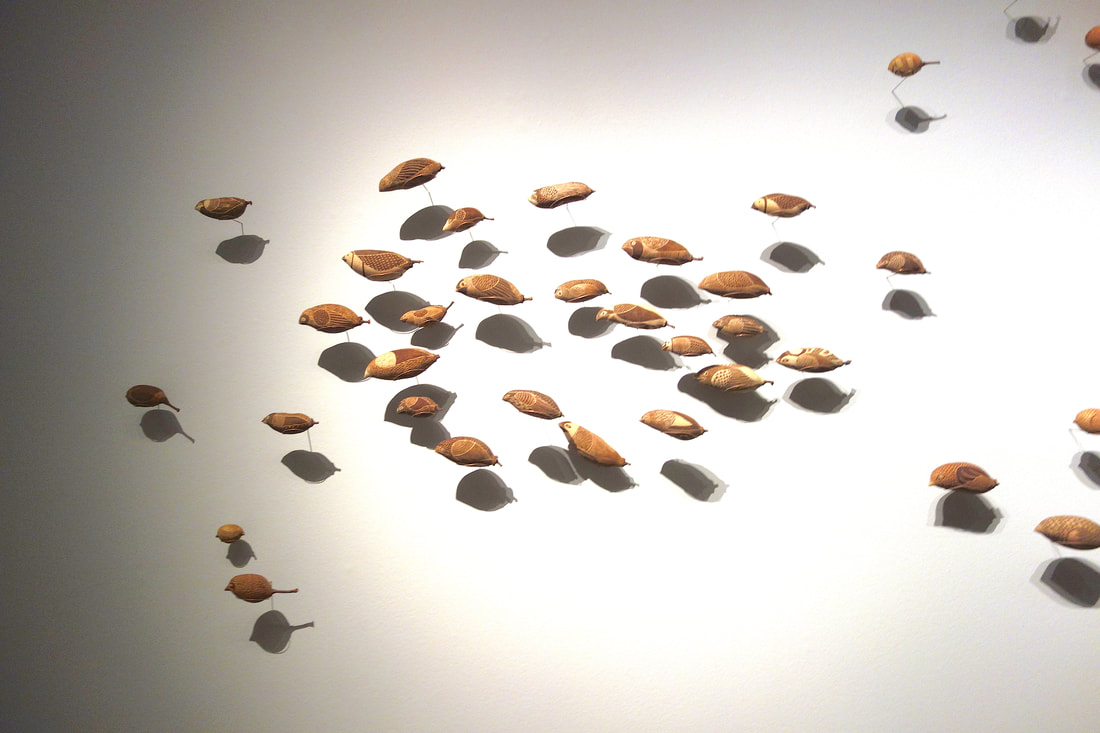 Waringarri Aboriginal Arts, Dreaming of birds, the metamorphosis of boabs, 2021, installation view, photo S. Grishin Another installation that was surprising and unusual was that by the Waringarri Aboriginal Arts artists. Carved boab nuts have long been the backbone of the tourist trade in outback Australia. Here nine artists have been commissioned to carve a large number of birds on boab nuts and these have been suspended from the wall on ingenious copper rods at various distances from the wall. There is a wonderful play between the objects and their shadows so that the flock appears to glimmer as it flies off the wall.  Timo Hogan, Lake Baker, 2021, synthetic polymer paint on linen, three panels, 300.0 x 200.0 cm (each panel), © Timothy Hogan/Spinifex Arts Project, photo: Grant Hancock Timo Hogan’s Lake Baker is a huge painting some three metres high and six metres across. It is an amazing piece with a fantastically detailed snake and textured white surfaces against a black background. The more time I spent with it, the more I was seduced by its magical spiritual presence. Although his star in recent times has been in ascendency, this painting makes a strong claim for his standing as a major artist.  Alec Baker, Ngura (Country), 2019, synthetic polymer paint on linen, 67.0 x 91.0 cm, © Alec Baker/Iwantja Arts Alec Baker is deservedly one of the big names in the show and is the senior artist at Iwantja Arts. His Kalaya Tjina (Emu Tracks) is a suite of sixteen paintings – each a meditation on country. He has a complete certainty of touch knowing exactly where to place the mark. The series is initially a mesmerising experience and subsequently a gateway to meditation.  Angelina Karadada Boona, Wandjina Emerging II, 2020, white gum sap and earth pigments on paper, 37.8 x 29.0 cm, © Angelina Karadada Boona/Kira Kiro Artists/Waringarri Aboriginal Arts, photo: Sarah Duguid The painting by Nyunmiti Burton of the Seven Sisters was one of the big surprises at the exhibition. I usually associate her work with very tight carefully articulated pieces, but now there is a breadth and freedom with gestural swirls so that the ancestral travellers appear to take off and defy terrestrial gravity. Angelina Karadada Boona’s Wandjina images are growing gradually more ethereal as they are created with the materials from the land from which they arise. She captures perfectly the sensation of something emerging out of the spiritual realm to become visible but ready to retreat back into a timeless dimension. There is always a danger when reviewing a show of this nature to plunge into a catalogue of exhibits enhanced with a bit of a verbal commentary. Sadly, that by its very nature is somewhat boring and this exhibition is anything but boring. There is a great fecundity of invention throughout the show, a vitality and sense of urgency.  Tiwi papers, installation view, photo S. Grishin Tarnanthi 2021
Art Gallery of South Australia, Adelaide 15 October 2021 – 30 January 2022 Spowers & Syme: Early Melbourne modernist printmakers 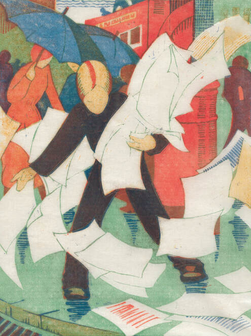 Ethel Spowers, The gust of wind, 1930, colour linocut, printed in colour inks, from four blocks, National Gallery of Australia, Canberra, purchased 1976 The long awaited Ethel Spowers and Eveline Syme exhibition was meant to open to the public on Friday 13 August 2021 at the Canberra Museum and Gallery. A day earlier, there was to be a small opening at 6.30 pm – alas the Canberra lockdown came into force that evening at 5pm – the show did not open, it has not been seen. This is almost true, sensing the disaster that was about to unfold, covering my gardening clothes with an overcoat, I hopped into the car and sped off to see the show before it and I were locked down. Ethel Spowers (1890-1947) and Eveline Syme (1888-1961) were silver spooners who came from the Melbourne establishment. They were daughters of the rival newspaper magnates – The Argus and The Age – who were lifelong friends and both were prominent printmakers who championed a version of modernism. 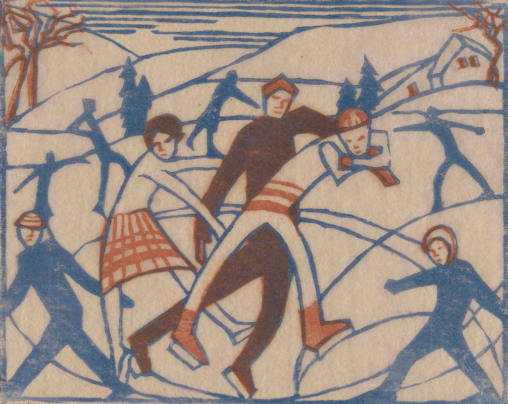 Eveline Syme, Skating, 1929, linocut, printed in colour inks, from two blocks, National Gallery of Australia, Canberra, purchased 1979, © Estate of Eveline Syme Their most productive years fell in the period between the two world wars when their art was featured in exhibitions in Australia and Britain. In the context of conservative Melbourne, their colourful linocuts looked modern and attracted a few champions and a couple of detractors. However, most of the art world simply ignored them until they were ‘rediscovered’ posthumously in the 1970s and 1980s as part of the revival of interest in the so-called ‘Claude Flight School’ of modernist linocut printmakers. Outside of the art market, the revival was spearheaded by the curator Stephen Coppel, firstly in Canberra and later in London. Today their prints are highly prized and command considerable prices on the art market. 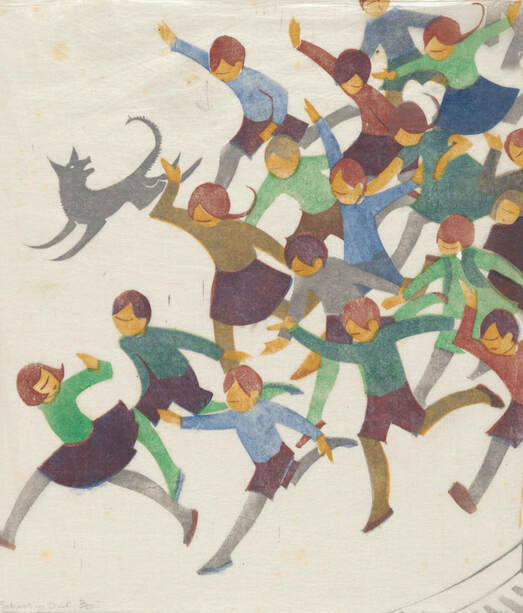 Ethel Spowers, School is out, 1936, linocut, printed in colour inks, from five blocks, National Gallery of Australia, Canberra, purchased 1976 This could be described as a ‘perfect exhibition’. It is small enough to be manageable, yet sufficiently comprehensive to give an excellent understanding of the two artists seen within their cultural context. It includes linocuts, drawings, paintings, fairytale illustrations and even an embroidered screen. It is meticulously researched by Sarina Noordhuis-Fairfax, the Curator of Australian Prints and Drawings at the NGA, who uncovers mountains of new material from the artists’ archives. She is also the author of the accompanying monographic catalogue, where the interwoven lives of the two artists are explored in her text, employing the metaphor of skating on ice. Noordhuis-Fairfax writes in a lively engaging style, where despite the abundance of quotations from primary sources, such as the detailed correspondence between Spowers and Frances Derham, it remains a very readable text. 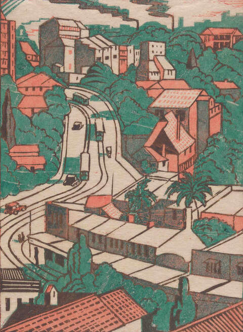 Eveline Syme, Sydney tram line, 1936, linocut, printed in colour inks, from four blocks, National Gallery of Australia, Canberra, purchased 1979, © Estate of Eveline Syme The English artist Claude Flight, through the Grosvenor School of Modern Art in London, championed the colour linocut in Britain, with a whole army of talented pupils including the Australians Dorrit Black, Spowers and Syme. There were a few peculiarities of Flight’s method. One was his worship of the Italian Futurism and British Vorticism – the exhilaration of speed and the demonic energy of machines. Flight translated this into curved dynamic lines and fragmented colours designed to express speed, movement and hustle of modern life. Flight and his disciples used three to five blocks to print colour to produce an animated surface. The third feature of the Flight method was printing on very thin oriental tissue paper Gampi or India paper, printing on the reverse side of the paper allowing the image to bleed through to the other side, permitting a degree of subtlety. 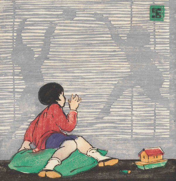 Ethel Spowers, The bamboo blind, 1926, linocut, printed in colour inks, from five blocks Gallery of Australia, Canberra, purchased 1976 The colour linocuts of Spowers and Syme have a glowing luminosity and rhythmic dynamism. Spowers’s The works, Yallourn (1933), a print of considerable complexity and employing seven blocks, and Syme’s Sydney tram line (1936) from three blocks, are outstanding examples of the Flight method. All is caught up within a dynamic explosion of energy with a rich and vibrant colour palette.  Installation photograph from Spowers & Syme, CMAG, photo S Grishin The beauty of this exhibition, at least in part, lies in the forensic matching up of sources and contexts, for example, a porcelain squirrel with an acorn appears in a Spowers’s print Still life (1932) with its dynamic play with shadows and in the exhibition the actual figurine is exhibited next to the print. In another instance, Spowers’s joyful School is out (1936) print is matched up with the artist’s drawing that served as the basis for the print.  Installation photograph from Spowers & Syme, CMAG, photo S Grishin When you recall that much of the work was made during the Great Depression, it is a gay and somewhat frivolous world that we encounter in their art. The artists did possess a social conscience and were heavily involved in charitable work, women’s education and the war effort, in their art they celebrated a joyful innocence and hedonism.  Eveline Syme, The factory, 1933, colour linocut, National Gallery of Australia, Canberra, purchased 1979, © Estate of Eveline Syme Spowers and Syme may not have made work of the same calibre or profundity as Jessie Traill or Dorrit Black, however, they did produce a body of exquisite prints that have finally been recognised and are celebrated in this wonderful exhibition. 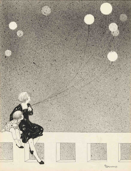 Ethel Spowers, Balloons, c. 1920, drawing in black ink, National Gallery of Australia, Canberra, Gift of Chris Montgomery 1993 Spowers & Syme Canberra Museum and Gallery, Canberra 13 August – 12 February 2022 Western Plains Cultural Centre, Dubbo 26 February – 1 May 2022 Heide, Melbourne 18 June – 2 October 2022  Ethel Spowers, Bank holiday, 1935, linocut, printed in colour inks, from six blocks, National Gallery of Australia, Canberra, purchased 1976 An earlier version of this review was published in The Canberra Times
|
GRISHIN'S ART BLOG
Sasha Grishin AM, FAHA is the author of more than 25 books on art, including Australian Art: A History, and has served as the art critic for The Canberra Times for forty years. He is an Emeritus Professor at the Australian National University, Canberra; Guest Curator at the National Gallery of Victoria, Melbourne; and Honorary Principal Fellow, Faculty of Arts, at the University of Melbourne. Archives
September 2023
Categories
Keep up-to-date with Sasha Grishin's blog with the RSS feed.
RSS offers ease of access and ensures your privacy, as you do not need to subscribe with an email address. Click here to download a free feed reader |
 RSS Feed